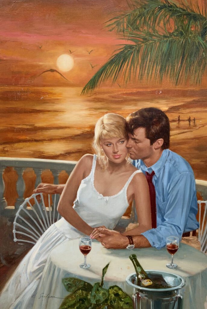
Did you know that OPA has been sharing artists’ blog posts for over ten years? We have an extensive collection available to the public on our website. This fall, OPA will be taking Deep Dives into our archives and sharing our favorite posts from years past. Please enjoy this Deep Dive by Adam Clague OPA.
In many ways, making a good painting is like walking a tightrope. The particular tightrope I am thinking of is the one with the Abyss of Unbridled Creativity on one side and the Chasm of Static Rendering on the other.
If we ignore the gravity of technical accuracy, we risk plummeting into “There-are-no-rules-so-I-can-do-whatever-my-whims-tell-me Mode.” On the other hand, if we traverse the tightrope chanting “Paint what you see; paint what you see,” we can topple into “Gotta-get-this-right Mode” and produce cold, slavish, technical renderings.
I have lost my balance on both sides of this tightrope many, many times. However, I am more prone to tumbling into the Chasm of Static Rendering, and I would like to address this danger.
Accuracy and Vision Should Work Together
I used to think if I could “paint what I see” with 100% accuracy, I would automatically produce masterpieces. Today, I realize a good painting requires more. Don’t get me wrong, I am not suggesting we abandon technical accuracy in the fundamentals (drawing/shape, value, edge, temperature, color). These compose the foundation upon which good representational art is built. But once we’ve laid a solid foundation, it is time to construct the walls and roof. Truthful observation of our subject should be our primary blueprint. Yet, I propose we use this blueprint in harmony with a secondary blueprint–one I call “getting the vision”.
No, I’m not talking about anything mystical. I am just speaking of having a clear mental image of how we want each picture to look, both before we start and as we work.
The Scope of Our Vision
Within the realm of representational art, it is vital that our vision does not take us outside the boundaries of what is visually understandable. And the only way to learn where these boundaries lie is through persistent, observant painting from life. However, that’s a different topic, and one I feel has been well-covered. Let’s focus instead on the scope of our vision, which can be broad. Our vision may affect every area of painting, including composition, choice of subject matter, technique, and even the fundamentals I listed above. That’s right, even the foundation of drawing may be manipulated slightly if doing so will serve the picture well. For example, a simple gestural line can be more expressive than an unnecessarily complex line in the subject. Asking “How can I make the best picture?” can help temper and direct our vision.
Example 1
I would like to share two paintings that my vision affected. Please understand, I’m not encouraging anyone to paint in my “style”. I only hope you’ll ask yourself “How do I want my painting to look?”
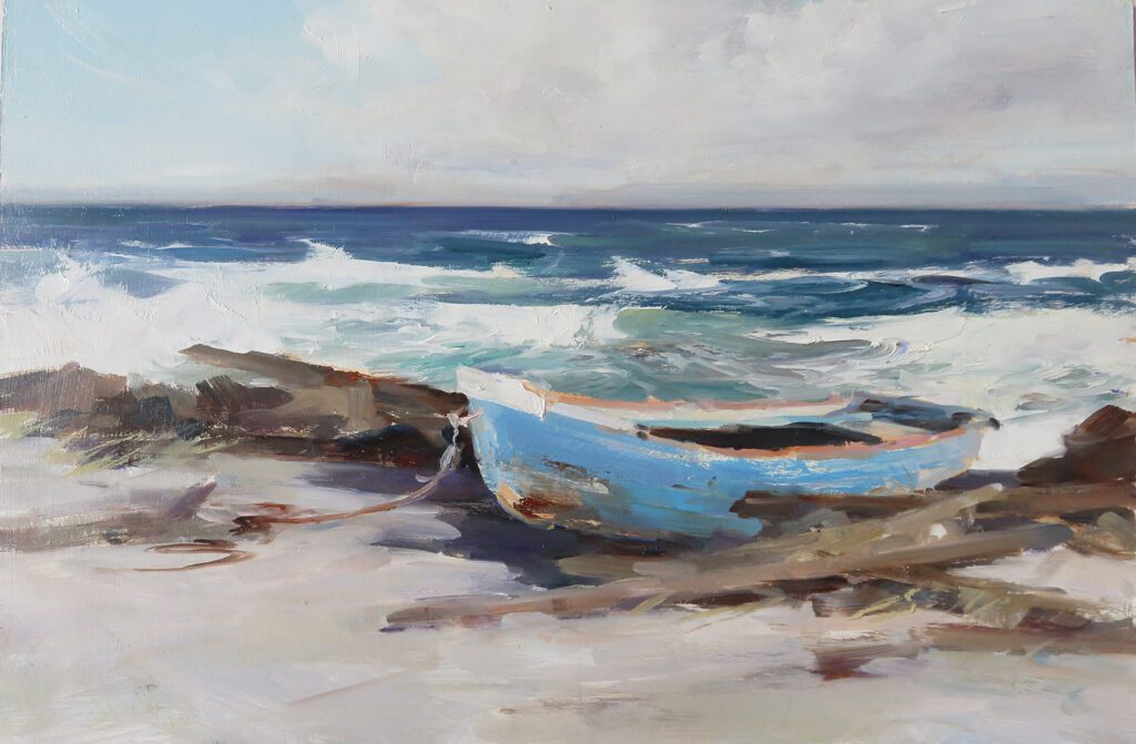
First is a piece that began as a few bad photos (one is below) and an even worse plein air (I’m too embarrassed to even show it). Still, I had a vision for the piece that I liked enough to attempt a small studio painting.
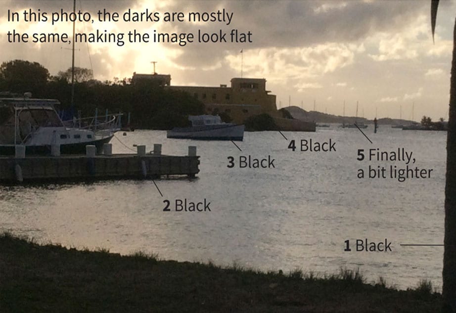
The darks in the photo below are mostly the same value, making the image look flat. To create depth, I painted the darks progressively lighter as objects receded (see painting below). My idea was based on the effect of aerial perspective—atmosphere that causes nearer shadows to appear darker and more distant shadows to appear lighter.
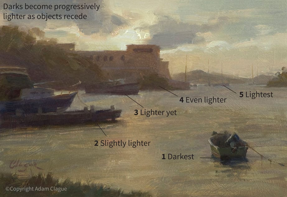
Fort Christiansted by Adam Clague OPA
7″ x 10″ – Oil
I also wanted to make the photo’s monochromatic color more realistic. I did borrow a few color notes from my plein air, but mostly, I made up the colors (I can hear you gasping now). Still, my color changes were based on effects I had previously observed from life. I have noticed that, when one is looking into the sun (as in this scene), there can be a glare that causes darks to appear reddish. Accordingly, I decided to replace the photo’s colorless darks with more reddish hues.
Example 2
I hope my next example will help those wondering how to paint more loosely. Classical painters, please don’t stop reading. Although I like impressionism, this article isn’t about tight versus loose painting. It’s about envisioning our pictures versus copying slavishly—I believe that applies to us all.
Loosening up starts with having a vision. How do you WANT your brush strokes to look? Look at just one small part of your subject. If you could paint that part any way you wanted, what would it look like? Get a clear picture of how you want that area to be painted, even if you can only visualize one stroke at a time. Now, pick up your brush and give it a shot. Determine to match your mental image, even if it takes several tries. Once you lay down a stroke, don’t keep blending it, or you’ll “kill” it. Rather, if the stroke needs to be adjusted, do so with a completely new stroke. Stand back ten feet. Does the area read well? If so, don’t touch it! The bravura strokes in some impressionist works might suggest the paintings were done entirely on some whimsical auto-pilot. On the contrary, loose painting is about vision and careful intent.
Compare the stages of the painting below. My vision was general at first and then grew gradually more specific. First, I envisioned only the basic planes of the model’s head and blocked them in (1). Next, I built upon this foundation by visualizing and painting progressively more specific shapes (2).

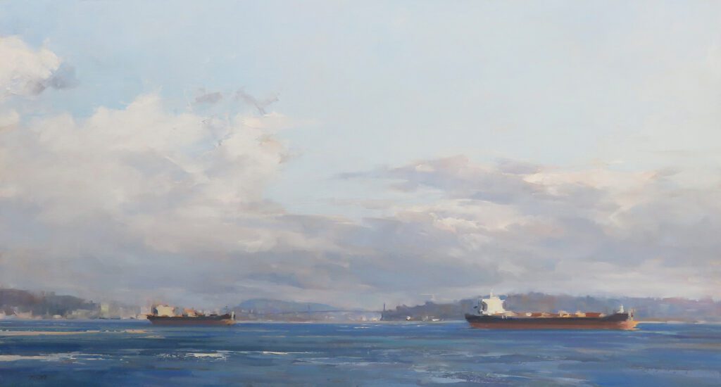
30″ x 30″ – Oil
In the final stage (3), many of my initial shapes have been softened, but I left a few visible strokes on top for aesthetic purposes. I enjoy doing this. These strokes are usually stylized versions of the shapes in my subject, almost like little graphic designs. You can also see this tendency of mine in “Violist,” below.

10″ x 8″ – Oil
Again, this is merely how I like to lay down paint. I hope you will endeavor to learn how YOU like to apply paint. To do this, study great paintings in person as much as possible to see others’ solutions to common problems. Strive for variety in your paint application—thick versus thin, opaque versus transparent, bold versus delicate, etc. Always ask yourself, “How can I capture that most convincingly?” along with “How do I want this to look?”
Keep Your Balance
Making it across the tightrope requires a balancing pole. One end of the pole is weighted with technical accuracy and the other end with creative vision.
Don’t look down! It is scary for me to leave my comfort zone of “Gotta-get-this-right Mode” and allow my vision to inform my work. Likewise, it’s scary to admit I’ve made a technical inaccuracy. But we must do both to create our best work. To maintain our balance, we must keep our eyes fixed straight ahead (and for me, upward as well). As we take one step at a time, our paintings will begin to look more and more like how we first envisioned them.
My paintings don’t look exactly how I’d like yet, but I am determining to press forward. I hope you’ll be encouraged to join me in walking this tightrope. I believe our best work is waiting for us on the other side.
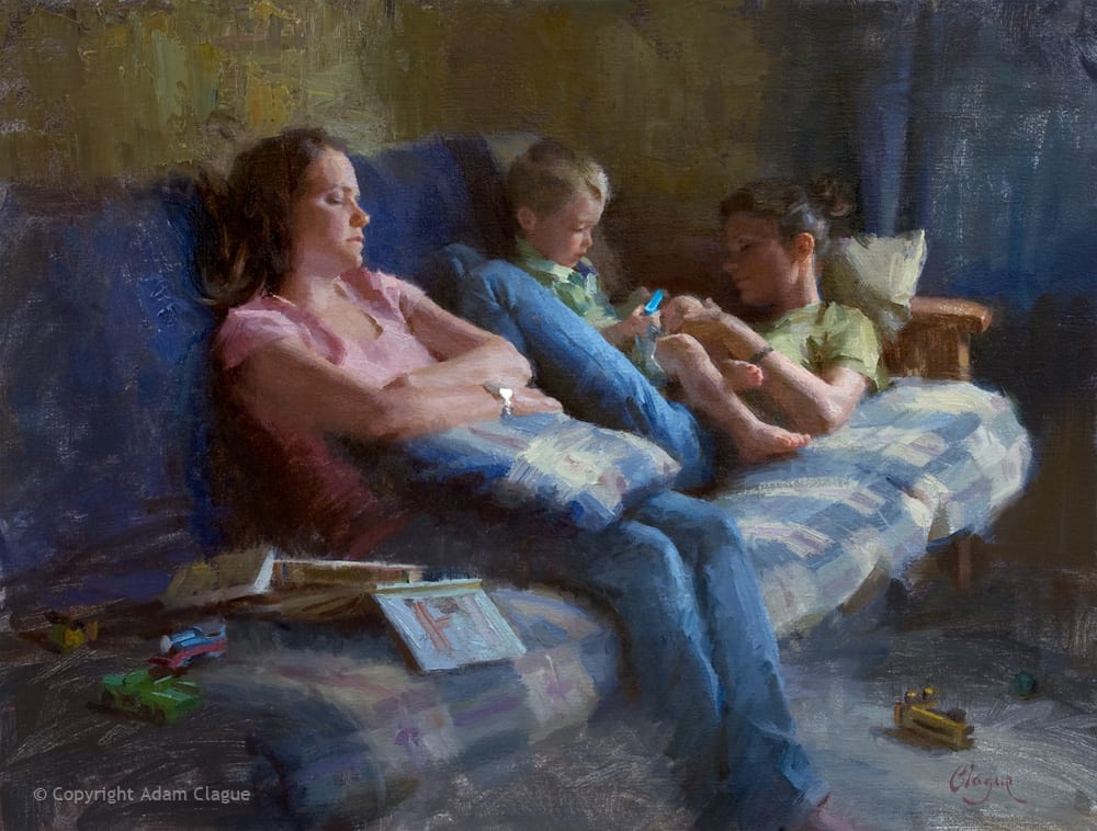
18″ x 24″ – Oil
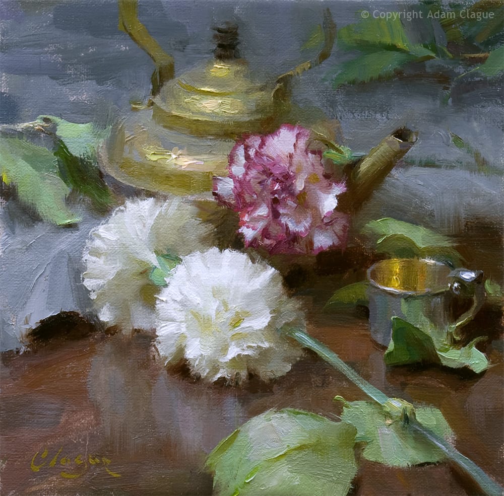
10″ x 10″ – Oil
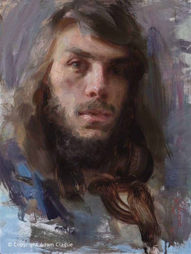
12″ x 9″ – Oil
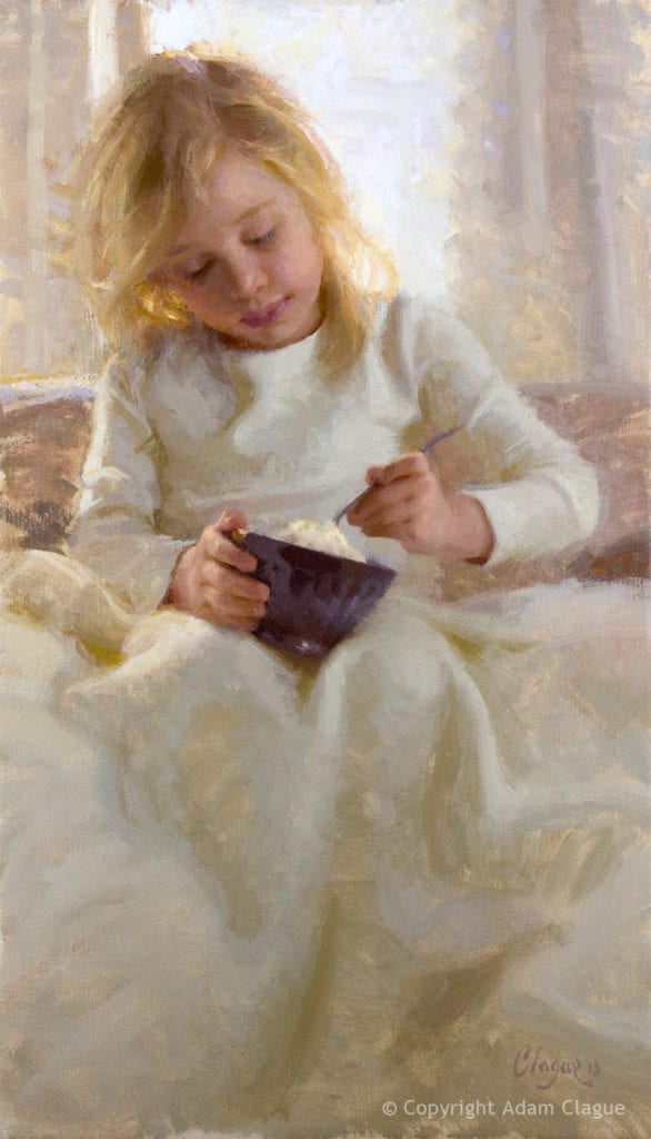
24″ x 14″ – Oil