• Skip to primary navigation
  • Skip to main content
  • Skip to footer
  • Help Desk
  • My Account

OPA - Oil Painters of America

Dedicated to the preservation of representational art

  • Home
  • About
    • Mission, Policies & Bylaws
    • Board of Directors
    • Presidential History
    • Frequently Asked Questions
    • History
    • OPA Staff
    • Contact Us
  • Membership Services
    • Member Login
    • Membership Information
    • State & Province Distribution For Regionals
    • Update Member Information
    • Membership Directory
    • Contact Membership Department
  • Events
    • Exhibitions
    • Online Showcase
    • Lunch and Learn
    • Virtual Museum Road Trip
    • Paint Outs
  • Resources
    • Brushstrokes Newsletters
    • Ship and Insure Info
    • Lunch & Learn Video Archives
    • Museum Road Trip Video Archives
  • Services
    • Sponsorship Opportunities
    • Scholarships
    • Critique Services
    • Workshops
    • Have A HeART Humanitarian Award
  • Online Store
  • Awardees
  • Blog
    • OPA Guest Bloggers
    • Blogger’s Agreement (PDF)
    • Comment Policy
    • Advertisement Opportunities
  • Show Search
Hide Search

Oil Painting

Mixing Skin Tones – Simplified by Susan Patton

Susan Patton · Sep 6, 2024 · 6 Comments

Painting portraits can be complicated, but mixing skin tones shouldn’t be. In my workshops, I teach a method to simplify the process.

Mrs. Bea Green, 16×12, oil

How to mix skin tones

  1. First, choose a “base” color like yellow ochre, transparent oxide yellow, raw umber, burnt umber, raw sienna, transparent oxide red, or transparent oxide brown based on the skin tone you are painting. This is what makes this process work for all ethnicities.
  2. Mix the base color with white to form the “foundation color.”
  3.  Mix that “foundation color” with various warm and cool colors- like red, blue, and green. The goal is to tint it- so you only need a touch of the primary color.
  4. The result is a palette of premixed harmonious- warm, cool, and neutral- skin tones with the correct “undertone” throughout.

Mixing the needed skin tones is now almost done. Small tweaks in the value or temperature will be necessary, but that is much easier than staring at pure red, green, and yellow piles of paint every time you need a new mixture.

———————————————————————————————————————

A closer look

Let’s look closer at these steps. I will demo for you in pictures so that you can see what I do. (I also have uploaded a video on YouTube that explains this process. @susanpattonart)

  1. Choose a base color.

To help you decide, do a simple color chart. (A quick one- I promise.) This will help you to choose which “base” color is best for your subject’s skin tone. Mix one base color at a time – yellow ochre, transparent oxide yellow, raw umber, burnt umber, raw sienna, transparent oxide red, or transparent oxide brown with white and put it onto a canvas. Repeat with each color until you have a sample canvas of foundation colors to reference each time you paint portraits. (Eventually, you will be able to choose your base color without this aid.)

Next, hold this canvas with its mixtures up to your subject. Choose the color that has the correct undertones. Choose the one with the least contrast between your subject and the mixtures,

I made a canvas with several sample “Base” colors on them. I put it next to skin tones requiring a different base color based on their undertones for you to see the advantage in making this color chart. I can use this simple color chart to choose my base color with portraits in the future if need be.

Tip: To help you out even more, mix several warms and cools for each base color and paint them onto separately labeled canvases. You can keep these canvases for future use when choosing your “base” color.

These 6 x 8 canvases were made with different “base” colors, but otherwise the same palette. The first is Transparent Oxide Brown, the second is Raw Sienna, the bottom left is Transparent Oxide Red, and the bottom right is Burnt Umber. Which would you choose as your base color for these pictures?

Which base color would you choose for doing a master copy of Sargeant’s painting?

Once you have chosen your “Base color”, put a small line of it onto your palette with a thicker line of white above or below it.

Tip – Can’t decide? A good middle-of-the-road is “Raw Sienna” for light skin. “Burnt Umber” works well for darker skin that has cool undertones.

2. Mix the base color and white to form the appearance of makeup that would blend in with the person’s skin.

Above that line, put dots of other colors. These colors are up to you and can be chosen based on the colors you see in the person’s skin. The idea is to have both warm and cool colors. Put a dot of blue, red, yellow, green, and black paint in a row above the foundation line. (You can also use any of the colors we named above as a “base color” in this row if you’d like.) No color is outlawed in this row- these are up to you. You can also put as many colors as you’d like.

Tip: Can’t decide which colors to put on this line? Try Ultramarine blue, Cad red, Alizarin Crimson, Yellow Lemon, Sap Green, Transparent Red Oxide, and Black. Mix purple using blue and alizarin.

Tip: Also be sure to include colors reflected onto the person’s skin from their clothing or surroundings. For example, if you plan to paint their shirt “Turquoise” be sure to put “Turquoise” in this line. That is because light bounces and carries color with it. Some of this color will bounce up and reflect in the skin around it.

3. Now that you have your “Foundation” line and dots of colors above, take your palette knife and “tint” the foundation with the colors- one at a time. For example, take a small amount of the blue and mix it into the foundation color (base color + white + small drop of blue), next, bring a small amount of red into the pure foundation below to get a pinkish flesh color (base color + white + red). Continue this process across your palette until you have various flesh tones to paint with.

Mixtures using Raw Sienna

Mixtures using Burnt Umber

Tip: Depending on your base colors, your flesh tones will have an undertone of warm or cool. Different base colors will yield a different spectrum of colors.

4. You are now ready to begin painting the portrait! The advantage of this method is that in choosing a base color, the colors stay “interconnected.” This makes them flow harmoniously from one to the next as the form turns around the head.

Tip: You can also mix the pure colors to form darker colors.

Be aware:

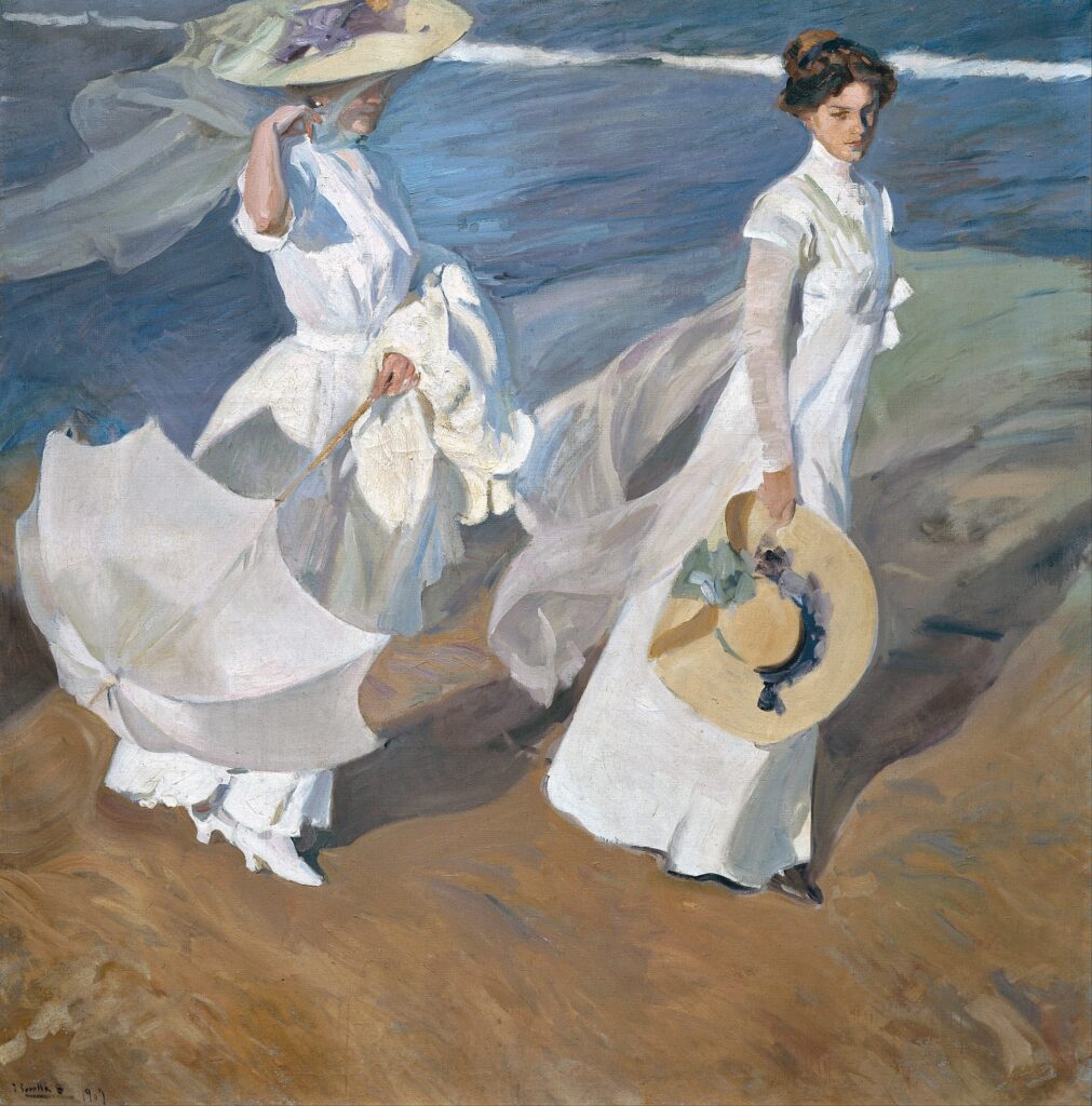
  1. Skin tones do not have to be matched precisely. The value and temperature are much more important than matching the hex color code. Look at Sorolla’s painting, After the Bath. Sorolla was much more concerned with beautiful shifts in temperature and getting the light and shadow correct than with matching the precise skin tones. It appears he wanted every area to be beautiful, regardless of the “actual” color.

These are some colors that I sampled from the skin of the lady and the child in this painting. Notice the beautiful warm and cool colors.

2. Avoiding plastic-looking skin, unless it is your intent. In my painting, Cherished, I painted a little girl and her baby doll.

There are differences between the baby doll and the little girl’s flesh. The baby doll is made of plastic in 1 color, so the only change of color or value is the light reflecting on the hard surface. Conversely, the girl’s hand has the warmth of blood flow, a bigger temperature change where the light hits it, and limited reflection because the skin is porous and soft. To show these differences in a painting, use a change of temperatures with similar values to indicate translucence. Control the amount of reflection on the skin by using stronger chroma without a big change in value.  To show light reflection on the doll, use a change in value with less chroma. 

3. The application of the paint and the direction/visibility of the brushstrokes are as important as the color you choose. Every artist has their tendencies and practices regarding this. Practice and time will tell your preference. The Portrait Society of America hosts an annual International Portrait Society Convention. It is a great way to see wonderful examples of beautiful portraiture. This painting was done as one of the “Faceoff” demonstrations by artist Jeff Hein at this year’s International Portrait Society Conference. Note how every color, temperature, and direction of the brushstroke is intentional.

4. Mixing beautiful skin tones is important but secondary to getting the drawing correct. Drawing with charcoal is a great way to practice getting likeness by focusing on turning form without color. After learning to draw, you can learn to sculpt (push/pull) the painting with temperature and “Color Value”, as Everett Raymond Kinstler would say. Never just color. Never just value. “Color-Value.”

This is a charcoal sketch of my grandmother. I drew it from a photo of her looking at me one day when I visited her. It is just like her, even though it is monochromatic.

My process of mixing skin tones is not the only way that works nor the only way I ever paint, but it has been an effective method to help my workshop participants see color in portraits. Maybe this will help you, as well, get a “head start” on mixing skin tones.

To see Susan’s upcoming workshop schedule, visit www.susanpattonart.com/workshops

View Susan’s video here: https://youtu.be/eKuH-oWqQx4?si=vw1IqotYPHuKRHr2

Thoughts on COMPOSITION, by John Taft OPA

John Taft · Aug 13, 2024 · Leave a Comment

Back when I was beginning to paint the landscape, I did this great trip with a few others to the Wind River Mountains.  It was an ambitious trip for me, especially because I was a novice painter. I remember asking myself, “How do I capture this subject on my canvas?” and “Where should I put the focal point?”  Heck, I was asking, “What IS a focal point?”


When people take photos they frame a subject so it looks good.  As “artists” we are often credited with having a “good eye”.  But in doing a painting with a whole world in front of us and a panel that can capture only a part of it, the idea of subject placement becomes job one.


I remember observing how unequal divisions created a relationship of spaces.  Notice the diagram below.  On the left are rectangles with equal divisions, on the right, with unequal.  In this most simple of illustrations, notice how on the left, A and B are equal in size and shape.  They almost become meaningless, speechless.  On the right, A and B are unequal and they now are in relationship to each other in a way that says something about each.  This principle of unequal divisions is foundational to good composition.

Most of us have heard of the “rule of thirds”, which is very helpful.  Arguably the more sophisticated version of that concept uses the golden mean, used throughout history in painting.  Below are a few examples from some of my heroes. Let’s take a look at how their primary subjects are positioned on the canvas. 


In Homer’s “The Fog Warning”, both the dominant vertical and dominant horizontal follow this idea.  Additionally, so does the diagonal.  The three directional lines make for a simple yet powerful composition. 


Bellow’s “Dempsey and Firpo” follows a similar structure where in this case, the strong diagonal is even part of a triangle

Isaac Levitan, the most poetic of these three, paints “Vladimirka Road”, a dirt road on an overcast day.  It is a masterpiece of simplicity.  If the vanishing point was centered like the left sides of our diagram above, each division would compete with each other, and it would be a weaker painting.

I include the last image, “Smith Rock”, because I kept the basic principle of unequal divisions in mind as I approached what for me was a complex subject.  I have found that doing so helps all my work.

“Smith Rock” by John Taft


Finally, in the first “Pirates of the Caribbean”, when Keira Knightley’s character pleads for “parlay”, according to the the “pirates’ code”, the captain’s response was “the code is more of what you’d call…guidelines than actual rules”.  The same applies here. 

Getting Good Shapes, by Rich Nelson OPA

Richard Nelson OPA · Jul 12, 2024 · Leave a Comment

Rich Nelson Violet, Charcoal and White Conte
15″ x 23″

I believe Richard Schmid said that most problems with paintings are due to drawing.  Most of us start out drawing but often, as we begin painting, we don’t circle back to drawing much.


I was fortunate to study drawing principles, such as perspective and anatomy, in art school in the ’80s in Detroit, Michigan.  However once I began painting a lot, I did not draw much and even began to feel that drawing was becoming a weakness I could mask with the occasional lucky shape, splashy brushwork and such. 


Fortunately, I was asked to do a series of charcoal portraits around 2007, and since then have done about a thousand of them! These have helped me to regain some confidence in drawing. They are usually done from my own photos, which I set up as though the person is sitting near.

Rich Nelson Hampton, Charcoal and White Conte 20″ x 16″
Rich Nelson Claire, Charcoal 20″ x 16″

This brings me back to Richard Schmid’s point. I think what he meant is that very often what is required to “bring a painting home” is accurate drawing, along with excellent values, color, brushwork, etc. 


It is confidence in drawing which helps to capture details that can really help elevate a painting. Richard Schmid was very accurate in his “drawing” of things like leaves or other details in his work, even if they were supporting characters in the overall composition.


To be clear, to me drawing is getting accurate shapes in my work. I’m not interested in minute detail of rendering every eyelash or thread or leaf or whatever.  I try to continue improving shapes throughout the drawing or painting process. I don’t “get a perfect drawing” and then fill in between the lines.

As you can see in the comparison of the block in photos and the final paintings below, it is drawing that helps to “bring home” the finished paintings; placing the shapes of the head and background, features, highlights and such correctly. This makes for a decent result at our three hour, Wednesday Night Head Study group. (We’ve been getting friends and neighbors to sit for us most Wednesdays since 2013!)

David Lanik ‘Block In’ Oil 16″x12″
Rich Nelson David Lanik, 16″x12″ Oil
Quick Drawing for Rachel 16″x12″ Oil
Rachel ‘Block In’ Oil 16″x12″
Rich Nelson Rachel, 16″x12″ Oil

If you’re feeling like you’ve lost touch with drawing skills, or would like to improve them, you might consider joining or starting a drawing class, drawing some still life subjects, or drawing your own face in the mirror. 


It may be necessary to revisit basic perspective or anatomy to understand our subjects, so that we can render them with confidence. For the figure, I like Andrew Loomis’ Figure Drawing For All It’s Worth, and there’s no shortage of information out there about basic one, two and three point perspective so that we understand things like eye level, vanishing points, ellipses etc.


I believe Norman Rockwell said his ability to draw was a little gift that he always had in his pocket that enabled him to pursue all of his ideas. It’s good to think of strong drawing skills as we draw or paint as our friend and ally, and not a weakness that we can somehow avoid for the rest of our days.

The Value, Motivation and Validation Most Artists Are Looking For

Susan Abma · Jun 17, 2024 · 1 Comment

Catalina Darling by Micaiah Hardison
24″ x 36″

Among the many artists’ organizations in this country, I feel that the Oil Painters of America is unique in the sheer number of events, programs and services that it provides its members.  I am making this observation after having a discussion with a member about OPA’s unique operating strategy compared to other art groups.  This member mentioned recent research comparing many of the leading artists’ organizations in the country according to their “operating efficiency”. Drawing on publicly available 501(c)3 filings, the research showed how these organizations compare based on the amount of earnings generated per member, and the percentage of stockpiled cash reserve. I was pleased and not surprised to find that the Oil Painters of America was ranked lower than most of the other organizations for cash reserve.

Riptide by Micaiah Hardison
20″ x 16″

While it is good to have a reserve in place to help an organization through financial fluctuations, it is hardly the purpose of a non-profit to generate income and stockpile cash.

Our goal as an organization is to serve our membership well, using our funds to create the maximum benefits that we can afford, while being financially responsible and keeping moderate reserves.

We perpetually look for ways to add value to our OPA “family” and to serve our membership. Spending on OPA member benefits is a valuable investment. We spend our funds on education through Lunch and Learns, student awards, our newsletter and blog, as well as educational sessions and demos at our many exhibitions. We spend our funds on shows that promote our artists online and at physical shows. Our funds are there to serve our members.

Gringo by Micaiah Hardison
36″ x 24″

While it is important to keep “rainy day” reserve dollars, what’s even more important is using all
that we can to help our artists succeed and, as per our mission; “advance the cause of traditional, representational fine art by drawing attention to the lasting value of fine drawing, color, composition and the appreciation of light”.

I was particularly gratified to have these reflections supported by a letter that was passed on to me. It was written by one of our members, Micaiah Hardison, who suggested that other arts organizations could learn from the example of the OPA.

I close by sharing his observations…

Susan Abma
OPA President

Fun at the Isthmus by Micaiah Hardison
20″ x 16″

“OPA is like a working parent, providing opportunities and resources for the family. Income is used to the benefit of the family, which keeps it alive and thriving.  The children are healthy and able to learn to support themselves and others. The more they receive the more they offer and give.

OPA is accelerating artists’ careers and providing opportunities for them to show and sell their work in galleries and offering prize money. They have about a dozen shows and competitions every year, along with an annual convention, workshops, paint-outs, etc. The advancement and success of its members’ skills and careers is its top priority. This is the value, motivation and validation most artists are looking for.” 
— Micaiah Hardison

To view a video on Hardison and his visit to the 2024 OPA National Exhibition and Convention
go to: https://youtu.be/89aths7DwNo?si=w7vUB2697ECLHgJv

Black Pearl by Micaiah Hardison
24″ x 36″

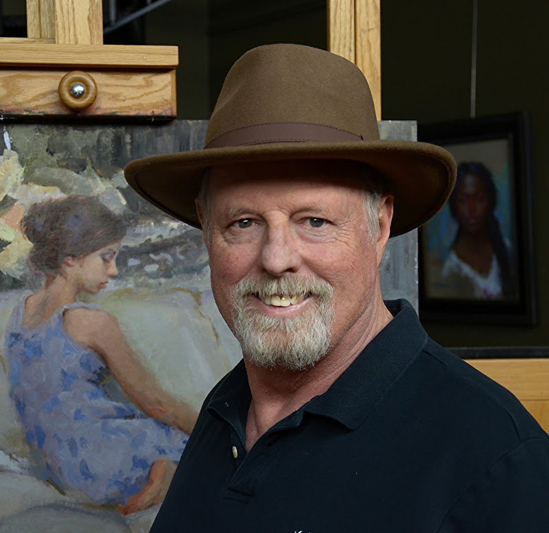
Painting Backgrounds

William Schneider · Jun 3, 2024 · 7 Comments

Some things don’t change, such as painting backgrounds and backdrops.  With that in mind we are re-presenting a blog written by one of our Master Signature artists, William Schneider.

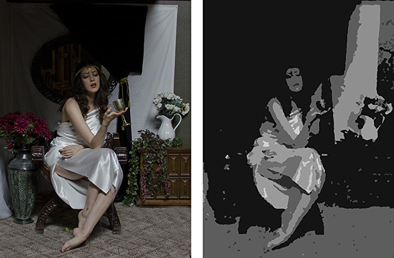
I have received a number of questions about painting “backgrounds” specifically for portraits. Too many students spend their time rendering the subject and then try to paint the background at the last moment. The result is often a disaster; the figure looks pasted on or there is a formless envelope around the head. The problem is that the background is an afterthought rather than an integral part of the painting. 

Don’t forget, someone looking at the painting sees the whole…not just the subject. In reality, the background is vitally important because it defines the center of interest. My pastel mentor, Harley Brown OPAM, told me “always work the background at the same time as the subject”. The key is to give some thought to what you’re doing and why. Here’s a great quote from Quang Ho OPAM: “If you make a decision, it’s always right!” Think about it! 


I think of three elements and three approaches when I make decisions about the background: 

Elements:
  1. Value – is the background darker (like a typical Rembrandt portrait), lighter  (like a more contemporary graphic piece) or the same value (used by some artists to lose the edges on the light side of the face).

  2. Hue – A background that is the complement of the dominant color of your subject (either grayed or high-Chroma) automatically defines the subject as the center of interest. Furthermore, if you place equal amounts of the discords (two steps on either side of the subject’s hue on the Munsell color wheel) near the subject you reinforce the effect.

  3. Shape – Rather than have a flat tone around the portrait (boring) you can create secondary points of interest…the three approaches listed below. 
Approaches:
  1. A specific scene or environment. Sargent did this in almost every portrait. He used columns, chairs and vases as secondary points of interest to create a mood.

  2. A suggested environment. Abstract shapes still place the subject somewhere other than empty space. 

  3. A vignette– although the picture plane is not completely filled, the shapes that are there fulfill a design purpose. (I was taught that it’s a good idea to have a vignette touch three sides of the picture plane. I often design the “background” to have a movement that opposes the thrust of the figure.)

Here are some examples of all three approaches. By the way, I cover this (plus a lot more) in my workshops and DVD on Design / Composition Secrets of the Masters. 

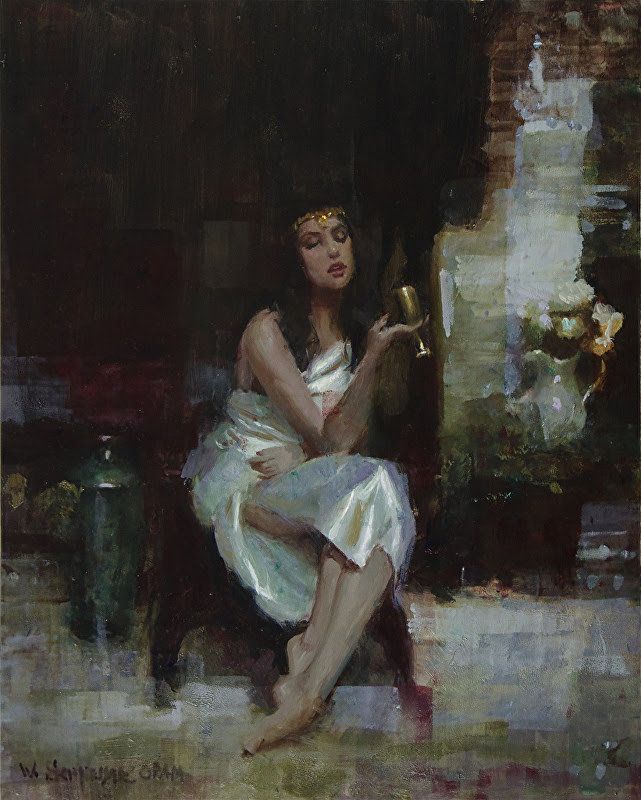
 “Circe’s Potion” by William Schneider OPAM – Oil
“Kelly by Moonlight” by William Schneider OPAM – Pastel
“Persecuted” by William Schneider OPAM – Pastel
  • « Go to Previous Page
  • Page 1
  • Page 2
  • Page 3
  • Page 4
  • Page 5
  • Interim pages omitted …
  • Page 80
  • Go to Next Page »

Footer

  • Home
  • About
    • Mission, Policies & Bylaws
    • Board of Directors
    • Presidential History
    • Frequently Asked Questions
    • History
    • OPA Staff
    • Contact Us
  • Membership Services
    • Member Login
    • Membership Information
    • State & Province Distribution For Regionals
    • Update Member Information
    • Membership Directory
    • Contact Membership Department
  • Events
    • Exhibitions
    • Online Showcase
    • Lunch and Learn
    • Virtual Museum Road Trip
    • Paint Outs
  • Resources
    • Brushstrokes Newsletters
    • Ship and Insure Info
    • Lunch & Learn Video Archives
    • Museum Road Trip Video Archives
  • Services
    • Sponsorship Opportunities
    • Scholarships
    • Critique Services
    • Workshops
    • Have A HeART Humanitarian Award
  • Online Store
  • Awardees
  • Blog
    • OPA Guest Bloggers
    • Blogger’s Agreement (PDF)
    • Comment Policy
    • Advertisement Opportunities

© 2025 OPA - Oil Painters of America · Design by Steck Insights Web Design Logo