“The object isn’t to make art, but be in that wonderful state that makes art inevitable”
– Robert Henri
For many years now this quote by Robert Henri has tickled my core self. It resonates with me, heart and soul. But why? Henri just put to words what is basic to the human experience. Put a single crayon and one single white sheet of paper before a four-year-old… and what happens? You will see the inevitability of art (if only we could maintain that complete sincerity to process as we get older:) But with experience comes a greater degree of receptivity perhaps, embodiment, or empathy even, to the world around us.
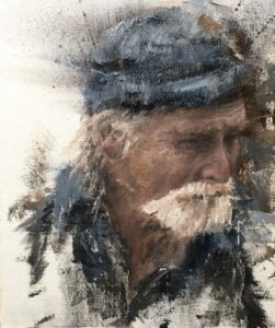
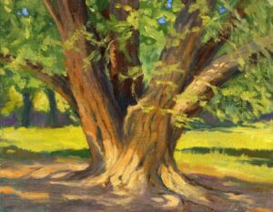
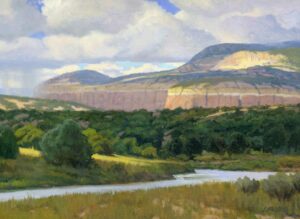
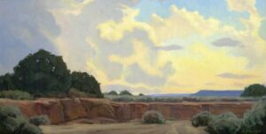
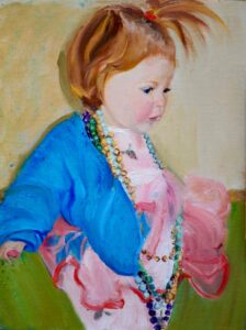
12″ x 10″ – Oil on Linen
To transform the mundane into the profound, to see color where before were only shadows? To be shaken out of the ordinary and experience the extraordinary. Being in that mental state that makes art inevitable is not about happiness. It is not about tomorrows pressures or yesterday’s regrets. It is about being present to your creative moments. Doing what you enjoy doing. Learning to lose yourself in the process.
At the very heart of making art inevitable, I have found three fundamental overlapping themes: flow, creativity, & mastery. Peeling back the layers in my process these are the core engines of my growth. In your personal discovery, you may find different engines…
But whatever your engines of growth may be, identify them, peel back the layers and go deep, tease out even the smallest details. Here are some of the layers I’ve uncovered, some philosophical, some technical, all a subject of study in themselves:
- Sincerity to process over product.
- Drawing on internal motivations over external concerns.
- The habit of hard work.
- Deep concentration on a limited field.
- Developing intuition in your process.
- Drawing with your eyes first.
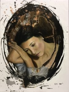
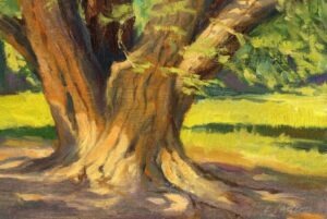
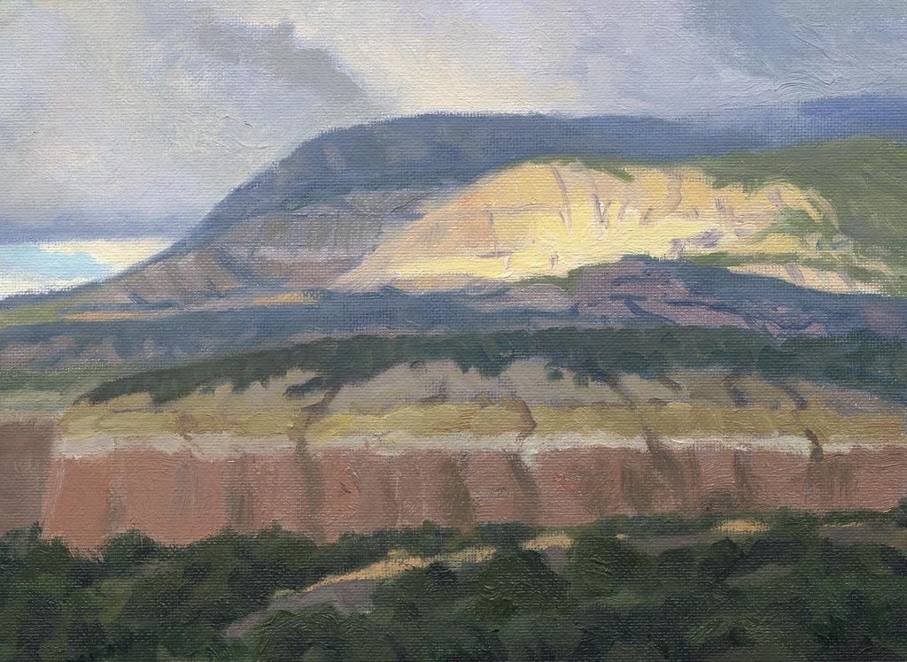
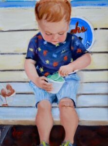
24″ x 18″ – Oil on Canvas
Enjoying the moment, immersing oneself fulling in the present, fully experiencing the now. Master pianists who revel in perfecting their scales. Athletes who enjoy losing themselves in the process of practice and drills. Let alone the joys of exceptional performance. The future is heavy, that past burdensome. Putting our mental time travel aside to enjoy making our art inevitable… seems a thing worth doing.
To misquote Scott Adams, always remember:
“The day you became a better artist”
Mr. Adams original quote is about writing, his thrust technical, ours philosophical. But makes a profound point for any creative. In merely swapping tenses, the statement draws our attention to the now. You want to be a better artist? Great. Start. Now. More flow? More creativity? Perfect. Start now. Tomorrows too late.