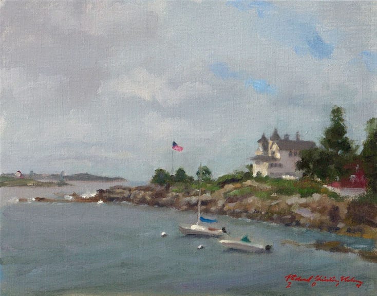
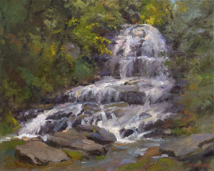
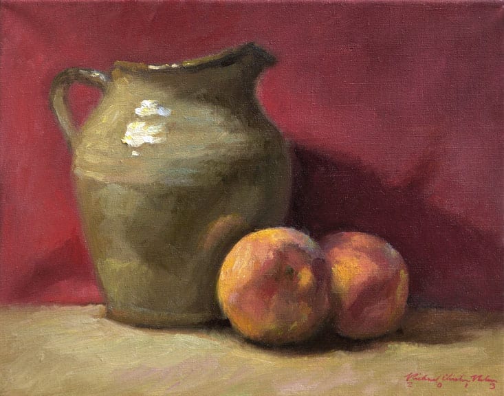
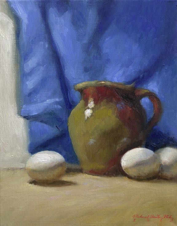
 Born in Guangzhou, China in 1952, Huihan Liu has become a master signature member of both the Oil Painters of America, and the American Impressionist Society and an artist signature member of California art Club. Huihan Liu was trained in the Guangzhou Academy of Fine Art in China in 1972 and has a MFA from the Academy of Art College of San Francisco in 1989. With more than twenty years in his professional career as an illustrator, teacher, and painter, he won Best of Show Award in the Oil Painters of American Regional Exhibition in 1996. Huihan Liu’s artwork has been featured in major artist publications over the years. He is the juror of the 24th National Juried Exhibition.
What do you believe the relationship is between ‘talent’ and becoming an artist?
I believe that artistic “talent” is the passion you have about something you love to do, no matter how frustrating it is. As children, we have a natural ability to draw before we can read. Interest is a driver of motivation, and with motivation, you will discover and use your “talent”. Otherwise, if you have “talent”, but if you have no motivation to develop that interest, then talent is meaningless. I never thought that I was talented, but I loved to draw and found it was fun as a child. When I was in high school in the late 60’s, I painted many propaganda paintings.
Was it difficult for you to pursue an art education in China?
It was very difficult because we had to go through a ‘family political background check’ during “Culture Revolution”, which was a time of social and political chaos in China. My father was a teacher and he had Christianity in his background. Both of these issues caused me trouble when I applied to art school. Luckily, I was accepted after a long and difficult process.
How did you get to study at the Academy of Art in San Fransisco and how did this lead to further opportunities?
In 1987, I was studying for my graduate degree at my art school Guangzhou Academy of Fine Art in China. To further my graduate studies, I applied to the Academy of Art University, moved to San Francisco and graduated in 1989 with a MFA. During the one year of the practical training program, I worked as a story board artist in an advertising agency in San Francisco. I had to move back to China after the one year training program according to the student visa. However, the agency wanted me to stay because their client liked my portfolio style for the storyboard presentation. It was very complicated to get a green card to stay permanently. The agency had to advertise my job in the newspaper for several days so that any US citizen could apply. More than sixty people were interviewed, but the company still chose me because they were sure that I would make a contribution to the company and country.
What were the challenges of moving to the United States to study art?
I was separated my family, my wife and son who remained in China more than a year while I studied in the US. I didn’t have any friends or family members in the US. My English was very limited. I was lucky that my wife and my son had applied for US visas and could come to stay with me during my second year of study. However, I had no problem when I finally went back to visit China was 1995.
How did you start to earn money with your art?
In China, before I left, I was not represented by art galleries. I was teaching art at the Academy which was a comfortable life. In the U.S., I began selling my paintings in 1994 through galleries and was teaching.
How should one develop their learning if they can’t do an MFA or an Atelier program?
It would be best to have an individual intensive study directly with a mentor who will work with the student in a specially designed program. Another option is taking workshops. It is best to take a workshop with the same teacher two times a year or once a year for about four years where the workshop is limited 10-15 students. This method is the best way for both the mentor and student to maintain a commitment and consistency in working together. If the student is always shopping around for a different workshop every year, it would be difficult to see progress.
Should artists try a wide arrange of artistic style (realism/impressionism) and different mediums to develop their style/likes/dislikes?
Yes. I did this as well throughout my career.
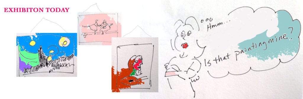
Regarding judging OPA’s 24th National Juried Exhibition, what is your procedure for judging the hundreds of paintings?
To be a judge for the awards is a challenge and difficult, like judging a sport. While there may be technical factors to evaluate, the final decision often comes down to a matter of personal opinion and taste.
To me, excellent artwork should catch my eye and make me say, “Wow!” at first glance from a distance, without hesitation or thought. If a work stops me in my tracks, I will gradually take the chance to study the painting more carefully. Generally, the extraordinary representational painting should be well-engaged, with a unique idea paired with excellent craftsmanship. It should also possess strong fundamental elements such as overall composition and color pallet, and also draw from, but not be limited by, an original interpretation by the artist.
What is your advice to those that have submitted paintings for exhibitions and haven’t been accepted?
It is normal to have paintings that haven’t been accepted and it happens to me. My advice is to re-evaluate the painting if it needs be improved. If not, go on the next one, don’t be discouraged.
What a typical day/week looks like in your artist life?
I am a scheduled person. I mark everything on a calendar. On average, I paint around 35 hours per week. I paint 6-8 hours a day, four days a week at home. On a major project, I will work longer. Generally, I will paint for several hours then I need to take a break. I really like to go for a walk or exercise when I take breaks. Sometimes I will stop on a painting, and chose to paint something different like a still-life. I love to paint “Plein Air”. When I return to the studio I will have a fresh eye for my work.
It is important to me to stay well balanced. Exercise is like meditation, and it is really healthy. Painting is like meditation, however, only until the point when you lose judgement because you have been working too long at one time. This gets frustrating and then you know you need to take a break, and go painting outdoors! Most importantly, hard work doesn’t equal good work. There is a right time and the right moment. Balance is everything.
Teaching is a very important part of my life and I take it very seriously. In my workshops, in addition to explaining and demonstrating the fundamentals of how I approach my painting technique, I really feel it is important that I teach students how to evaluate and judge their own paintings. You as an artist need to know how to view your paintings and see what is right and what is a problem when a teacher is not around to help. In addition, I have changed my workshop to include composition. I ask the students to bring three photo references for their future paintings ideas, and then we walk through them, learning what works and what would make the best composition. With this in hand, my students are one step closer to creating great paintings.
Oil Painting
Career Building Advice for Any Level
First of all I would like to start out by making it very clear, there is absolutely nothing wrong with being an artist who chooses NOT to turn making art into a “career.” It in no way makes them less of an artist; it only means they are not going to rely on their art to live. If you are one of those artists and you make art solely for the joy, congratulations!
Beginning-Mid-Level Career Artists
-
Entering exhibitions and competitions:
For the rest of us, building a career is, at the very least, time-consuming. It can also be super degrading and, at times, expensive. Someone told me once to expect a good resumé item to come in at no less than a grand. That was many years ago. I suspect by now, it costs much more than that. By this I mean the expenses incurred with membership fees, entry fees, crating fees, shipping fees, travel to the event (if you are fortunate enough to be able to attend), return shipping fees if the painting or paintings do not sell, etc. can add up quickly. At this point, you are up to several thousand dollars, and this does not take into account the time, supplies, framing, oh, and lest we forget, painting the award-winning painting!
 Okay. So many of you already know this part. But for anyone just entering the world of competitions, it may be tough news. Yet, entering competitions is one way to begin to build a good resumé and career. Quite frankly, it is also one of the least expensive ways to start. [Note: yes, you will be rejected from time to time and want to give up. Don’t. I say this with all honesty and humility. Pouting, making accusations, and posting your failure all over social media will get you nowhere. Try again. It is true that the very piece that did NOT get into one event, may win the top prize in another. You must learn to leave your ego out of this and continue to seek these opportunities.]
-
Networking:
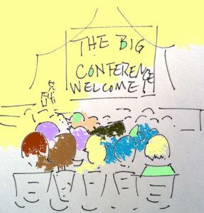
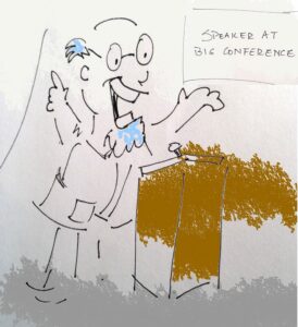
Another way to help your career along, is to attend conventions and events that are meaningful to you. For example, you have already taken the step to belong to OPA. If you can take one trip this year, why not try to go the conference? I remember my first one. My $1200 painting was hanging next to David Leffel’s $100,000 painting. I could have tucked my tail and retreated; instead I felt a sense of “WOW. Here I am! Next to these amazing painters.” Research conferences, conventions, and other networking opportunities and set a goal to make it happen.
 Sometimes even more difficult than going to an event, is to leave your ego or shyness at home. As artists, many of us are introverts. I am no exception. This can manifest itself in one of two ways: arrogance or timidity. Fight both. A few public speaking, improv, or acting classes, professional coaching, or counsel, followed by rehearsing and preparing what you might say and can get you through a lot. You will not die. You will make connections and friends that will have an effect on your career for years to come. I met Quang Ho at my first OPA conference. He, in turn, has mentored me and become one of my dearest friends. We are now working together on projects. Whether you mean to or not, the people with whom you connect can help build your career. This is in no way using their goodness. It is just a product of it. Chances are you will in turn help their careers as well.

Mid-Level-Upper-Level Career Artists
First of all, you should STILL be doing those things listed above. Now, you will add…
-
Marketing and Advertising:
Go ahead and say it with me… marketing. See, it isn’t an ugly word at all. Some people cringe when they hear it, but the truth is that you produce a product. It is one that is near and dear to your soul, but it is still a product to the mere mortals (buyers) of the world, and it has to be marketed. No one is going to accidentally stumble onto your front porch looking for a great piece of art.
 Marketing can mean a lot of things. For instance, if you are putting your work on facebook, twitter, pinterest, blog, or any other social media, you are marketing. You are just choosing the free route which doesn’t seem quite as icky somehow. The question is, are you making those efforts on a whim or do you have a plan? Look into the insights of what works and what does not, which types of posts are getting the best response, and what subjects your followers most want to hear about. Follow the advice of experts to make “free” marketing work for you.
There will come a time, mid-level career, that you may find it a good idea to up your game with some paid marketing. You need to know that you are ready for such a leap. One of the best ways to determine that, is to answer these simple questions:- Do I paint regularly and produce a steady stream of work?
- Is my work consistent in style? (We will keep growing, but your work should look like YOURS, not your instructor’s
- Can I commit to at least a year of paid advertising?
Paid advertising can be in the form of print ads or banner ads in publications, direct mail, or whatever. The hard truth is that it will cost some money to do these things. This is money you don’t have, after all, because you are an artist building a career. But like a lot of things, consistency will prove that it will pay for itself over time.
 When I began print advertising in a meaningful way (by that I mean, not just once here or there to get editorial coverage), I was absolutely in no position financially to do it. You’re thinking, yeah, but you weren’t as broke as I am. Yes. I was. The point is, I did it anyway and lived on faith and water for a very long time. Only you know your responsibilities and can make this decision. After about 8 months of consistently advertising, I noticed things changing. collectors, gallery owners, event organizers, and other artists, do not always distinguish between paid ads and editorial content. This is great news! As your ads show up every month, the lines become more and more blurred. All people really remember, is that your name is in the magazines “all the time.” Name recognition builds clout. Clout builds career.
You-Think-You’ve-Made-It Level Artists
-
All of the above and then some:
Sorry to tell you this, but the stakes are even higher for you now. There are still important exhibitions in which you will want your work. They may be on the museum-level and/or high-end-private-collector-level. It is also a fair idea to be a leader by continuing to exhibit as Masters of those core groups and organizations that helped “make” your career in the first place.
 This seems more important than ever. While the demands are greater on you, so is your responsibility. Look to the artists who still do this. They are revered. The others who allowed ego to make decisions for them are getting lost in the pile. If you are at the top of the heap, congratulations. You are now one of the artists whose name may show up in the history books. For you, public appearances, lectures, community involvement, and mentoring will solidify this, and you may well be remembered for many generations to come. You will leave a legacy behind and your children and grandchildren will reap many benefits!
As for conventions, mailings, and advertising, you should still do those. (Remember, someone else is eager to take your place if you do not.) They are just directed differently now. Now you are doing this because it keeps your name fresh among the newer converts to this business, the go-getter types who are making the calls, getting the high-dollar collectors who are talking about your sales. The museum directors, the top 1% of collectors who want to visit your private studio, and buy your books that are now worth several hundred dollars, are watching and guess what, they get magazine subscriptions too. They watch TedTalks and CBS Sunday Morning. Your name has to stay on the tip of their tongues. Now that you can offer only a few pieces on the market each year and have some guaranteed collectors ready to buy, your calling is a higher one. Use it for good. - A Few Other Quick tips:
- Snail mail – Send handwritten notes to would-be workshop attendees and art buyers. People love a personal touch.
- Become an expert – on a topic at which you are passionate. People will come to you for lectures and answers.
- Get your art seen – If you are at “museum exhibition” level, great. If you are not but you paint lovely dog portraits, ask your veterinarian if you can hang your work there. Put ego aside and just do it. It’s a start.
- Start a blog (or wipe the dust off of that old one you started) – Don’t make it all about You, You, You. Be giving and sharing of your information.
- Support your friends – Going to art openings for your friends is a great way to learn how things work, meet others in the business, and maybe even find a great gallery. Just remember, it is THEIR night. Do not approach a gallery owner during someone else’s moment to shine.
- Email – Begin an email campaign. Start your list of people with a few or hundreds, but start it. (By the way, NEVER add anyone to your list without permission.) Then, email people on the list in a very personabe way. Sure, send them announcements about all of your great trips and accomplishments, but also send them stories and helpful tips and links (like one to that last blog post you finally got around to doing).
- Social media – Free. Use it. Don’t abuse it. You do not want to shove your news down everyone’s throat, but remember that most things must be posted more than once, in different groups, and at different times of the day. If you feel you are already doing too much of this, enlist someone else to “brag” on your behalf and tag you.
- Volunteer for an Organization – So much good can come from being part of an art organization. By default, your name is in front of people all of the time. There are many great artists in positions in organizations but there are also many who are, perhaps, not as great yet. If your name is in a publication as a leader in an organization, the assumption is that you are a professional, good at what you do, and everyone should know and respect you.
-
Set goals – and I should add, WRITE THEM DOWN. Goals keep you on track. These should certainly be artistic goals, but you should also write career goals. Make them just beyond what you think you can actually reach in a specific period of time. On April Fool’s Day in 2005, I became a full-time painter. I gave myself many goals. One of them was for where I wanted to be in 10 years. Happy anniversary to me! But I didn’t stop making goals all along the way. Things change; your goals change. Write them all down. Make them happen. If you don’t realize a goal in the specified time frame, reevaluate what you did or what you might have done differently or even if the goal was totally unattainable in the first place. Example: Paint en plein air on the Mars.
More realistic goal: meet a real astronaut who, by the way, happens to also be an artist. (Seriously, look up Alan Bean. Send him a note and tell him I asked you to. He will get a kick out of it).

So what are you waiting for? No matter where you are in building your career, I have given you something to do. Go do it!
Getting the Vision
In many ways, making a good painting is like walking a tightrope. The particular tightrope I’m thinking of is the one with the Abyss of Unbridled Creativity on one side and the Chasm of Static Rendering on the other.
If we ignore the gravity of technical accuracy, we risk plummeting into “There-are-no-rules-so-I-can-do-whatever-my-whims-tell-me Mode.” On the other hand, if we traverse the tightrope chanting “Paint what you see; paint what you see,” we can topple into “Gotta-get-this-right Mode” and produce cold, slavish, technical renderings.
I’ve lost my balance on both sides of this tightrope many, many times. However, I’m more prone to tumbling into the Chasm of Static Rendering, and I’d like to address this danger.
Accuracy and Vision Should Work Together
I used to think if I could “paint what I see” with 100% accuracy, I would automatically produce masterpieces. Today, I realize a good painting requires more. Don’t get me wrong, I’m not suggesting we abandon technical accuracy in the fundamentals (drawing/shape, value, edge, temperature, color). These compose the foundation upon which good representational art is built. But once we’ve laid a solid foundation, it’s time to construct the walls and roof. Truthful observation of our subject should be our primary blueprint. Yet, I propose we use this blueprint in harmony with a secondary blueprint–one I call “getting the vision.”
No, I’m not talking about anything mystical. I’m just speaking of having a clear mental image of how we want each picture to look, both before we start and as we work.
The Scope of Our Vision
Within the realm of representational art, it is vital that our vision does not take us outside the boundaries of what is visually understandable. And the only way to learn where these boundaries lie is through persistent, observant painting from life. However, that’s a different topic, and one I feel has been well-covered. Let’s focus instead on the scope of our vision, which can be broad. Our vision may affect every area of painting, including composition, choice of subject matter, technique, and even the fundamentals I listed above. That’s right, even the foundation of drawing may be manipulated slightly if doing so will serve the picture well. For example, a simple gestural line can be more expressive than an unnecessarily complex line in the subject. Asking “How can I make the best picture?” can help temper and direct our vision.
Example 1
I’d like to share two paintings that my vision affected. Please understand, I’m not encouraging anyone to paint in my “style.” I only hope you’ll ask for yourself “How do I want my painting to look?”
First is a piece that began as a few bad photos (one is below) and an even worse plein air (I’m too embarrassed to even show it). Still, I had a vision for the piece that I liked enough to attempt a small studio painting.
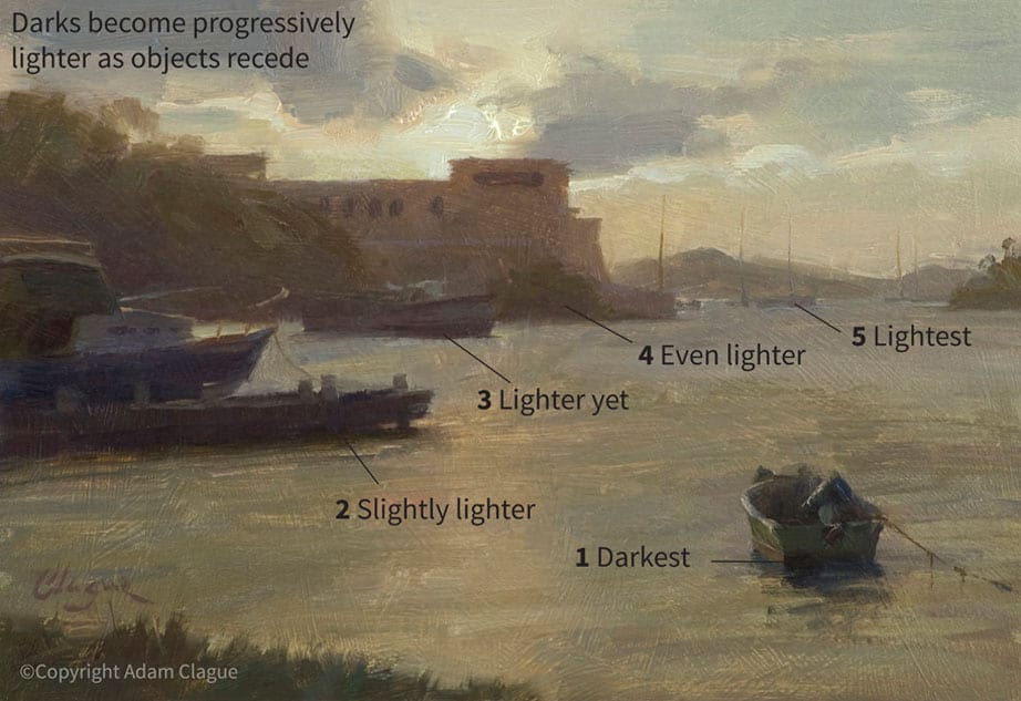
The darks in the photo below are mostly the same value, making the image look flat. To create depth, I painted the darks progressively lighter as objects receded (see painting below). My idea was based on the effect of aerial perspective—atmosphere that causes nearer shadows to appear darker and more distant shadows to appear lighter.
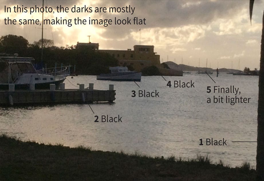
I also wanted to make the photo’s monochromatic color more realistic. I did borrow a few color notes from my plein air, but mostly, I made up the colors (I can hear you gasping now). Still, my color changes were based on effects I had previously observed from life. I have noticed that, when one is looking into the sun (as in this scene), there can be a glare that causes darks to appear reddish. Accordingly, I decided to replace the photo’s colorless darks with more reddish hues.
Example 2
I hope my next example will help those wondering how to paint more loosely. Classical painters, please don’t stop reading. Although I like impressionism, this article isn’t about tight versus loose painting. It’s about envisioning our pictures versus copying slavishly—I believe that applies to us all.
Loosening up starts with having a vision. How do you WANT your brush strokes to look? Look at just one small part of your subject. If you could paint that part any way you wanted, what would it look like? Get a clear picture of how you want that area to be painted, even if you can only visualize one stroke at a time. Now, pick up your brush and give it a shot. Determine to match your mental image, even if it takes several tries. Once you lay down a stroke, don’t keep blending it, or you’ll “kill” it. Rather, if the stroke needs to be adjusted, do so with a completely new stroke. Stand back ten feet. Does the area read well? If so, don’t touch it! The bravura strokes in some impressionist works might suggest the paintings were done entirely on some whimsical auto-pilot. On the contrary, loose painting is about vision and careful intent.
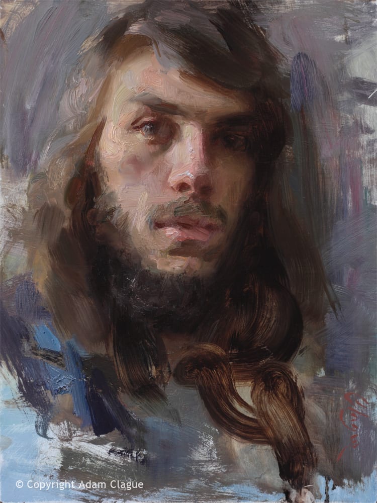
Compare the stages of the painting below. My vision was general at first and then grew gradually more specific. First, I envisioned only the basic planes of the model’s head and blocked them in (1). Next, I built upon this foundation by visualizing and painting progressively more specific shapes (2).
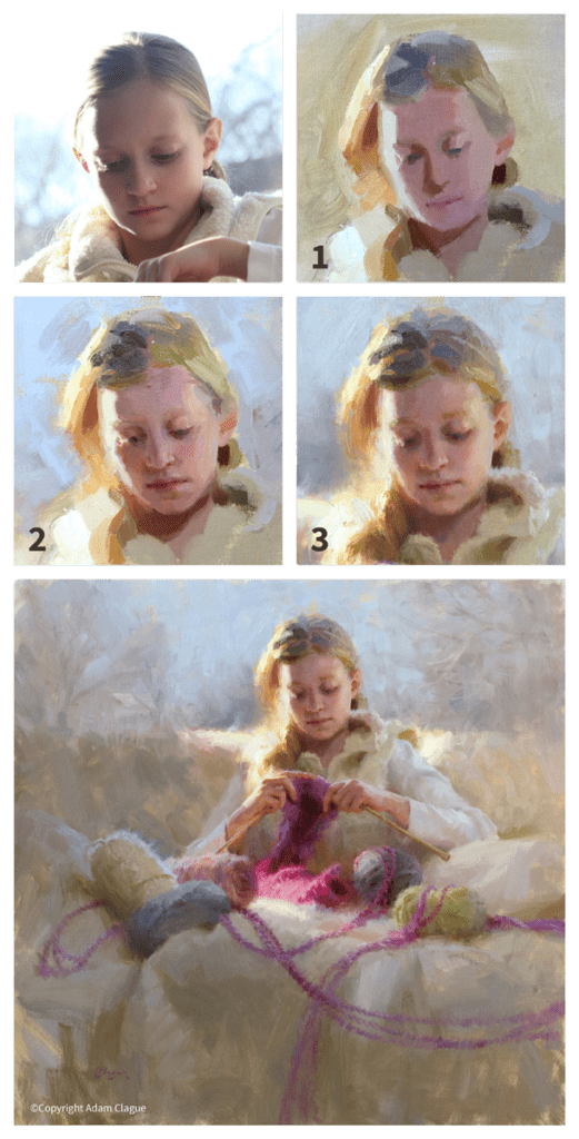
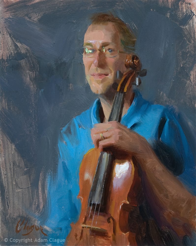
In the final stage (3), many of my initial shapes have been softened, but I left a few visible strokes on top for aesthetic purposes. I enjoy doing this. These strokes are usually stylized versions of the shapes in my subject, almost like little graphic designs. You can also see this tendency of mine in “Violist,” below.
Keep Your Balance
Making it across the tightrope requires a balancing pole. One end of the pole is weighted with technical accuracy and the other end with creative vision.
Don’t look down! It is scary for me to leave my comfort zone of “Gotta-get-this-right Mode” and allow my vision to inform my work. Likewise, it’s scary to admit I’ve made a technical inaccuracy. But we must do both to create our best work. To maintain our balance, we must keep our eyes fixed straight ahead (and for me, upward as well). As we take one step at a time, our paintings will begin to look more and more like how we first envisioned them.
My paintings don’t look exactly how I’d like yet, but I’m determining to press forward. I hope you’ll be encouraged to join me in walking this tightrope. I believe our best work is waiting for us on the other side.
Bittersweet
You know, life is just that way. I guess the title for this post could be many common expressions: the glass is half full, two sides to the coin, etc. Trite but true. It’s about perspective. Choices. Focus. Discipline.
As artists, we need to learn more than the multifaceted, infinite aspects of creating our craft. That’s the sweet side of the coin: pure passionate sweetness in pouring our hearts out to develop this gift of talent. We also need to learn the art of juggling the demands of the business aspect. That’s what I’ll call the bitter side.
Planning, purchasing supplies, workshops, conferences, open studios, commissions, DEADLINES, websites, competitions, shows, DEADLINES, galleries, Facebook, Twitter, Instagram, framing, crating, shipping, DEADLINES, newsletters (I don’t even have one yet), recordkeeping, studio maintenance…the list is never ending.
These two sides of the coin, the sweet side of creating and the bitter side of the business aspect must co-exist. The sweet artistic creativity can be strangled by endless to-dos, and without the bitter business side of things, few could truly self-sustain as artists. What I’m hoping to learn is the balance between the two–how to manage the tension each exerts on the other. I’m writing about this not because I’ve mastered it, but because I struggle with it. The thoughts in this post are personal, from my singular point of view. It may be that many of you enjoy the business side. (Seriously?!).
I find the clutter of life can be overwhelming, draining and distracting from the passionate pursuit of excellent art. When the to-do list is huge, and the time frame is tiny, stress mounts, abundance is crushed, and the result can be a toxic cocktail, poisoning our creativity and our wellbeing.
I’m finding three major components that serve to protect the sweet and deal with the bitter. Applying these three aspects can help pull us out of inactive frustration into satisfying productivity: choice, focus and discipline. These three separate actions are intertwined, mutually drawing from and strengthening the other.
From our first conscious thought in the morning we’re faced with countless choices. I usually like to head to the easel (the sweet part) early in the day when my mind is most fresh. It’s a choice to focus fully on the task at hand rather than to allow the to-do list to invade my thoughts, making them fragmented and unclear. Disciplining our thoughts is one difficult choice that keeps the mind and heart free and clear for a fire of inspiration. There is solid joy in the process, unhindered and untainted by a myriad of distracting emotions. Distraction is an enemy of success.
I’m usually fretting over the state of my painting and thinking I should just give up and make cookies instead. Fatigue and stress are the culprits that erode peace and confidence. Discouragement knocks on the door of my mind. Far too often, I don’t make the hard choice to do the right thing and instead open the door wide, inviting discouragement to join me in the downward spiral that empties me out.
It’s a proactive choice to ignore the negative stuff and instead choose to discipline my thoughts toward relentless focus. It seems that even small successes with proper focus breed more success…it’s like strengthening the muscles of our minds. Choosing discipline builds strength of focus which builds powerful momentum to stay on track with our goals and desires, both the (bitter) business side and the (sweet) creative side.
“To pay attention – this is our endless and proper work.” Mary Oliver
Personally, I feel so blessed by God with this extravagant gift of passion for art and life. I’m not responsible for having the gift any more than I’m responsible for having brown eyes. But with the gift, comes the responsibility to steward it well. My goal is to strive to balance the bitter and sweet and do my best to develop the gift in honor of the Giver.
The Best Therapy

And sadly there is often less than optimal news at many of these junctures. Gallery sales and portrait commissions may not be great despite incentives and diligent marketing. This or that sale or commission are on “hold”, the six charcoal portrait sittings you thought you were doing on your trip are now three, the painting that went out on approval has made its way back to the gallery, the workshop is not filling up… sometimes things are not looking as good as we may wish.
Well, I’m here to tell you the best therapy (in my humble opinion). Last week I drew the figure for three hours at our local arts organization’s weekly session. Geez, that felt good. Then I had three full days to work on a new portrait. Somehow those days at the easel have released some needed substance into my brain. I have new resolve that this is what I do, what I am meant to do, what I have been doing for many years, and will be doing until, well… you know. Getting in touch with that inner core, which has been sparking since the start, is a powerful way to get past those nagging fears and doubts that can take the wind out of our sails.
Not to get all Pollyanna-ish on you. The world is still here, and it can be tough. But we too are resilient creatures. The marketing and travel and such are critical elements of our careers. They are ‘work’ and we can’t beat ourselves up for giving them the time they require. But be sure to make time for what’s most important. By spending time doing what we were put on Earth to do, we are administering some of the best therapy there is.