So many great artists, so many great places to see them, just not possible? Bring them to you!
If you’re like me, and most artists I know, you dream of going away to a workshop to immerse yourself for a week (or more) coming back full of knowledge and new approaches and having taken giant steps forward in your work learning from the masters. But let’s face it, we can’t all do that. Your resources may not allow for the expense of workshop plus travel and lodging, you may not be able to take the time away from family and/or work, or you may be holding back because you aren’t at the ‘right level’ yet.
There is a solution, a way to ease in, invite the artist to your home art league or organization. If you are not already in one, join one!
There are many advantages to bringing the masters to you. Here’s the who, what, wheres, hows and why from convenience to affordability to the truest value of it all.

Where to have it is the next thing to consider. Our league had a retail space for a gallery with a back room big enough for classes and workshops. The convenience of your own space is that you can set up ahead of time and leave supplies and work out over night all week long. You can run successful workshops at community centers, libraries, church trailers, and even hotel meeting rooms (we’ve done three of the four.) If you do have to pack up and take everything out with you every day have a few extra facilitators to help with set up every morning. It will be very hard for artists in the workshop to do the set up and take down every day and still get everything out of the workshop that they desire. Our league is made up of volunteer members so we can divide the work up under the guidance of a workshop director. Cost of space is part of your workshop fee of course. If you have the means, use them. If you don’t, be creative! In our town there are grocery stores with community areas built for local organizations to use. To keep cost down check these things out. Figure out rental fees or percentages of workshop costs to make it profitable as well.
Another where is the place your guest artist will stay. Being in a league/organization helps. WAL has members willing to host visiting artists, both teachers and students, during workshops. This really keeps your workshop fee as low as possible, and helps those attending from just a few hours away from having to spend on lodging. Do make this one of the first questions you ask a potential visiting artist. If they are willing to stay with a member that is wonderful, let the member also serve as their chauffeur for the workshop. If they are not willing to stay with a member, wonderful too–they are still coming! But you will have to find a hotel and that along with their transportation to and from hotel will add significantly to your workshop fee. Nonprofit organizations like WAL do get discounted rates at hotels for workshop artists.

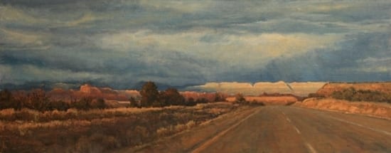
His first workshop for The Woodlands Art League was two weeks long. It was a great success. He has since returned in 2011 and 2014. We are planning his fourth workshop here for June 2015.
So that’s the priceless value of bringing a master artist to your group–building a relationship. As artists painting together, growing together, with guidance from a master artist, our abilities develop along with our friendships and our commitment. As Clayton says, “I see the progress as I return to a student and know the marks they are making on the canvas are done with greater understanding and ability. Very rewarding as a teacher to see such thing. I tell the students they are painting in the workshop to let me directly into their thoughts. It helps to know what a painter needs to hear so I have direction as a teacher.”

Proof–a few words from artists that attended his latest September workshop:
“I experienced a delayed absorption of information, because it wasn’t until weeks after the workshop that the words Clayton shared impacted my thinking and my approach to my artwork.”
Julie Graham
“What a lesson! After the demo already I felt I’d ‘leveled up’ as an artist! Clayton’s voice is still present as I work my own pieces and repeated in my elementary classroom as I share and remind my students of the importance of making every visible application intentional.”
Abby Salazar President, Woodlands Art League
“I hear Clayton’s words, “Is it in the light or in the dark?” I am reminded to put brushstrokes down only if I am sure that temperature and value are right. I think about area of emphasis and this new “awareness” makes me go back to reading and researching and putting it into practice every time I paint.”
Carolina Dalmas

Jill Behrens
“When I have an opportunity to study with one of these artists that WAL brings in, I jump at the chance. Not having to pay for my own room, board and transportation makes workshops exceptionally affordable. I’ve taken local workshops with Judy Carducci, Clayton J Beck III, and Rob Liberace. Each time I have studied with these great teachers, I’ve been able to adjust my own sensibilities and I’ve seen a maturing in my own work.”
Suzie Baker
The impact of the master artist can be felt throughout your home league and your community, not just those in the workshop. Ask your guest artist to participate in an evening reception open to all members and the public at large. By hosting an Artist Reception and Demo those not in the workshop still have the chance to meet the master and learn, still get a chance to build a relationship and grow. AND you spark interest for your upcoming workshops!

There ya go–it’s that easy to bring the master artist to you!
 Here’s how you prepare your canvas: It’s easier to work on a tabletop for this than using an easel. Tape the canvas to a board to allow yourself freedom to spin the chart around as you fill the squares. Measure out a quarter of an inch for the width of the tape, then an inch for each square, and repeat for every color. Make tic marks with your pencil, rather than lines, to indicate placement. Put the quarter-inch tape between the marks and leave a tag hanging off the end for you to pull when you’re done. Place all vertical tapes first, followed by all horizontal tapes. You will carefully remove the tape as soon as you are done with each chart (don’t wait till later!); it is easy to pull the horizontals off first, then the verticals. Now write the initials of the colors you will be charting. For example, the colors I use for the limited palette are Transparent Oxide Brown, Ultramarine Blue, Cadmium Red, and Cadmium Yellow Pale: TOB, U, CR, and CY. The Transparent Oxide Brown chart will have these headings on the columns: TOB, TOB/U, TOB/CR, and TOB/CY. Note that the size of your chart/canvas will be determined by the numbers of colors and values you want to explore. For the limited palette, I chose four colors and five value steps, so I will have four across and five down, plus some space between each chart. Measure it out accordingly.
 Here’s how you create your chart: Understand that this is an exercise for your eyes, mind, body, and soul. It will demand your full involvement in a most personal way as you begin a real dialog with your colors. Give yourself lots of latitude, grace, and hours.
 When you have your first and last colors laid in, you will mix the value that is right in the middle of those two. Mix it and hold it on your knife over the two color values on your chart and ask yourself which it favors more, the pure color or the lightest tint. This is when your colors really start talking to you. When you finally mix a color value that favors neither, you have your middle square. The last two colors are halfway between each of these: one is halfway between pure color and middle color value, the other is between middle color value and lightest possible value.
 It’s easy to see how your mind and eyes are challenged by the creation of color charts, as all the measuring is intellectual and visual. If you try to literally measure part-for-part, you will not have an accurate chart because every pigment has a different saturating power. So, your mind and eyes are about to get smarter. You will not find how it challenges your body until you start the process. You will then be amazed at how physically demanding this assignment is. This isn’t for sissies. And as for the soul… ultimately your choices, as objective as this process seems, will be determined by how you feel. It can’t be taught. You will only get it when you do it. This is why charts must be done and not just seen. It’s also why the color charts vary between different artists, and why Richard Schmid can say that he learns something new every time he makes a new set. He is still making new charts for himself! And since he’s been painting longer than a lot of us have been breathing, perhaps it really is a worthwhile thing to try.