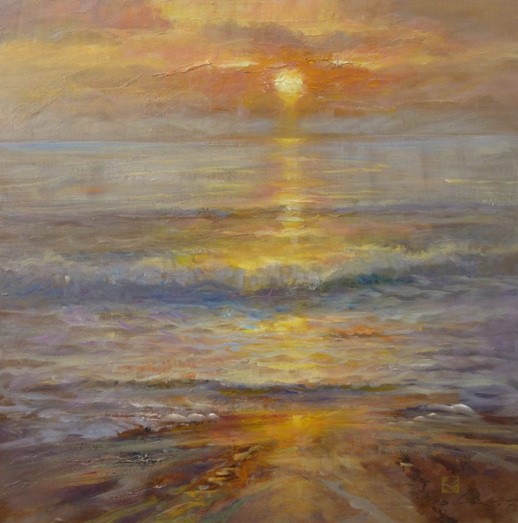
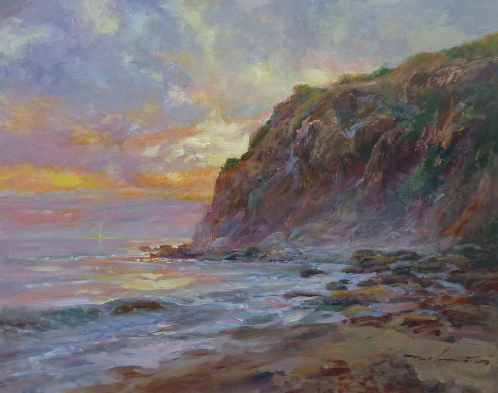
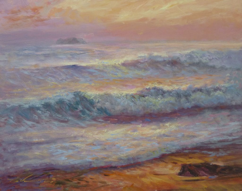
“There’s always one in the crowd”, as the saying goes…and Canadian artist David Gluck is the one.

When I received his responses to my interview questions, I found myself laughing out loud. I also realized that when you encounter a guy like this…it’s really important how you phrase the questions.
Is David Gluck a serious guy or a comedian? I guess that’s for you to decide. Even if he doesn’t take himself seriously, one thing is certain, that cannot be said when it comes to his work.

When I saw that his painting, The Trapper, won the very prestigious William Bouguereau Award in the recent Art Renewal Center International Salon, I was totally on board…a phenomenal painting indeed, and an award well deserved.
William Bouguereau (1825-1905) in his day was considered one of the world’s greatest painters. Many consider his paintings to be absolute perfection. But, as modernist thought replaced the academic, Bouguereau went the way of so many great artists…as did the training that helped produce them. Today, some of that solid training is being resurrected and we’re seeing the results. David Gluck’s work is one such example.

The Bouguereau award is given to a figurative piece that displays a strong sense of emotion and theme. Assessing whether The Trapper really met these stringent requirements, Gluck said, “The figure; clearly a man. The theme; manliness. Emotion; pfft, men don’t feel emotions. The only emotions I feel are rage and hunger, which usually go hand in hand.”
How did he feel about receiving the award, “I was actually extremely honored to have received this award. I have been a long time follower of the ARC and they have continued to support my career.”
Wondering what he thought of the great William B…”As far as William Bouguereau goes, I know everyone is a huge fan of the guy, but frolicking wussy peasant children never appealed to me. I will say, his technical proficiency is one to be admired.”
And now, more from Mr. Gluck.

How would you define your role as an artist? I fill up inconvenient blank spaces on a wall.
How does one find their individuality as an artist? It should come naturally. I found that living apart from most other artists and being primarily self-taught was helpful in finding my voice. Also, it helps to wear a hat.
Do you consider the process of painting more important than the result? Not at all, the result is what stands the test of time. Focus on the process is simply post-modernist thought.
What is the major thing you look for when selecting a subject? A fine balance between manliness and awesomeness.
How much of your work is intellectual vs. emotional…and how would you define the difference? I am not really a man with either quality, so I am unsure how to answer that.

What colors are most often found on your palette? My flesh tone palette is Yellow Ochre Pale, Vermillion, Ivory Black, Lead White, and Raw Umber. There is also a yellow stain that might be mustard, but I can’t be sure.
How do you decide on the dominating color key for a painting, and how do you maintain it? Using a limited palette makes it quite simple to harmonize your colors. I feel the color key is often picked in accordance to the mood I am trying to portray.
I love this one…
Do you paint in layers? I typically only wear layers when painting in a cold climate, but otherwise I wear gym shorts with no shirt while painting.
Does photography play a part in your work? Sometimes. I work from life whenever possible, photos when it simply isn’t an option.

How much preliminary work do you do before beginning the final work? I would say at least half of a piece is in the planning. I always do a series of studies starting with thumbnails and preliminary drawings for tone and composition. I end with color studies before beginning on the final canvas. I try to leave very little to chance.
What is your major consideration when composing a painting? Composition of course is key. I try to work this out in the very early stages.
How does your work reflect your personality? Not very well. Most people are surprised I am an artist.
What constitutes classical painting and drawing, and why the resurgence at this time? Got me. Maybe it has to do with global warming or something.
You have the ability to paint incredibly beautiful works while using objects that are pretty common and not necessarily considered beautiful. What is the thought process behind that? Pretty objects and things don’t always make for a beautiful painting. It’s like the old saying…”It doesn’t matter what you say it’s how you say it”.

What advice do you have for a young artist/painter? Make your models bring their own towel to sit on. Otherwise you are stuck with a towel you have no idea what to do with.
What advice would you give a first-time collector? Buy my stuff.
If you could spend the day with any three artists, past or present, who would they be? My wife, Rembrandt, and Bob Ross. Actually, scratch Rembrandt, he doesn’t even speak English.
If you were stranded on an island, which three books would you want with you? One would be a choose your own adventure book to keep life interesting, Cooking with Beer, and maybe one super thick book to use as a seat.
Who has had the greatest influence on your career, and why? Easy answer, my wife. She is my primary influence being a fellow realist and the main contributor in inspiring my work.

When you become discouraged and feel the well is dry, so to speak, what do you do? I call my good buddy Jack Daniels for moral support.
Why do you enter art competitions and how do you go about selecting paintings for them? I enter competitions to win sweet mullah. Apparently I enter the same painting in every competition.
Thanks David for participating in this interview and allowing me to share your fabulous, beautifully executed works. I’m sure we’ll be hearing more of you. I hope it’s good.
Oil Painting
Abstract vs. Realism
Hello, Painting Friends,
I’ve been getting questions regarding composition. I’m happy to be getting that question since composition is such an important consideration – it’s right up there at the top of the list! However, that spot at the top must be shared with the element of mood and excitement, the emotion & vision that is unique to each of us and that only YOU can bring to YOUR painting. The “Nuts and Bolts” of painting must be balanced with Individual Personality.
Regardless of whether you are a beginning or advanced painter, here is a practice of preliminary study that will advance your compositional skills AND infuse the element of emotional content into your paintings!
Abstract vs. REALISM
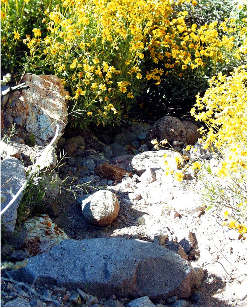 Here is my photo reference. The challenge is four-fold:
- Realistically represent the rocks, flowers, sun and shade.
- Convey feeling – the excitement of being surrounded by these glorious, golden flowers, the feel of the warm, spring sun and cool shade.
- Express the reality AND the illusory in my own personal painting style.
- Composition: maintain the first rule of composition & design which is asymmetry and create a value pattern.
To get loosened up, I painted this little abstract study – what an advantage it gave me!
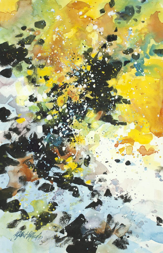
- I did not concern myself with portraying any parts of the picture realistically. I squinted my eyes and sloshed in the colors and dark value pattern, then splattered white gouache.
- Instinctively I set the bottom boulder at a slant rather than the horizontal direction in the photo, which improved the composition.
- The quick, intuitive paint application allowed me the freedom to explore without worry the explosive action of the flowers contrasted with cool, blue shade that wasn’t exactly like the photo but what I saw in my mind’s eye.
- While it prepared me for the “real” painting, it was fun!
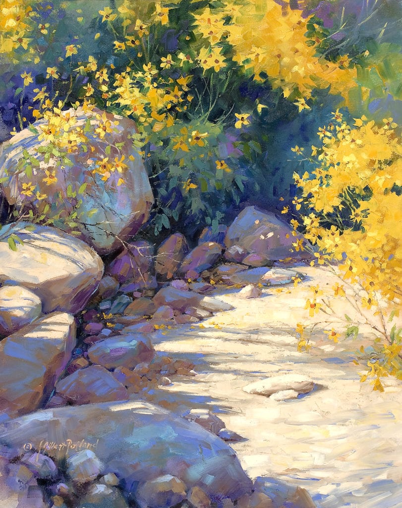
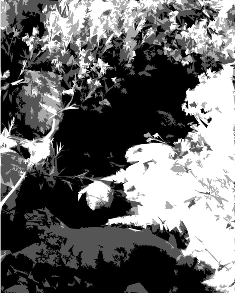
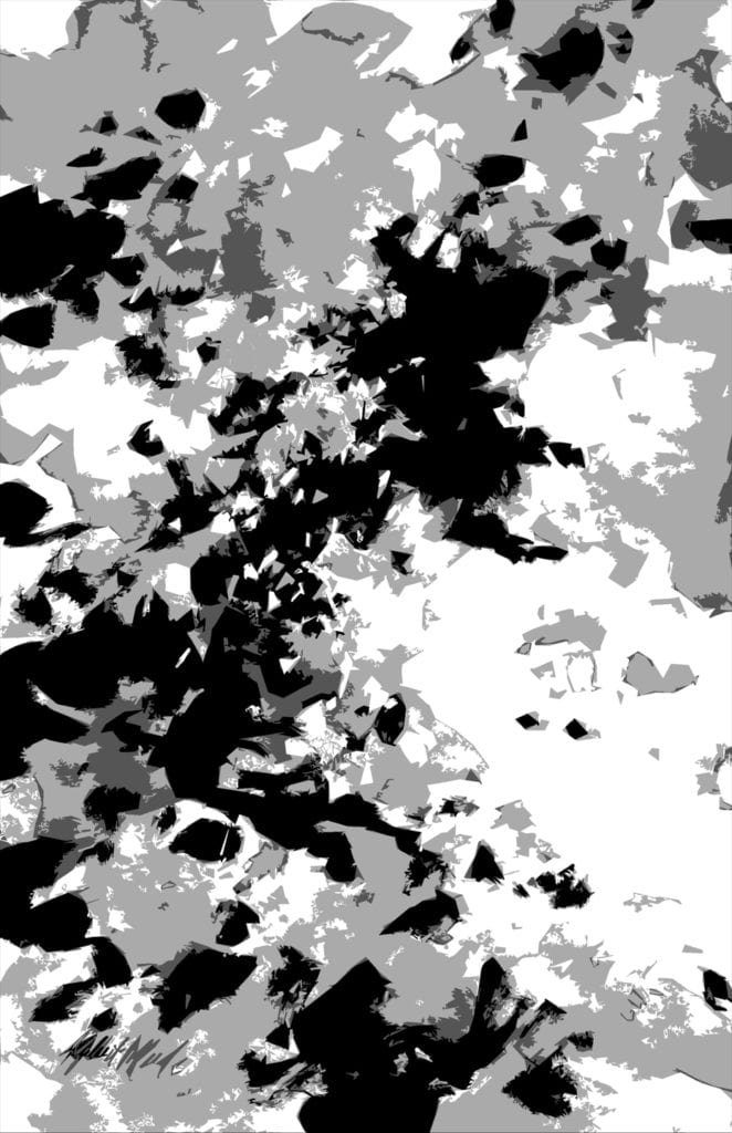
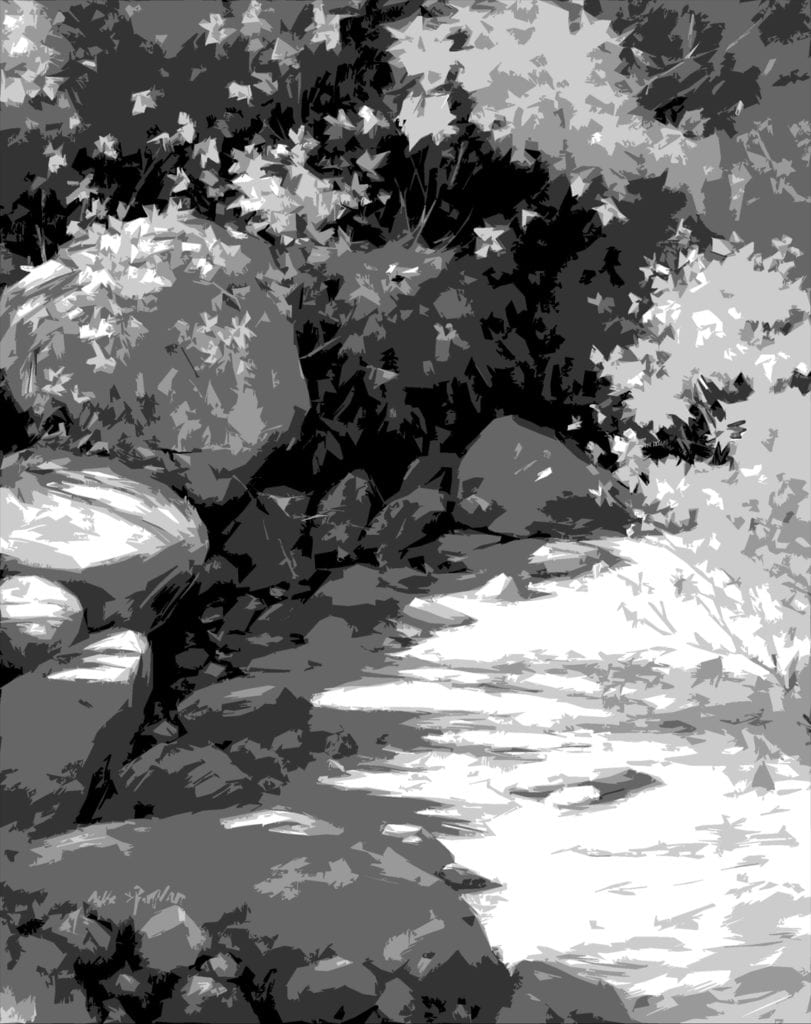
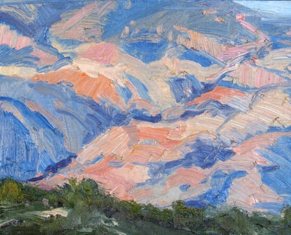
These three illustrations show the progression from photo-reference to abstract study to finished realistic painting. They have been “Photoshopped” so you don’t have to squint to see how the original value pattern has been carried through – but the darks also opened up to allow the viewer see into the shadows.
While I was using the abstract study to get in touch with the painting I had in mind on an emotional level, several extremely important Elements of Design were studied as well:
- value pattern – see how the darkest value creates a solid foundation for the basic composition
- asymmetry – asymmetrical design is achieved by placing shapes so that no shapes are centered nor equidistant
- movement – the linkage of shapes and values lead the eye through the painting
- repetition of similar shapes
- variation of shape and size within the assembly of repeated shapes
- color – color responsive to my emotional attachment to the location and memory of the day – and what I would call a “near-complement” color scheme
I consider this particular abstract study to be a finished painting in its own right. However, most of the studies of this nature I do are simply small sketch book studies. There are no rules except to relax and have fun with it. You simply must try it – it can make all the difference in the world!
Is There A Heaven For Paintings?
Importance of the Canvas
I always use a very high quality, pre-primed, heavy-duty linen canvas by a leading manufacturer. I also choose a very coarse linen. Why? When observed very closely, the surface of such canvas is a series of round bumps linear in both directions.
Once I have suggested the drawing, or perhaps more correctly the positioning of my masses, I like to color the canvas with a wash of chosen color. I never use pure turpentine, only because it denies any body in the pigment in places on the canvas where no other paint will cover this wash which, without the addition of oil, will not survive time.
At this point in the procedure, I have no white or opaque colors on my palette. The result is an effect as pure in color as a watercolor on white paper. Often the most gorgeous colors are dark and intense. Here I might bypass the wash and apply the pigment without medium. Then because I require a lift in the tone or lightness of an area, I use a knife to scrape off most of the paint. Now because the canvas has all its multiple mini-projectories, the paint will be left only in the recesses of the canvas. So, actually what happens is that the white of the canvas bumps is seen through the applied pigment. From very close, it appears spotty, but from afar, the eye reads a lighter value of a delightful dark pigment which has in no way lost its transparency or luminosity. Also because the paint is so recessed in the canvas texture, one can apply either a scumble or impasto without drying time.
At this point, I normally choose to scumble, also because being so thin and adhering to the canvas projectories only it will harden quickly. Until I really have my picture talking to me, I don’t choose to paint wet in wet.
What I’m describing is more for large canvasses in one’s studio. Plein air small works don’t belong to this category. Small plein air, one tends to go in fully loaded. There is too much wind and way too many bugs to do anything else.
Scumbling, a very light touch to the canvas with a large flat brush using undiluted paint, will offer numerous effects but never totally cover the wash or the scratched areas. Otherwise, why bother to put them in, in the first place. Every stage is part of the finished painting.
Now comes the impasto. For some reason or another, lumpy paintings have become the vogue. The idea of a lump on a canvas is that under angular lighting, a lump will catch the beam of light and visually leap off the canvas. Now this is great for highlights in high-toned colors. If the painting is ultimately varnished, your lumps will “shine” as well under spotlights. If you don’t want shine or glitter, don’t lump. Lumps in a dark area glisten and totally destroy the intensity of the dark. Recently, I saw a show where the whole painting was lumps. Wonderful for the manufacturer but a disaster to the painting – and the viewer!
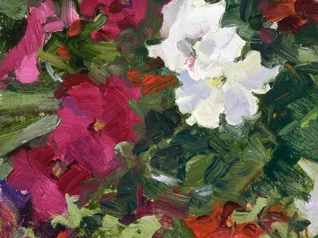
Painting florals is interesting. A knife is good, but it tends to lose the delicacy and femininity of a petal. As petals of a rose, for example, are so perfect a non-textural finish is needed. No shadows are required in a petal under the sun. A brush stroke will leave fiber striations, which cast minute shadows. A latex gloved finger will give you a petal beyond your expectations. But use a new finger for every application. Otherwise, you will have the most devastating mud pie!
There is no need at any stage of a painting to apply any pigment which will not be seen in the finished work. One can, of course, rub color over another color to create a secondary value – but let’s not get too complicated!
It’s Just Paint and Canvas
Lines, colors, shapes, usually on a flat rectangular surface: that’s how we most often define “a painting.” As an objet d’art it has perceived value, both inside and out of the marketplace. Often paintings contain little or no moving parts. Precious metals may be employed, but not usually — it’s simply canvas by-the-yard and pigment. The materials of which a painting is made today are not much different than they were thousands of years ago, when early man painted and engraved shapes of animals on cave walls, with crushed plants and vegetable matter for paint, and animal-fat crayons and fingertips for brushes. The technology of paint-making and the variety of painting surfaces have significantly improved since then, but paint is still made of pigments and the surface of a painting is still usually flat. Doesn’t sound that impressive, does it?
“The synthesis of truth and beauty…is the highest and deepest reality.”Ovid
“ We keep our eyes on the things we cannot see: for the things which we can see are temporal; the things that are unseen are eternal.”2 Corinthians 4:18
The artist is the catalyst in this process of Imagineering and revelation. It is through the artist’s eye that new possibilities can be discovered, and comprehended. In fact, former President John F. Kennedy underlined that creative significance: “I see little of more importance to the future of our country and of civilization than full recognition of the place of the artist. If art is to nourish the roots of our culture, society must set the artist free to follow his vision wherever it takes him.” The painter does what the director does for a film, or the composer for a symphony. He or she draws unrelated concepts together, instills pattern, variety and unity, and discloses the essence of an idea. If we look through the painter’s lens, we are treated to a new perspective on reality. The visionary artist is a conductor on the journey to an exotic destination. We begin to understand that here is something higher in that artwork, than just paint and canvas.
“An artist is not paid for his labor, but for his vision.”James Abbot McNeill Whistler
For a painting, it is the experience of the artist expressed therein that is of utmost value. The material nature of the work is quite secondary. A painting that conveys the power of emotion to the viewer is more than “just paint and canvas.” It is the description of a heartfelt concept that has been forged into tangible excellence through a creative process of envisioning and technical facility. It even has the power to change lives. “(Art) has the capacity to penetrate even the most callous skin and to ignite a revolution from within,” as musician Benjamin Moore so eloquently reminds us. Pursuing art with our whole hearts and minds is probably the most civilizing undertaking we can do as artists. “What a privilege it is to be able to take brush in hand and put paint on paper in this troubled world,” is our encouragement from artist Veronica Stensby.
A painting’s value is not in its material nature, as “just paint and canvas.” Rather, it is the vision an artist expresses with those materials that is of value: that slice of heaven, the best of the Best, that idea of the Ideal, that is the central core of both the material and spiritual worth of an artwork.