In a recent blog post a fellow artist labeled still life as a “lesser” genre of painting. While I know that historically this may be true, this judgement really rubbed me the wrong way! You see, I have spent the last 15 years painting mostly still life and loving it. To me, it is not “lesser”. On the contrary, I find it meaningful, expressive and instructional. Painting still life has contributed immensely to my growth as a painter.
About the time I finished my undergraduate studio work as a Fine Art major, family life intervened and my educational and career goals changed. I taught elementary school for sixteen years. I absolutely loved teaching young children. But my career, along with family life and raising three children, left me no time and even less energy to paint. I would not trade those years for anything, but when I retired early to paint again, I knew I would have to work hard to get the creative juices flowing and to advance my skills. I had some catching up to do!
I painted realistic watercolors from photo references for several years, which left me feeling enslaved by the photo. Like a robot, I repeated the same tight technique over and over with each subsequent photo. I love a beautiful watercolor, but for me it was like a chess game: think five steps ahead with every move. The reference photos and careful strategic approach left me wondering, “where is the joy and creativity in this?” I took a watercolor class that helped me loosen up a bit, but the real break came when I bought oil paints and started painting from life. My first oil painting (since college 30 years prior!) was as horrid as you might expect. But I did not care. Something new and exciting was happening, and I felt the possibilities were endless. I loved the smell and smoosh of oil paint. I felt free! If something was not working out, I could (enter angels singing) WIPE IT OFF!!! Hallelujah!
I painted small and often. Almost every day for a few years I wrote myself a daily schedule that included a 3-5 hour window for painting. I could complete a small 6×6 inch or 6×8 inch painting in that timeframe. I finished household tasks earlier so I could focus on painting. The only interruptions I allowed were calls from family. In 2010 I had the good fortune to take a workshop with Carol Marine. Let me just say: life changing! On the last day of the workshop, I drove home and by 2:00am had launched my blog. I had called myself a “Daily Painter”. Now I had better live up to it! I would paint and post a new painting nearly every day. But more important than posting a finished product, the daily practice quickly developed my skills.
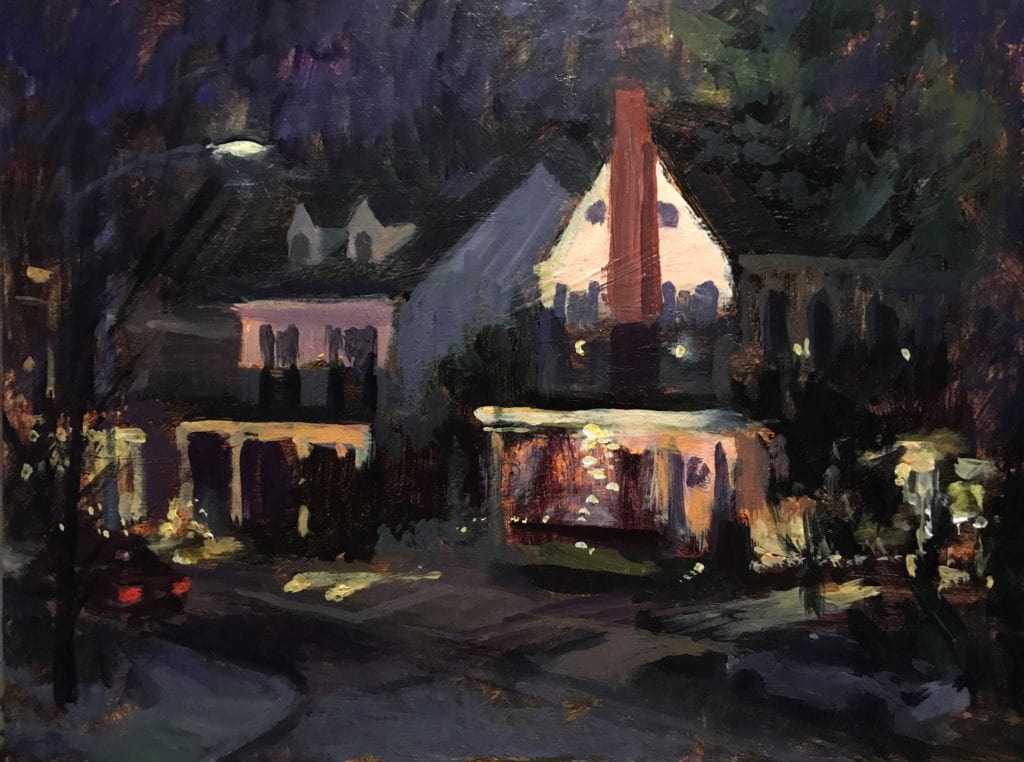
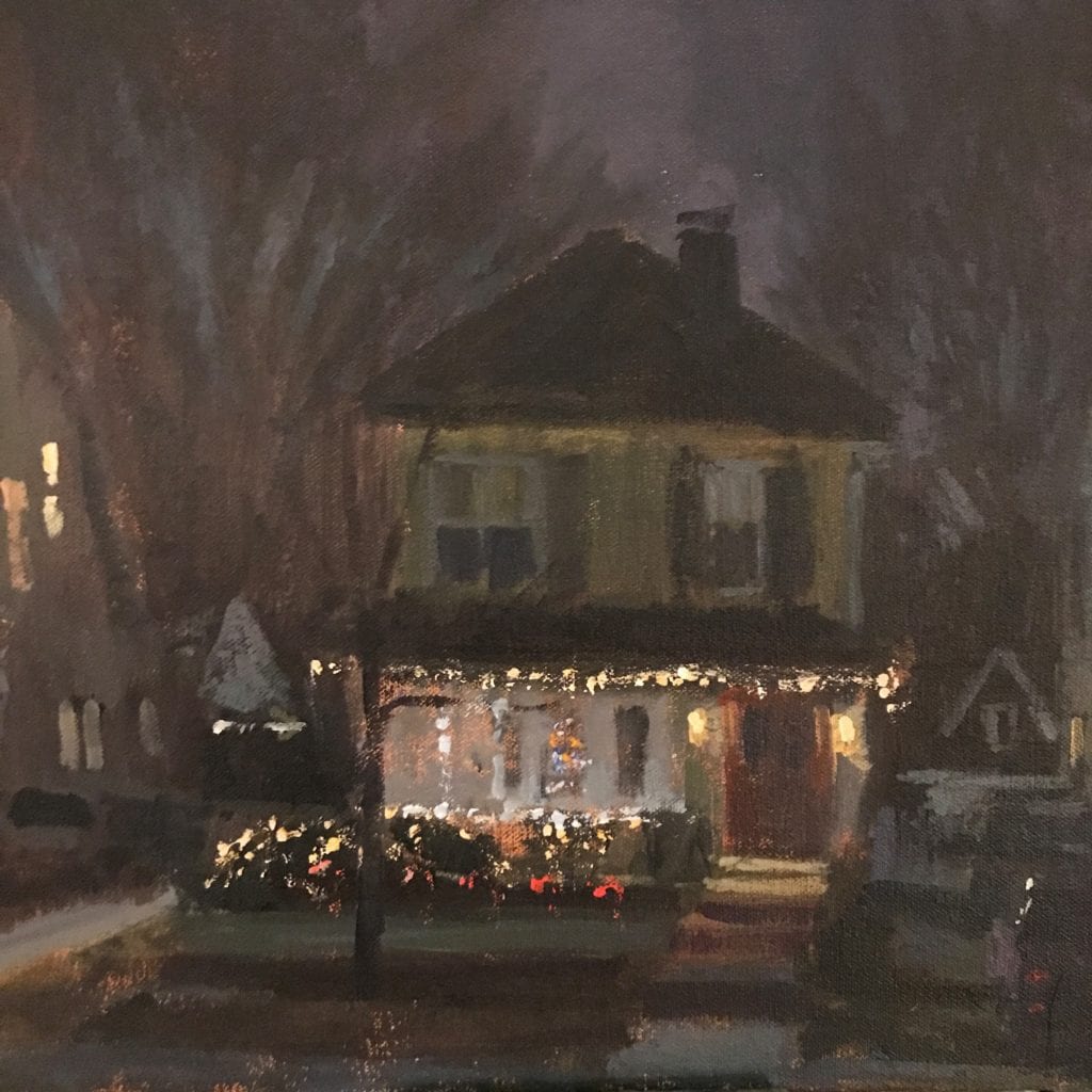
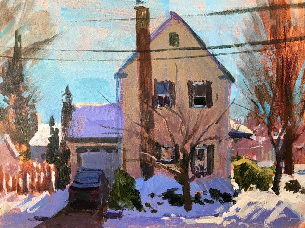
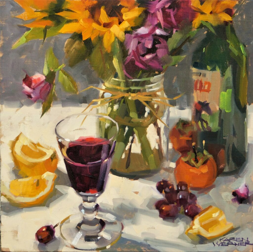
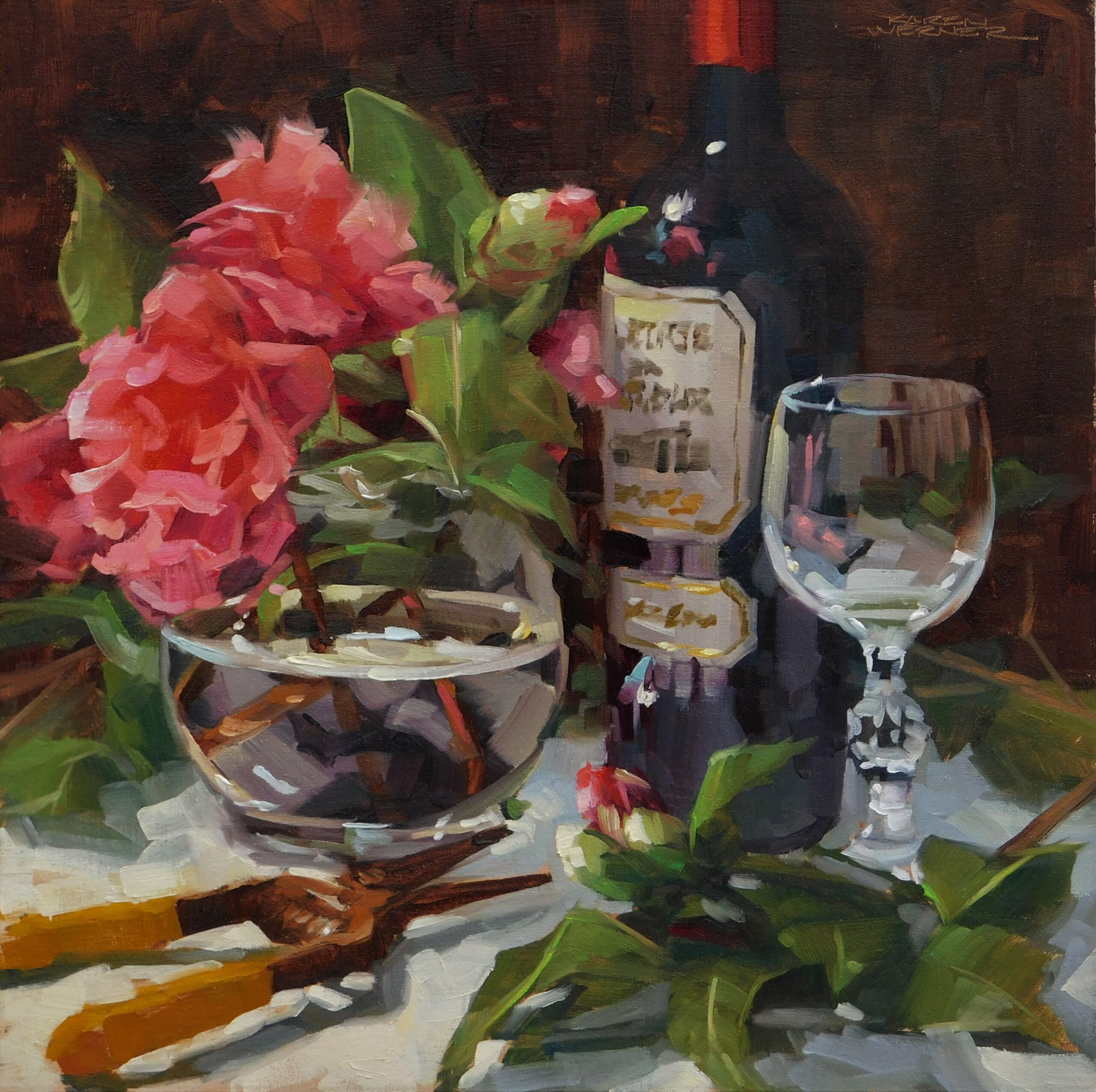
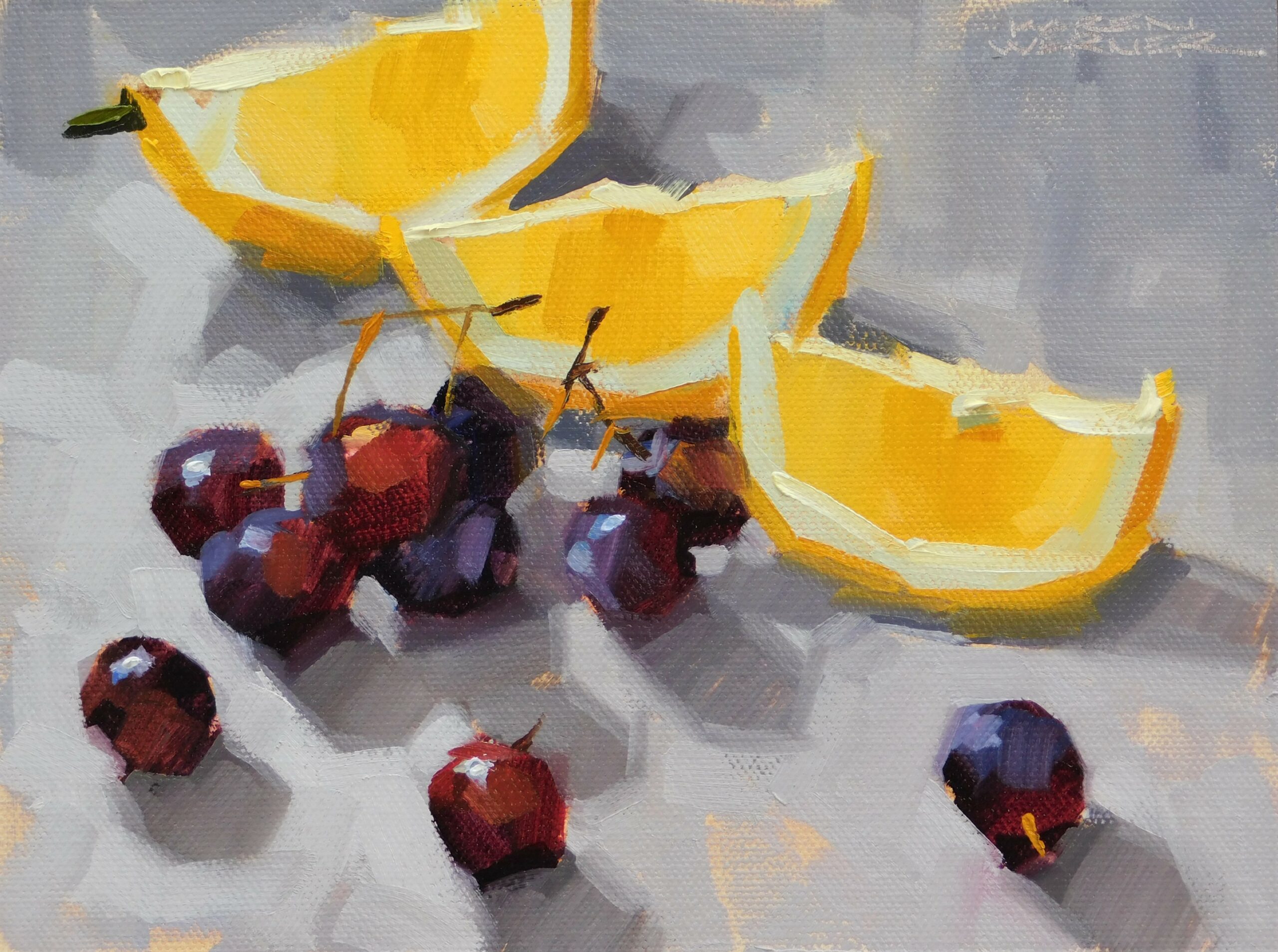
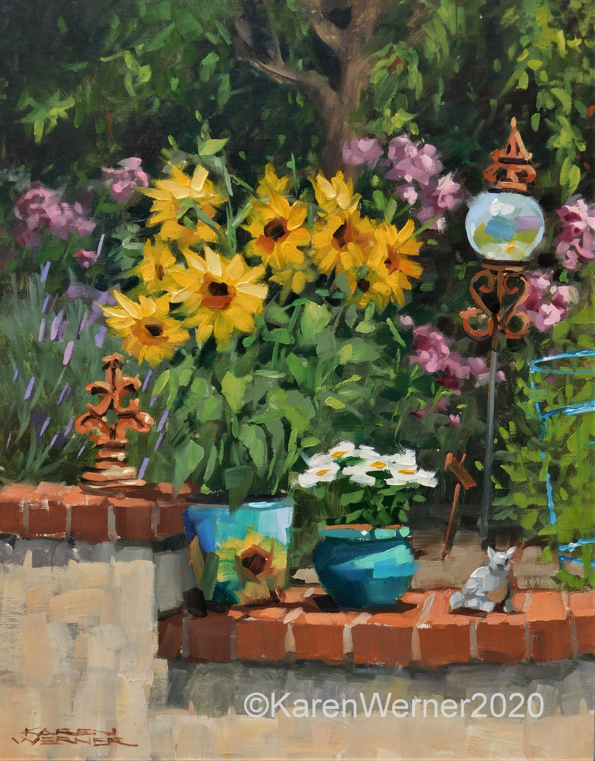
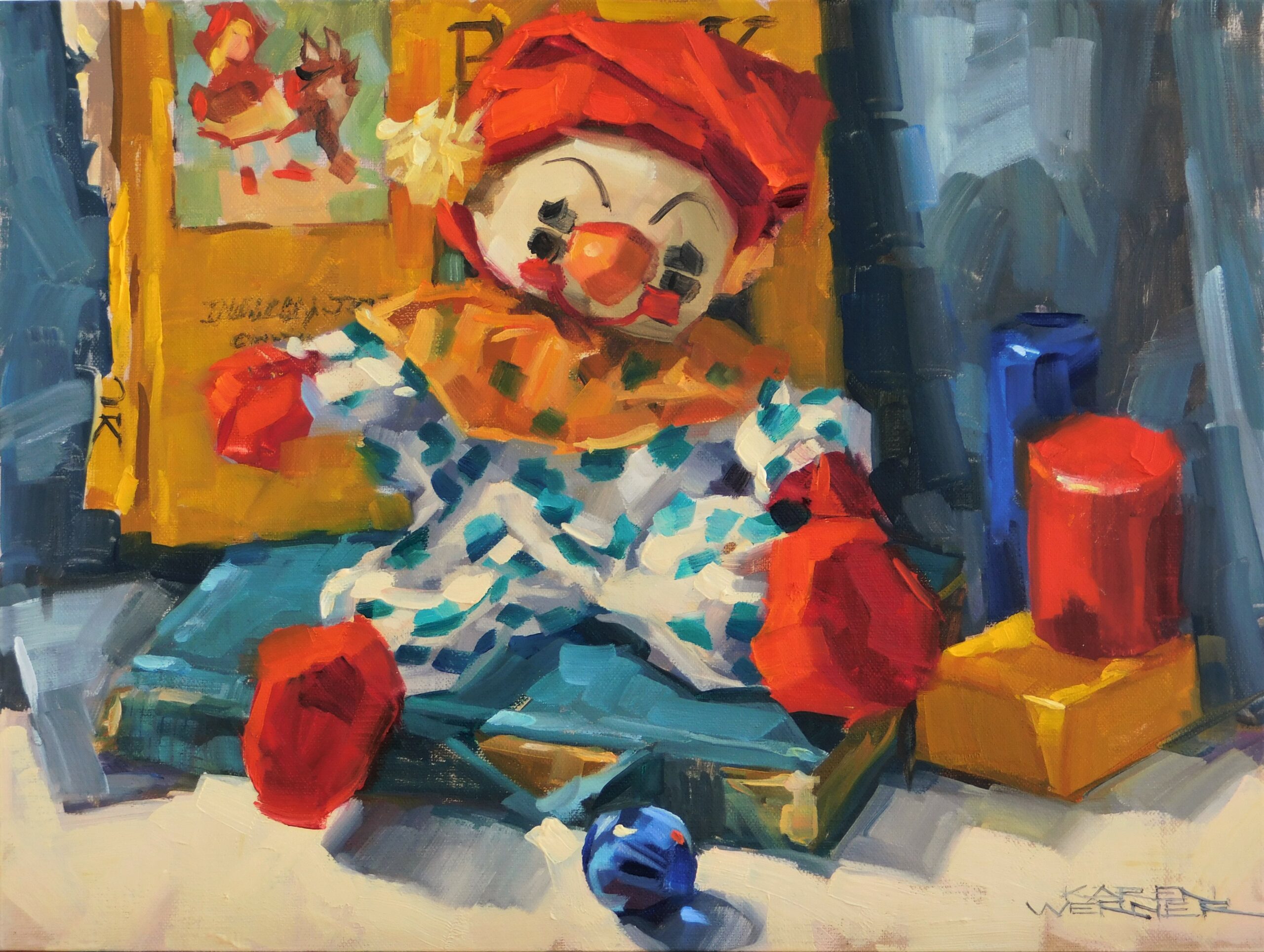
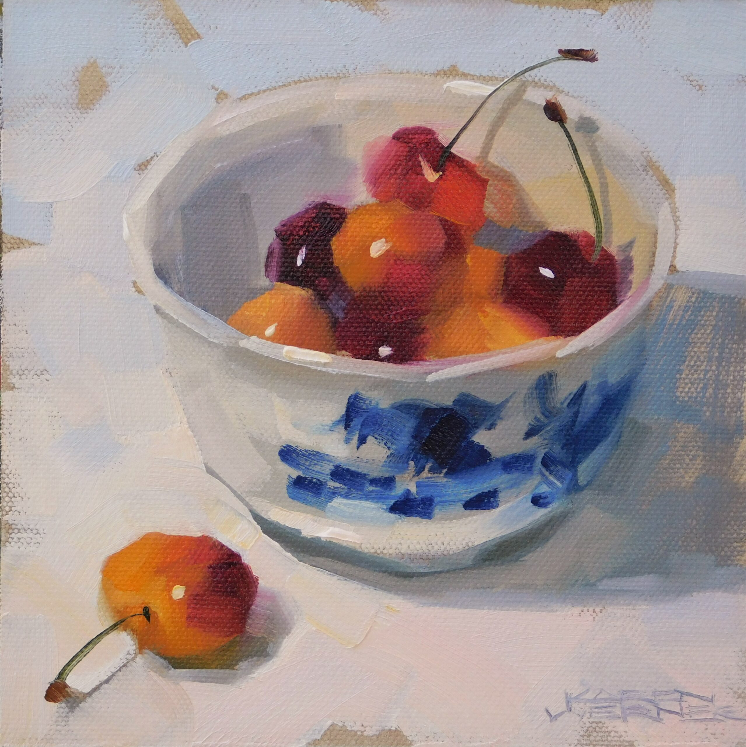
Sometimes I felt like a chicken pecking around looking for something to paint. It could take a while, as did the arranging of objects. Versatility was my goal. I wanted to be able to paint anything. Maybe not at the time, but eventually. I painted toys, tools, sticks, rocks, candy, jars, food, dishes, desserts, books, hammers, houses, bottles, vegetables and more than anything else, flowers and fruit. It was all practice. Still life was teaching me how to paint.
What was I learning amidst all the 6×6 panels, fruit and flowers? I was learning how to see and portray shape, value, color and edges. How to create pleasing design and harmonious color. How to reveal the overlooked beauty of everyday objects and last but not least, the lovely drama of light and shadow. These fundamentals have helped me, since then, to paint landscapes, urban scenes, animals and the figure as well.
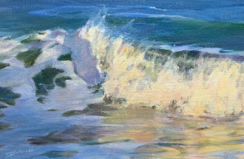
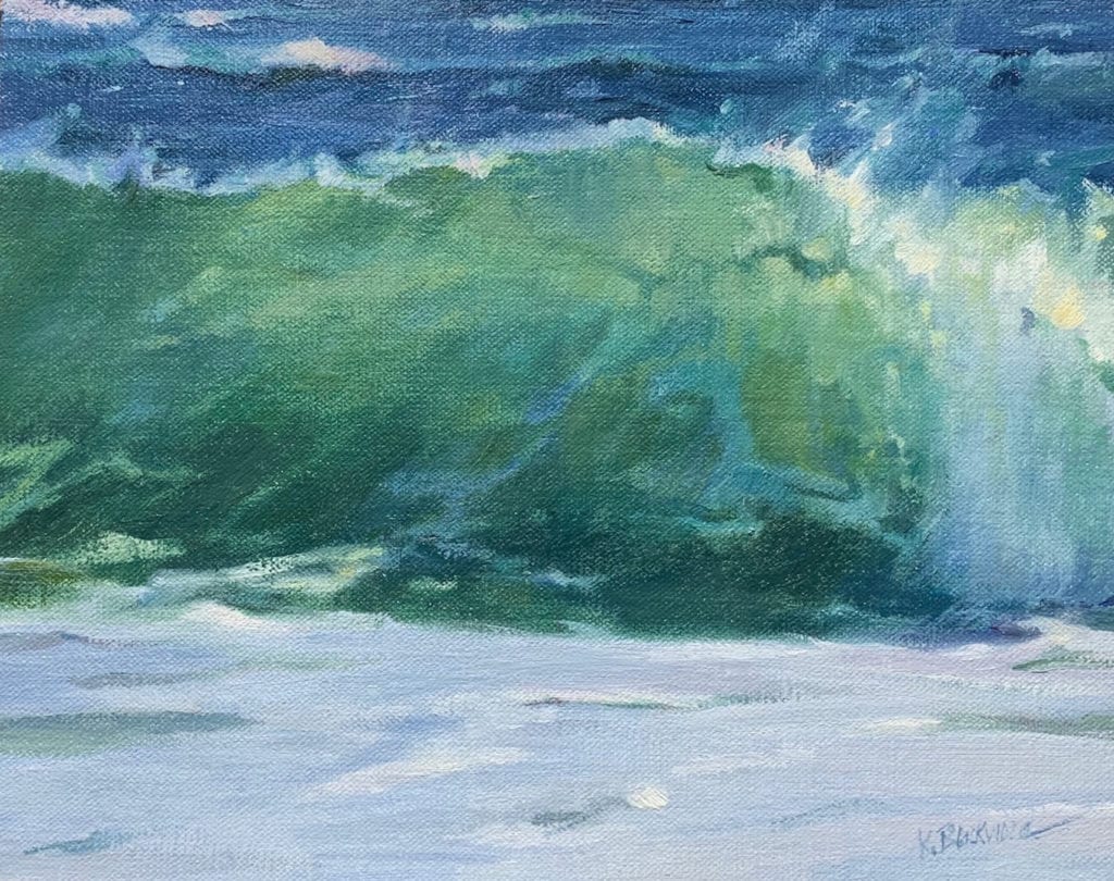
The more I painted, the more I realized that still life does not have to be stiff and lifeless. It is possible to paint a dynamic painting full of energy and vitality. My goal is a “not-so-still life”. I want my paintings to be like fresh sushi, not well-done beef.
Here are some of the many benefits of painting still life:
STILL LIFE IS PRACTICAL
- Your subject is readily available. Just look around you. You can paint anything that you love or excites you.
- Be comfortable. Stay home and paint.
- No time constraints. Take your time and enjoy. (Unless flowers. Paint them first!)
- Controlled lighting and weather.
- Paint alongside your life. You can still paint if you have obligations at home. If you have only a small amount of time, paint a simple subject really small like 4×4.
- Paint from what you already have. No need to pack up, print a photo, look at a screen, leave home or hire a model.
- Keep your brushes moving. A small still life painted often is better than not painting at all. You may be able to avoid feeling rusty or suffering the dreaded “artist’s block” by painting small canvasses between bigger projects.
- Arrange an outside still life in your yard. Paint en plein air without going far from home.
- Interiors are just big Still Lifes. Paint a part of your home that you love.
STILL LIFE IS PURPOSEFUL
With every small still life, you will practice these fundamental skills:
- Design. You arrange the objects. A view finder is handy.
- Drawing accurately. Drawing from life is an essential skill.
- Values. Accurate values are required for creating form (the illusion of 3 dimensions on a 2-dimensional picture plane.)
- Color. Still life will help you to see and portray color in light and in shadow. Correct color shifts to create form.
- Form. How to portray the 3-dimensional form of small objects (an apple, a bottle, etc.) will translate to larger objects like figures, animals, trees, etc.
- Effects of light and shadow on color. You will readily see how the color of an object is different in light than it is in shadow. That difference is how to achieve a feeling of light in your paintings.
- Brushwork and style develop after miles of canvas. Painting small and often is a way to get there. Still life is always accessible.
- Painting from life. Your paintings will be lively and authentic. Painting from photos has many pitfalls. The most common and obvious of which is black, colorless “dark hole” shadows. But this is a subject for another post! Painting from life can give you knowledge that will be useful for times when you have to paint from photos.
- Warm Up. Use a small study from life as a warm up for your painting session.
- Experimentation. Use a simple still life for experimenting with new colors, palette, brushes or processes.
STILL LIFE IS PERSONAL
- Choose objects that you love, find beautiful, or excite you. It does not matter what they are. Your emotional response will show in your painting.
- Do you have some treasured objects? I have painted my father’s mahl stick, my mother’s button collection, a grandchild’s tiny shoes, and my old teddy bear just to name a few. Memories flood in as you paint objects tied to loved ones and family history. Your connection shows in your work.
- Whatever you include in your still life, whether mundane or meaningful, are the objects of your life. Like a self-portrait, they infuse your work with your unique self.
In conclusion, whether you are a beginning painter or a seasoned professional, if you paint landscapes, figures or en plein air, painting still life can be valuable to your painting practice. It is a worthwhile endeavor to be sure.
TIPS FOR BEGINNERS:
- Choose simple objects. Avoid white things, glass, metal and flowers.
- Use a spotlight-type lamp for a clear distinction between light and shadow.
- Use a viewfinder to see your composition.
- Do some thumbnail sketches.
- Paint some small value studies using four values: black, white and two grays.
- Paint small, simple paintings: 4×6, 6×6, 6×8. Paint a LOT of them!
- Use a brush that feels a little too big.
- Challenge yourself. Paint one a day for 30 days. See your progress!
- Practice this: Make a mark and leave it alone. Just like golf, make every stroke count.