What is the Zorn palette? What did Sargent’s palette consist of? Artists have always been intrigued by palettes of other artists. Why is our palette so important? Our paint colors define and influence who we are as artists; in particular, our painting boundaries and our color choices.
Color mixing is intuitive and unique to each of us. Yet, unconsciously, each one of us works within a small part of the 3-D Munsell color space. The Munsell color space is one of the most comprehensive collection of colors that can be mixed on our palettes, it is a collection of nearly 1400 colors. This sophisticated system accounts for value in color. Which causes it to be 3- dimensional. It also takes into consideration physical limits of color mixing.
Oil paints mixed to the Munsell scale are not widely available. As an artist I would premix my paints for each project. Realizing that there is a real need for fully customizable oil paints, I started The Grackle Studio. My goal was to bring the vast range of color, and the subtle hues of the Munsell color space to the artist palettes. I gained a lot of color experience mixing for The Grackle Studio. Some of these mixing principles can be used even in our daily painting practice. I felt that by sharing some of them, I could help simplify a little bit of the painting process for each one of us.
Color mixing is like a chemistry experiment. In some ways it produces logical results, and at other times it results in unexpected surprises. To a great extent, this process can be manipulated to achieve great color precision. Every color has a value. Value is a characteristic of color that defines how dark or light a color can seem. I like to mix colors at the same value. I do this to predict the end value. For example, if I were trying to mix a dark orange, I will bring both red and yellow to the same dark value as I am looking for. Of course, I like to darken and lighten things using white or black. But for the sake of accuracy, it does help to mix at the right value. I use this principle when I am trying to mix a new color. While value is one of more obvious aspects of color, it can be difficult to predict value in highly chromatic colors. They will seem brighter than they actually are.
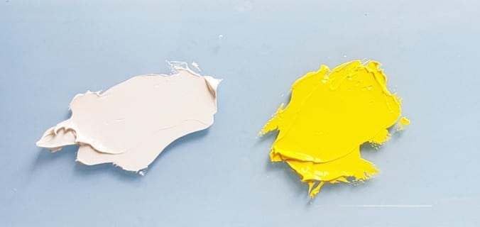
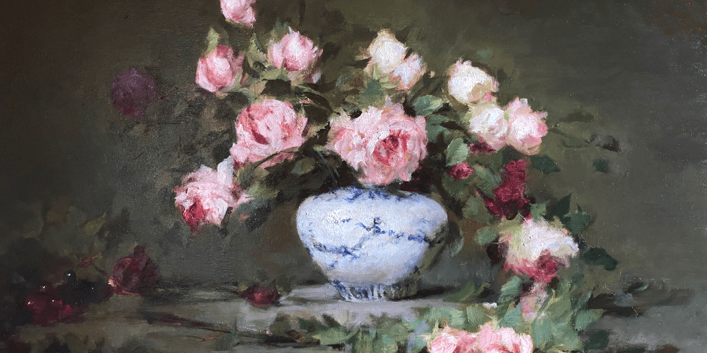
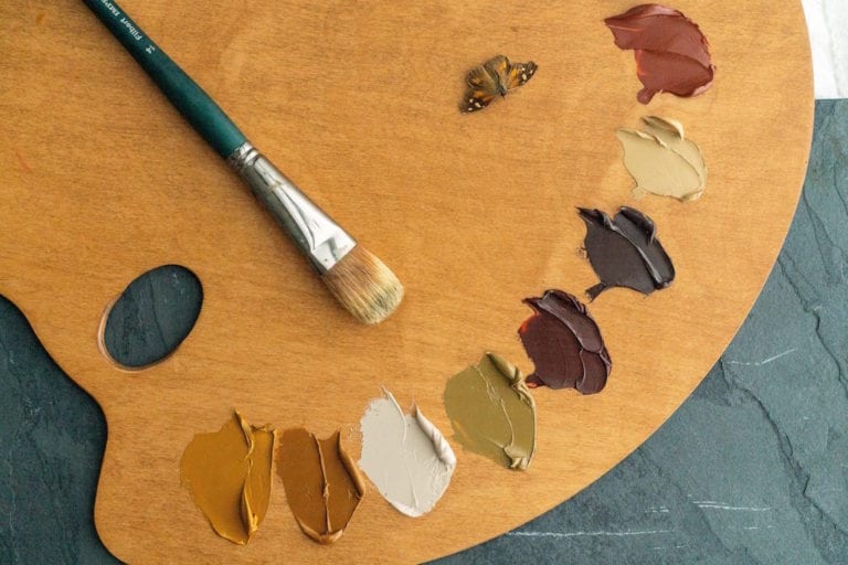
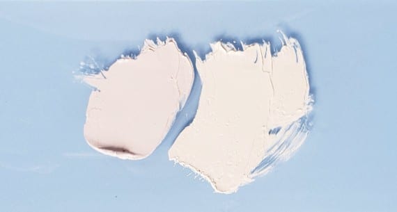
The second thing I look out for while mixing are the hue shifts. Paint mixing is not a linear process, it has an organic nature to it. Hue shifts can be observed when you mix primaries to obtain a secondary color. A green might look bluish or a red might have a purplish tint to it. It can also be seen when you try to lighten or darken a color. It is my opinion that hue shifts are inevitable in color mixing. Most hues shifts are very obvious and can be seen by the eye. But some hue differences can be very subtle. For example, the following two very similar-looking paint piles are actually two different hues.
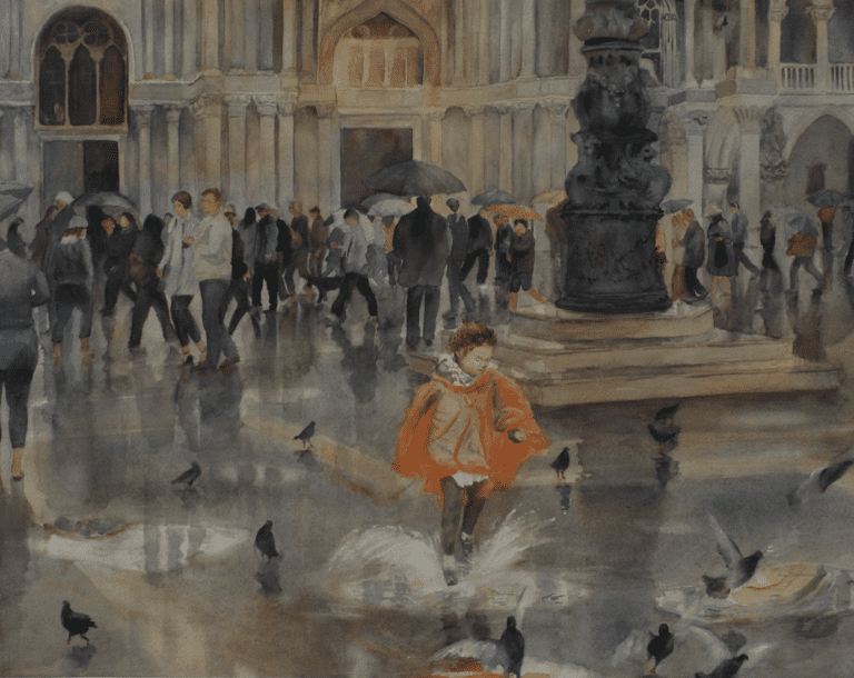
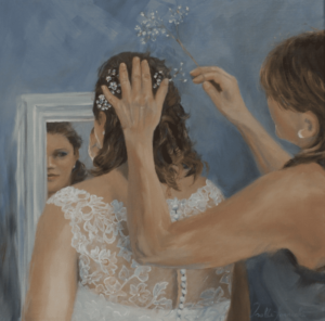
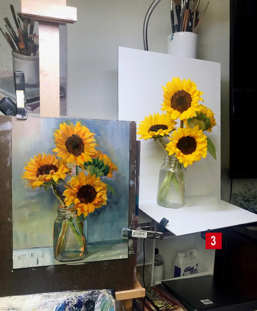
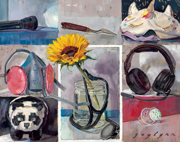
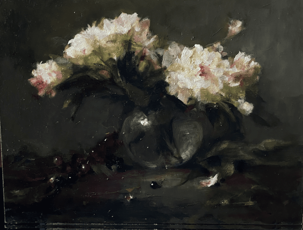
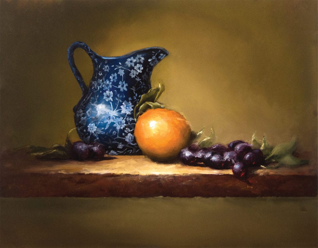
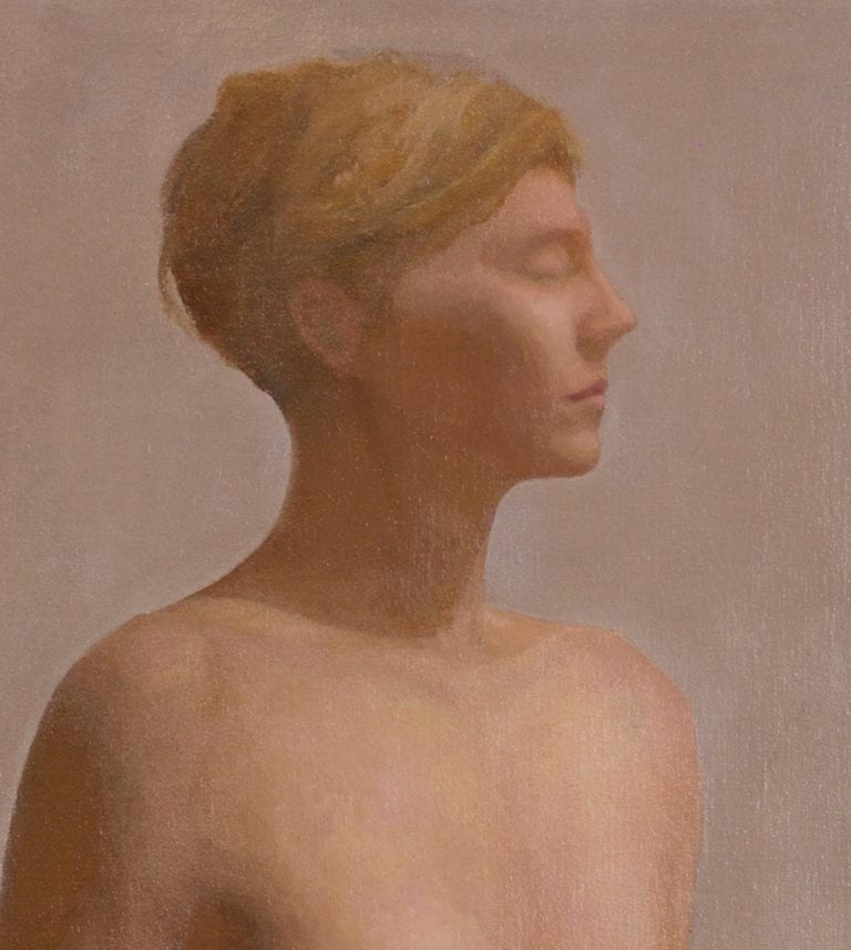
During my early days of painting, I liked to fix my problems on the canvas rather than on my palette. My palette was overwhelmed with colors. I never got to use all of them. I now customize my palette for each painting. And I try to minimize the colors required. Five hues were used to create the following painting. I always work from life. A limited palette is useful in minimizing the guesswork.
Painting is an exceedingly complex endeavor. We have to think of the drawing, subject, composition, and a host of other things. It is a difficult juggle that when done right can look effortless. It therefore helps to simplify each aspect of painting before we launch into our projects. I always try to figure out my color needs before I start a painting. I like to make sure I have the right colors for the color scheme.
Artists of the past lived in a very different world than us. They did not have the distractions of the modern world. They managed to give all aspects of painting their focused attention and they were masters of their palettes. Thanks to the industrial revolution and the resulting needs of the industry we have several pigments at our behest, in order to make the most of this bounty it really helps to understand color. A better understanding of color leads to making informed choices while painting. It can also help in preventing problems before they happen on the canvas. At the end of the day a painting is nothing but a juxtaposition of color and all problems we face while painting are color problems.