We thought it would be interesting to ask some of our Board Members what they have been up to since being quarantined. Here’s what they have to say:
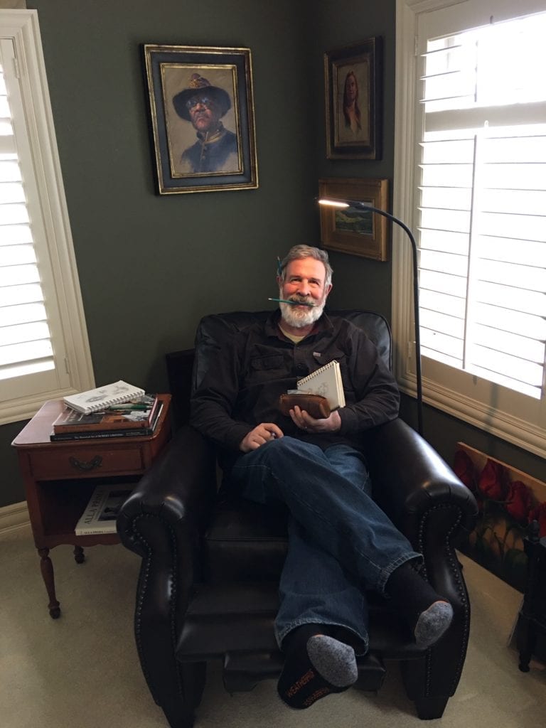
Bill Suys OPA
I came home from teaching at the Scottsdale Artists School on Feb. 8 and fell unbelievably ill for about 3 weeks. An already scheduled chest scan showed either pneumonia or covid-like areas, which tells me I have fully made the transition from an ‘invincible’ young man to one of the ‘vulnerable’.
The incredible shutdown that followed made it clear that this is an economic threat as much as a medical threat. As much as ‘Art’ means to us, there will be an impact on our sales. As I described in my OPA blog on March 30, it is time to focus on the ONE thing that makes us artists. The PROCESS of art and creation is why I’ve done this my entire life, and the past year has convinced me I need to rededicate myself to focusing on my artistic soul.
I believe the highest level of productivity is ‘creative productivity’ — whether in business or Art — and it is best nurtured when many factors come together to create a creative environment. The pandemic was not conducive to this environment, and the disorganization in my studio had gotten to a point where I knew this was a time to take charge and make some changes!
My studio is not huge, but I wanted to create a more welcoming ‘nest’ that would encourage me to dwell and focus on why I do what I do. The first step was to order a reading chair that would allow me to take advantage of the many beautiful art books I’ve accumulated, and I want to take the time to absorb what they have to teach me. At the same time, I will be able to look around and view my recent work with an eye on how I can drill down to what each existing piece needs to grow, and what I need to consider and explore if I hope to grow as an Artist.
I have gone through a challenging period over the past year or two as I I have gone through a challenging period over the past year or two as I have felt the urge to go ‘deeper’, but I know this inner pull is a healthy thing. This mess has done a lot to derail all of us, but I, for one, am starting to feel I’m on the right path and I’m excited to dig in.
Susan Abma
I have been trying to view the ‘downtime’ because of Covid-19 as a bit of a blessing in the way of time. It has given me more time to stop and smell (okay see) the ‘roses’ that our members are producing. Great work by Dave Santillanes, Bill Farnsworth, John Lasater, Heather Burton and Jing Zhao to mention just a few. Some, like J. Kenneth Grody, impressively took on a self-portrait challenge. Others, like me, took the time to regroup.
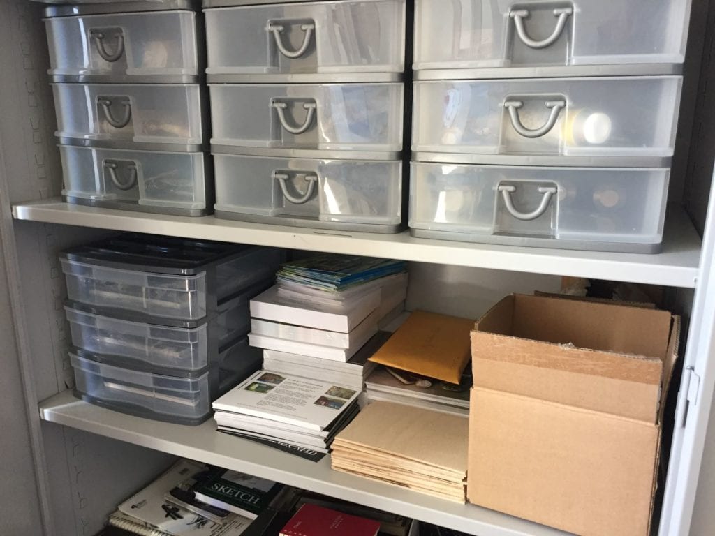
I am always tidy in my studio, except at the easel perhaps. 🙂 The Covid-19 is taken really seriously here as well (I’m in Alberta, Canada), so I haven’t left home in about a month.
As a result, my studio is even more organized than usual.
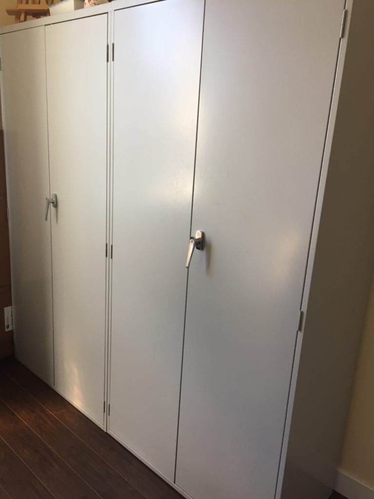
I have four large upright metal cabinets in my studio that hold art cards, paint, pencils, etc. in small plastic drawers. It makes my life easy. I can grab anything I need quickly.
The initial investment was not teeny, but I have had them more than 20 years and they’re still like new. For me, it was money well spent
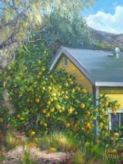
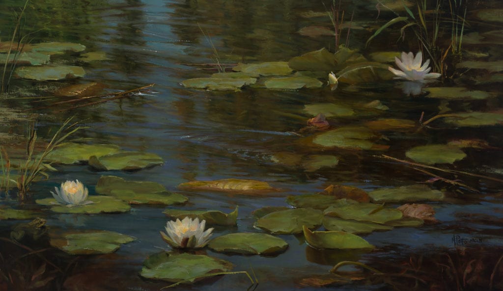
Jane Hunt OPA
11″ x 14″
“Because my family is high risk, we’ve been quarantined for almost 6 weeks. I admit, for the first three or four I wasn’t handling it very well…reading too much news, and panicking because I couldn’t get my daughter’s seizure medication for weeks amid the shortages! Once I got the essentials figured out…acquiring meds, food delivery etc., I started to feel less overwhelmed.
It took almost a month, but I was finally able to pick a up paintbrush and get back to work. Best decision I could’ve made! Immersing myself in the thing that I love helped to challenge and distract my mind. Over the last week or so I’ve started to feel more like myself again. No matter how bad things seem, I think it’s always therapeutic to get back to painting.
Attached: a piece from a couple of days ago ‘cloudscape’ 11×14 will be headed to the reimagined Olmsted Plein Air (the show will be all virtual this year).”
Stephanie Birdsall OPA
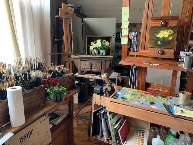
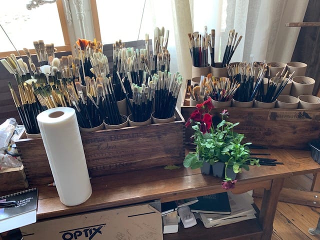
This Coronavirus downtime has made a subtle difference in my days. It has given me the time to clean my studio and make new brush holders. Something I’ve wanted to do for a long time. But I feel like I’m a little in slow motion. I’m spending more time teaching my students through FaceTime, zooming, being sure that I check up on my friends that are alone.
It has given me the time to explore my neighborhood in Ct on foot because there are so few cars. I live on a very narrow, winding, hilly road, surrounded by homes dating back to the 1700’s. I’m finding so many places to plein air, as soon as the weather holds up. The slow spring coming to CT, seems to play to the slower days. I’m enjoying the peace, though . I find I’m meditating more, and watching podcasts of people I admire.
I feel like I’m recharging my batteries, getting ready to explode into spring!
We hope you have enjoyed hearing from some of our Board members. Please let us know how you have been spending your time during COVID-19.