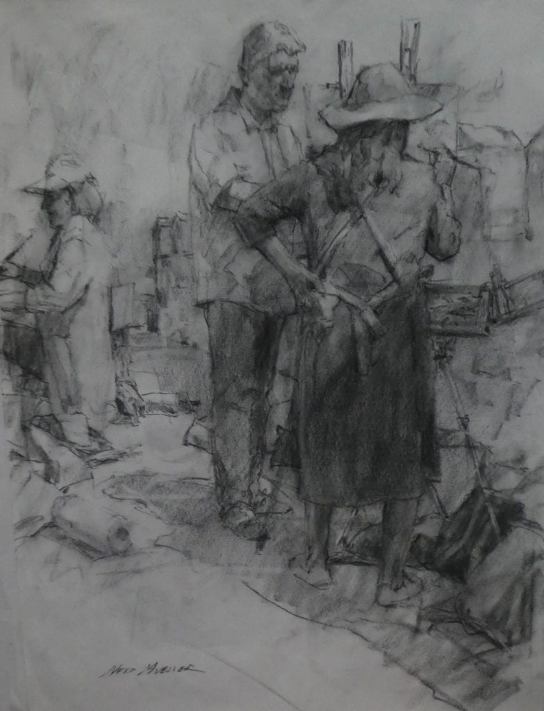
What motivates us to do the things we do? For some, it is a pursuit of money, for survival to excess. Some seek recognition, to make their presence stand out from the crowd of humanity. For some, it is service to others, compassion for those with less. Some seek tranquility in a world of chaos and craziness. Physical improvement to support a healthy life is common. Sadly, there are some who are motivated by hate and a love of violence. Everything we do is motivated by something – nothing done is without it.
As artists, we choose the master we serve. Is it producing a product for money? Is it sharing an inner vision? Is it making a statement – political or social? Or could it be to reveal to the world our unique experience of living? Does it make our existence seem worthwhile, or lasting? Why do we do it?
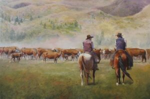
For many years, I painted the same landscapes and subjects. I had built a niche market in an area of explosive growth. I enjoyed it and felt comfortable doing it. The creations had a sense of place and connected with collectors. They were infused with a love for the land, and it showed. The media of choice was acrylic on canvas (I couldn’t dry an oil quick enough to ship it!), and I explored the paints to a high level of understanding. Creatively, I was cranking right along.
Four years ago, a rumble of change came, a subtle, intuitive sense that business, as usual, wouldn’t cut it much longer. My most productive gallery owner was talking retirement, and he didn’t intend to sell the business. It was time to actively seek growth – I was motivated to do more if my art career was going to survive. What would be the vehicle? At the time, I was weighted with obligations at home and with my outside work. It wasn’t possible for me to leave where I was. But I had to do something. What was it going to take?
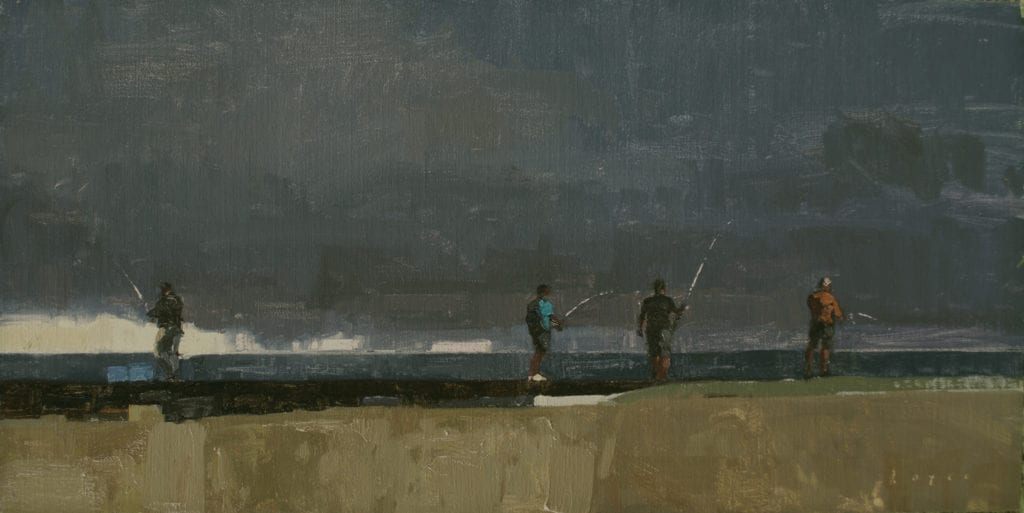
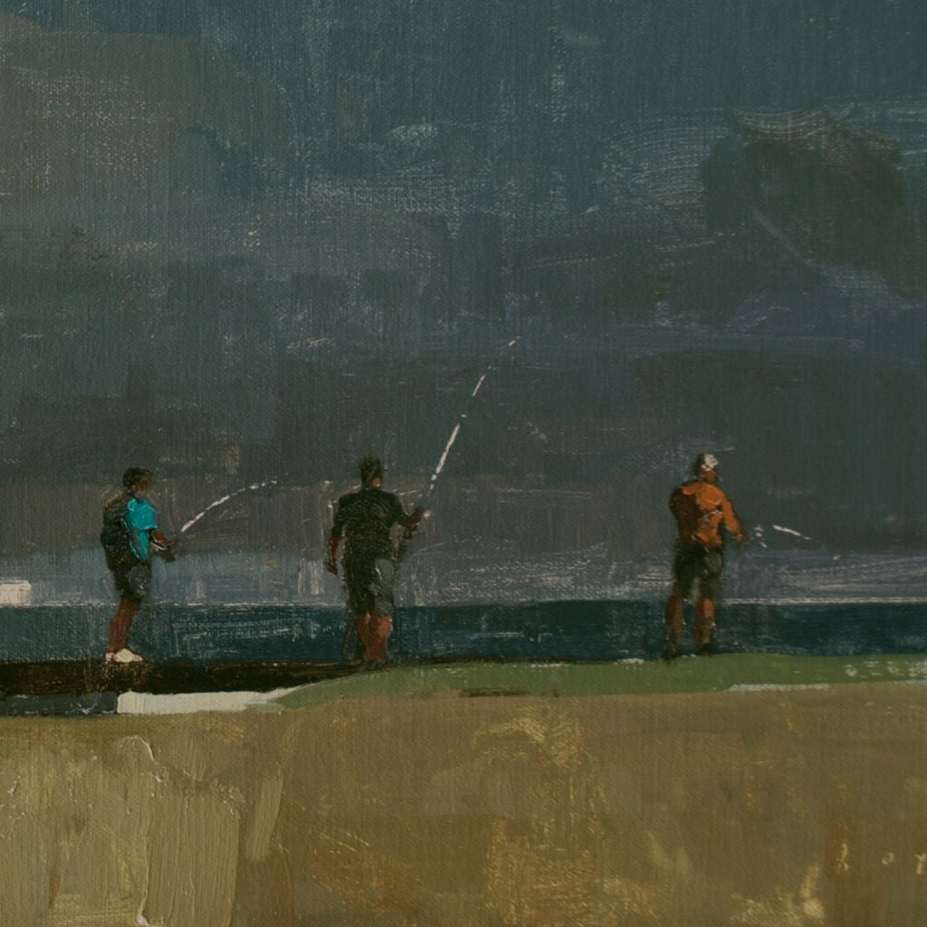
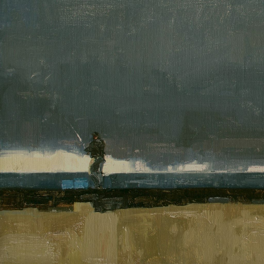
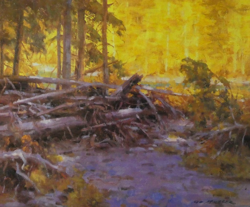
I stumbled across a website showing the work of Carol Marine (www.carolmarine.com) who is a daily painter. Her work was bright, happy, and varied. Her technique was straightforward and fresh. I bought her book “Daily Painting” – a great encouragement for artists of any experience level – and made the decision to give it a try. Thirty days, thirty paintings. I would put away my acrylics, and go back to my first love, oil paint. I would choose subject matter that would challenge me, use colors outside my usual palette, and learn as I went. Subjects varied from table settings to an autumn pumpkin, to the front end of an old Camaro. I painted nothing with a goal in mind other than to find my artistic spark. Some images worked, some didn’t. To add urgency, I posted the work online DAILY, to expose myself to public shaming if I didn’t comply. In the end, I was exhausted creatively, but when I looked around the studio, there was a fresh energy, a renewed heart for what I truly loved – creating art.
My own motivation was from a sense of change in the market (and clients) I was serving. I needed a creative jump start. It was also a deep prompting that we are always growing, experiencing within and without. To stop is to be stagnant and eventually become frozen and mechanical. Our blessing as artists is that we have a calling to create in physical form what others can only glimpse in their imaginations. Our vision within creates the vision without.
Pick up your paints and brushes, get that sniff of turpentine and linseed oil (if you are still using those materials), and put some pressure on yourself. Give yourself a timeframe, and discipline your artistic muse to follow. At every turn, learn. You will find renewed energy by creating energy, in your work and in your artistic heart. It is possible to jump-start your art. You have the key! Crank it up!