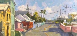
Chewing gum, a soda bottle, and a paper clip and supposedly we can MacGyver our way out of anything! I want to share one way you truly CAN MacGyver your way out of those times you feel like no matter which way you turn you are creatively stone-walled and once again the muses seem to have fled.
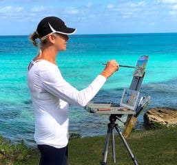
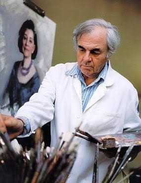
by Lyn Boyer
A lot of us will put music on in the studio along with knocking back a double espresso on those days our brain feels like day-old white bread. Get some mood enhancers going – we feel a bit better, we paint a bit better. So, now you know what this article isn’t about! What it is about is incorporating music into our painting practice in a much more powerful and intentional way.
Good friends and truly inspired – and inspiring – musicians, Dave Curley, Joanna Hyde, and Tadhg Ó Meachair, from the transatlantic trio ‘One for the Foxes’ have agreed to take this leap with me. They’ve offered up the gift of their music, thoughts on creativity and devotion to the arts and life to ‘we who wield brushes’ – their brothers-in-arms in the creative arts. They have provided the music you’ll be using for the exercises you’ll find at the end of the article. A sincere thank you to Dave, Joanna, and Tadhg!
The first exercise will focus on increasing brush vocabulary through painting using your entire body. The second, uprooting ingrained habits and assumptions that are way past their expiration date and have lost their usefulness. My hope is that the music in concert with the exercises will bring you and your paintings one step closer to the heart of all things.
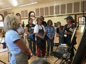
I had occasion recently to work with a talented student who was stuck. The brush was in a death-grip; the approach to the canvas was sincere but unfocused. Paint would be shoveled up, a stroke would be laid down and then rather than allowing a breath, a pause and stepping back from the canvas and assessing the passage they would stroke the passage again and again until any life it might have had was gone. It pretty much bled out on the sidewalk. The student was truly stuck in a loop chanting the same ‘word’ over and over with their brush – but not in a good Zen way. The musical equivalent could be a three-year-old future percussionist banging pan lids together like a bad loop until you want to open the slider and throw them out in the snow just long enough to make them stop. They haven’t yet developed the manual skills, artistry, and understanding of complex rhythms to be the heartbeat of a future band.
I tried everything in my coach’s bag to get them past the wall they’d hit. I had nearly given up when I reached over, turned on my trusty blue-tooth speaker, chose a track and said, ”Now, stop painting the painting and paint the music.” They focused their attention fully on the music. The death grip on the paintbrush loosened. The stance that had been hunched became relaxed. The impetus for the paint strokes began originating from somewhere deep. They began using their entire body. The strokes became fluid and full of life.
For years we painting instructors have tried to teach rhythm, melodic line, composition and such with little sketches, slides, diagrams and whatever else we can think up. This was a serious ‘duh’ moment for me. All this artist needed was, not to read about, talk about or look at charts about rhythm, the student needed to experience rhythm in the moment. When they did their body knew exactly what to do with it. Watching them pretty much dance back and forth approaching and retreating from the canvas, laying down strokes inspired by the phrasing in the music actually verged on spooky since minutes ago they were carved in stone.
FINDING THE HEARBEAT
What are some ways we can bring ourselves back to true north when it feels like our painting is going sideways?
We need a heartbeat to live. A song, a tune, a painting, all need a heartbeat to live. The lot of us, painters, composers and songwriters alike, are pretty much guaranteed to now and then have a time when we stand back and realize our creation that day is seriously DOA. Don’t panic – triage. Can it be resuscitated? If not then salvage some valuable learning from it and move on. If there’s still a pulse then:
- Step back and find the weakness that might be dragging down an otherwise important creation.
- Ask yourself if the initial intent was unfocused.
- Is there a weakness in the structure?
- Did you hang the curtains before the drywall?
- Is there an inelegant passage in the execution?
Sometimes we are only a very small adjustment away from saving the patient and a fine offering to the muses!
THE PRACTICE AND THE PERFORMANCE
As painters we work on two fronts – the practice and the performance.
- The practice: Striving for mastery of the technical skills. A painter’s version of practicing scales.
- The performance: We then choose a time to pull those hard-won arrows out of our quiver to create an image that will carry our message…hopefully squarely into someone’s heart.
Here are some go-tos for your tool kit to help you come at your creative life with more intention and focus.
- Slow down and resist the temptation to just launch right in. Give yourself permission to spend some time bringing into focus your intention for your painting so it is truly ‘about’ something, not a painting ‘of’ something.
- Keep your antennae up for those things you respond to.
- Search for what you feel deeply about. Love will be felt by the viewer if you paint what you love. Joy will be felt by the viewer if you paint what brings you joy. Peace by painting what brings you peace. Power if you paint powerfully.
- Quiet the voices in your head and sometimes the voices outside of your head.
Musicians lead us on journeys that are image-filled through lyrics and musicianship. As painters, we should strive to take our viewers on journeys that are music-filled, if not literally, at the very least through masterful handling of the painter’s versions of composition, rhythm, and harmony. The common roots of music and the visual arts surface constantly. We compose. We seek harmony. We design with rhythm. We use melodic line. We choose what key we are going to paint in. We place color notes. We find our voice. We create contrast. We use tempo to speed up and slow down the viewer’s path through the painting.
THE CREATIVE PROCESS
I asked Dave, Joanna and Tadhg of ‘One for the Foxes’ if they would share some thoughts on the creative process from the viewpoint of musicians and songwriters. I found their insights not only inspiring but remarkably applicable to our process as painters.
“My focus is covering two angles as I embark on my creative process and I try to keep these two fundamental elements (as I see them) at the front of my mind.
At the outset, most of my process is informed by my own personal experiences and what I take from myself and inject into the music. Establishing the narrative, drawing from past musical interactions and imagining new ones to create something new. As the structural, musical and lyrical elements begin to take form, I try to shift my focus and fine-tune my piece of art with the fresh perspective of a new listener. I have found that parts of my art that I become sentimental and attached to because of the journey of the piece, can actually hinder the overall piece of art and it might be better served if removed. This tension between the personal and the external is important for my process and can offer a lot more clarity to the listener/observer when both sides are taken into consideration.” Dave Curley – multi-instrumentalist, singer-songwriter
“In the spirit of art being a sort of continuum (in my mind), I find this element of ‘balance in flow’ really important. Just as Dave is talking about balancing the internal and external for the sake of art, I think that stretches to the idea of being open to whatever creativity is coming through you and/or from inspirational sources around you, and being able to look at it all critically without overwhelming yourself with judgment.
I think one of the most fundamental reasons for art is joy – getting to feel and share joy -, and that is a sort of mantra I try to come back to in order to keep myself balanced when I’m feeling bogged down by uncertainty or criticism, most often my own. I know it sounds trite, but I do think that happiness is the core behind this all, and that is ultimately what allows the creativity to come out into the world. Some of my favorite moments are when I’m listening to a piece of music and it fills me up so much that I get goose bumps. I’m experiencing the piece in such a pure way without consciously analyzing it. With the open and subjective process that is art, it’s sometimes hard to know from the artist’s perspective when to let a project or piece be “complete”, or at least sit for a while and decide whether or not to come back to it. I try to keep ahold of an awareness of this flow between the various states of creating something and experiencing all different feelings about it, so that I can continue to try new things, hopefully learn and improve, allow for the more difficult moments, create space when necessary, and more than anything, keeping loving the whole experience of it. That, in turn, allows for whatever I’ve created/shaped/molded to be shared, and perhaps become something new again for the next person.” Joanna Hyde – vocals, fiddle, songwriter
“As for my creative process, particularly in terms of composition, I find it to be an ever-evolving process. Perhaps coming from the Irish tradition, where ‘a composition’ is usually limited to 16 bars of music and incorporates repeated motifs within that, one can encounter a burning urge to break the rules and strive to make something ‘bigger’. This can be very rewarding. However, when all the rules are broken, suddenly the beauty of the original ‘simple’ form can also emerge. Then, rather than feel confined by strictures, one can find immense joy in appreciating subtleties often lost in a larger picture.
Ultimately, neither of these approaches is ‘wrong’, and, to echo Dave’s and Joanna’s words, letting go is the big challenge. You will always improve, evolve, and/or change as an artist. Tomorrow you might balk at the idea of something you love today. But today is just as valid as tomorrow. As the legendary Irish musician Dónal Lunny once told me in the midst of an album recording, ‘That’s why we call it ‘a record’. It’s a record of where you and your art is right now.’ “ Tadhg Ó Meachair – piano, piano-accordion, composer
MUSIC TO INSPIRE PAINTING AND PAINTINGS INSPIRED BY MUSIC
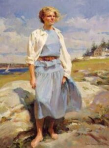
I’m going to share two paintings in an ongoing series that will be exploring music. The musicians are the subjects of the paintings but the message is the music. They are paintings ‘of’ musicians but ‘about’ music. The first is about music that was and will be. The second is about music in the present moment.
The Harpist
The painting is of a harpist but it is about the space between the notes where music exists. Her hands in her lap mirror the rests in a composition. It looks back to when the music was and forward to when the music will be again.
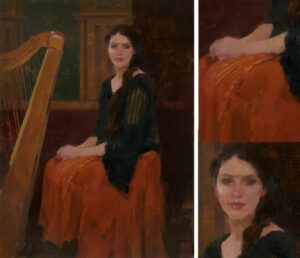
16″ x 12″ – Oil on linen – Private Collection
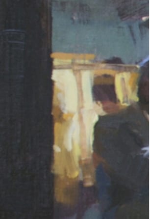
Buena Vista Social Club
This is, on the surface, a painting of musicians on a stage. Again, the painting is about the music. For this painting, I literally used the spaces between the musicians to paint the music. Every stroke, color note, paint passage was executed to be a visual translation of the music filling the club. Even the powerful bass line lives in the dark vertical post on the left. The tangle of wires speaks about the complexities of the notes – of how the voices of instruments intermingle.
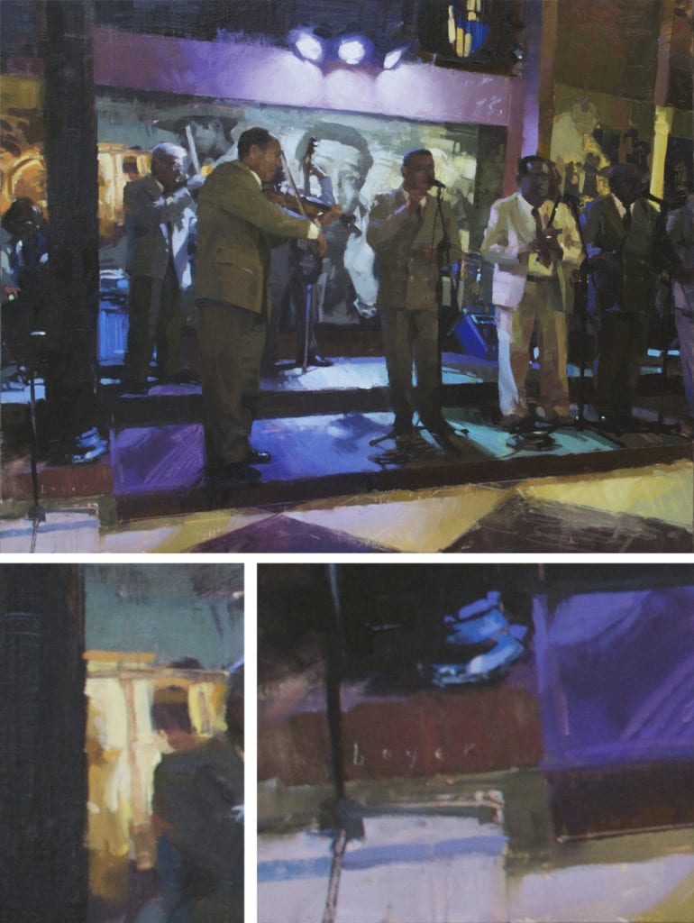
16″ x 20″ – Oil on linen – Collection of the Artist
PUTTING IT ALL TOGETHER
Okay, now we’ll turn our thoughts toward how to put all of these ideas into practice. Let’s dump some sound and some pigment into an imaginary particle accelerator and make the two collide. When any two things collide in this universe something is created. Water + rock = a canyon. Car + tree = a trip to the body shop. If you DO create something new because of a fender bender after you’re over inventing new profanities, stop and look at how the light might be hitting the new wrinkles in the sheet metal. Look at the sweeping patterns the grass stuck in the quarter panel is making. There’s beauty even in something that a minute ago totally sucked the life out of your day. Pass no judgment on what appears on your canvas during the exercises. Just let the worlds collide and feel the joy of the process.
My hope is that the music in concert with the following exercises will bring you and your paintings one step closer to the heart of all things!
EXERCISE 1: Increasing brush vocabulary through painting using your entire body.
Use two 12×16 or larger inexpensive canvas panels or paper. You don’t want to worry or feel precious about the surface you do exercises on.
Work standing up so you can move freely. Make sure you have a clear path so you can step back from your easel at least 6 or 8 feet if possible. You need to always be moving forward and back. Forward to lay down a passage. Back to see the big picture. For this exercise, you’re to not care a whit what ends up on the canvas. Focus entirely on the music and use it to inspire new ways to approach your canvas. Allow the marks you make on the canvas to just ‘be’ with no judgment. Relax and use your entire body. Let the stroke originate in the earth, move up through your spine, shoulders, arm, through your brush and finally to the canvas. Click on the audio clips to access the music for your exercises.
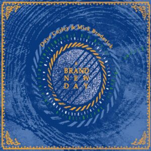
I’ve chosen two of Dave Curley’s pieces from ‘A Brand New Day’ for this exercise.
A. The first piece you’ll work to is a beautifully rendered piece that leads you on a gentle and at the same time emotional journey awash in visuals. ‘The Pleasure Will be Mine’ – written by Alan Reid, arrangement by Dave Curley and Mick Broderick.
© Dave Curley and Mick Broderick
I want you to be aware of the
grace in the music and let that translate into how you move your body and hold
your brush. You should hold a brush with both delicacy and perfect control. It
should nearly fall out of your hand. You’ll move from shoveling up paint and
spreading it on the canvas like stuccoing a wall to a vocabulary of true brush
calligraphy that can speak volumes with a stroke.
B. For the second half of this exercise, you’ll work to one of Dave’s original pieces, ‘Off to War’, which is both powerful and poignant at the same time. e NOTES: ‘Off to War’ is a true story from Ireland in 1916, based off a mother’s diary which she kept for her son who was fighting in the Irish regiment of the English army in the 1st world war. Old story, new art. – Dave Curley, Mick Broderick
© Dave Curley and Mick Broderick
Use a new canvas or paper. The
intent, the rhythms, the message are entirely different. As you focus on the
music and begin responding, you’ll discover you’ll be using your body in an
entirely different way as you approach the canvas. There is a more powerful
undertone in this song with compelling rhythms. There are moments that are
lilting and inspiring and conversely poignant and heartbreaking. Pull out your
Big Book of Brush Vocabulary for this one! You’ll need lots of different words.
EXERCISE 2: Uprooting ingrained habits and assumptions that are past their expiration date and have lost their usefulness!
Again, use two 12×16 or larger inexpensive canvas panels or paper.
For this exercise, we will again focus on the music but the intent is to interpret what we’re hearing and translate it into passages of color on the canvas. We have a huge vocabulary in a single brush. We can go from a wisp of a hairline to a powerful and bold stroke with just a twist of the brush in our hand. After you load your brush you then have three tools for making your mark – speed, pressure, and direction in infinite combinations. Try them individually and then combined. Step back between passages and assess how successfully you’ve communicated the intent of the music.
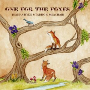
I’ve chosen two wonderful pieces from ‘One For the Foxes’ for this exercise.
A. The first tune you’ll work to in this second exercise is a beautifully crafted piece, ‘Virginia’, that is sure to draw you in and inspire you to use your brush in new ways as it takes you along on its journey.
Notes: Virginia is a town in County Cavan in Ireland, and is one we particularly enjoyed putting together with its more distinctive arc/journey from slow and airy to faster and punchier. – Tadhg Ó Meachair
Trad. Arr. Joanna Hyde & Tadhg Ó Meachair
Let your mark making follow the
arc of the story in this one letting your brush follow the beautiful drawn out
passages in all of their tenderness. Then interpret the anticipation as the
tempo slows then builds and the piece becomes more complex. This is a great exercise for breaking the
habit of repetitive brush strokes. You will have the pure music of radically
different passages on one canvas. That’s when the painting becomes a dance.
B. The final piece you’ll be working to in this series of exercises fully invites you to the dance of life – ‘One for the Foxes’!
Notes: “One for the Foxes…is a mix of two tunes – one Irish tune composed by Junior Crehan, and then the tune that myself and Joanna composed in honor of some foxes who lived in my back garden in Dublin!” – Tadhg Ó Meachair
This last exercise is about shaking off dusty habits that have been holding us back, stealing our voice and keeping us from true expression and connection.
So, put the last canvas on the easel, turn up ‘One for the Foxes’ and feel what it’s like to channel joy!
Comprised of two tunes: Her Long Dark Hair comp. by Junior Crehan and One for the Foxes comp. by Joanna Hyde and Tadhg Ó Meachair, set Arr. Joanna Hyde and Tadhg Ó Meachair
Enjoy your journey of discovery! – Lyn
Credits:
Many thanks to Joanna Hyde, Tadhg Ó Meachair and Dave Curley of ‘One for the Foxes’.
ONE FOR THE FOXES
Dave Curley, Tadhg Ó Meachair & Joanna Hyde form an exciting and dynamic transatlantic trio that presents a rousing blend of Irish and American folk music, having already won over audiences on both sides of the ocean. The group is made up of Dublin’s Tadhg Ó Meachair (Goitse), Galway’s Dave Curley (SLIDE) and Denver, Colorado’s Joanna Hyde (The Hydes), and features a mix of Irish and American folk music and song – both traditional and newly-composed – presented in an energetic and engaging manner. Their performances strike a tasteful balance between the stories found in ballads across both sides of the Atlantic and the respective instrumental music traditions of these places. Award-winning instrumentalists each in their own right, Dave, Tadhg & Joanna take a unique twist on the diverse strengths of their individual backgrounds, weaving between traditional melodies, their own compositions, and songs from the broader folk canon. The results are highly personalized and thrilling in their daring and forthright grasp of the material. Through a shared deep-rooted passion for Irish traditional music, this trio highlights the vital role of Irish traditional music as an origin of many American folk musics and explores how those styles can interact with one another in a manner both eclectic and grounded.
Dave Curley
A multi-instrumentalist from County Galway, Dave Curley has worked with multiple Grammy-winning acts, as well as being a member of the Irish supergroup, SLIDE. Not only an outstanding musician, singer, and songwriter, Dave is also known as a champion Irish step dancer.
Tadhg Ó Meachair
An All-Ireland champion pianist, Tadhg has toured the world with his multi-award-winning band GOITSE. His musicianship, recognized by legendary musician Dónal Lunny in his ‘Lorg Lunny’ television series, has led him to collaborate with acts ranging from Seán Ó Sé to The Stunning.
Joanne Hyde
Award-winning fiddler and vocalist Joanna Hyde, a Colorado native, is steeped in musical styles on both sides of the Atlantic. A recipient of the Jack Kent Cooke Foundation’s Graduate Arts Award, Joanna has an MA in Irish Traditional Music Performance from the prestigious Irish World Academy in Limerick, and tours throughout North America and Europe with various projects
‘One for the Foxes’
‘A Brand New Day’
© Lyn Boyer – No Fear Oil Painting™