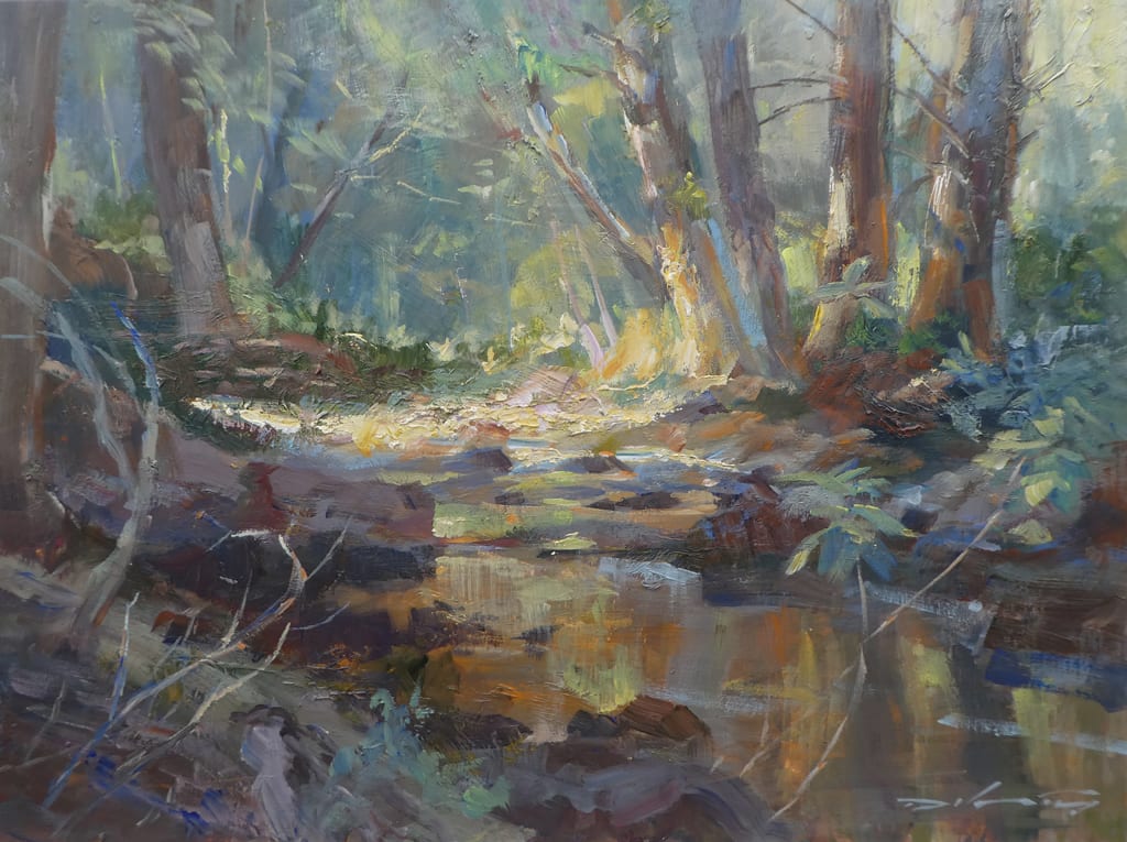
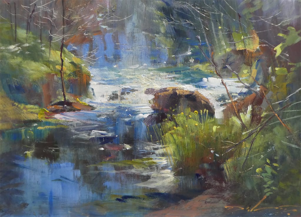
I think we’re all suckers for one thing or another in painting. That tantalizing scene that we’re drawn to over and over even when we know we should be “trying something new” or “pushing ourselves”. For me it’s the “Radiating Line” composition (from Edgar Payne’s essential reading: “Composition of Outdoor Painting”).
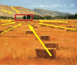
As I look at landscapes, especially in Plein Air, the “Radiating Line” is my go-to composition and one that I see readily when I’m out painting. One of the reasons I’m so fond of its power to enhance depth and pull you into a painting. It’s also a great way to use these “lines” to force the viewer to go where you want them to look. It’s basically one-point perspective and I love the effect of creating three-dimensionality on 2D surfaces.
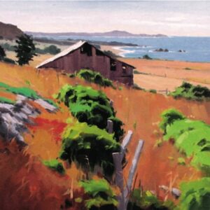
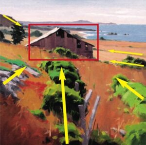
Here are some examples below. All were painted en Plein Air. Each time I see these scenes on location, I’m always looking for ways to use landscape elements and position them to work in my favor. Most of the time it takes some adjusting when you’re not in a comfy studio and have multiple photo references to explore or manipulate.
18×18 Oil
18×18 Oil
In each instance, all of the objects are consciously placed, using the actual landscape as a reference only. I rarely see a scene that has everything in the perfect spot, so I always try to position myself in the best place possible where I have to move the least amount of elements. But inevitably something needs to move, change or be eliminated. I’ll analyze my scene from many angles to find the best one instead of just showing up and begin painting. Sometimes I’ll see the scene that I want to paint, but spend 20 to 30 extra minutes choosing exactly where I’ll stand. I feel the extra time scouting can definitely make or break a good composition.
16×20
Oil
16×20
Oil
16×20 Oil
16×20 Oil
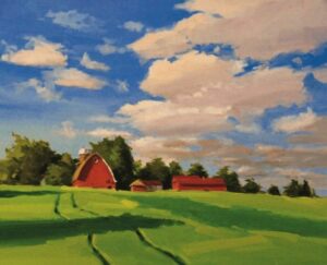
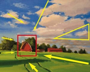
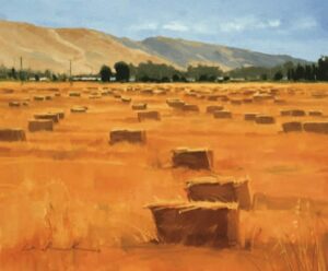
In the painting with the hay bales. All of the bales were placed to lead you back to the distant buildings and two larger trees. I took time in setting up to find the best angle, but most of the stacks were painted with intent to lead the viewer where I wanted. I try to keep it as natural looking as possible, although it seems blatantly obvious when pointed out.
16×20 Oil
16×20 Oil
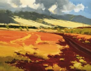
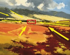
In the painting “roasted reds” (done on site during the “Maui Invitational”) I felt the red dirt road leading you in from the right wasn’t strong enough to push you back to the small structures in the distance. I decided to add the other tire tracks in the golden grass to enhance my point. Those “tracks” were there but I had to adjust them to the position shown in the painting.
I think there are many ways to add depth to your work with values and temperatures, but strengthening it with subtle object placement radiating and angling inward can enhance the composition. I love to play around with these angles, pushing something a little more this way or that can really improve your statement and enhance the drama of the painting.
Best in painting!
Greg Larock
greglarock.com