When I was in high school, I excelled at certain subjects except anything pertaining to math or numbers. To me, algebra class was a time for inner reflection (staring out the window for the duration of the class was very helpful in this respect).
Cut to 2010 where I find myself in the art gallery of the aforementioned high school standing among 25 of my own paintings for a solo show. I run into my former algebra teacher. She looks around the gallery at my paintings, and I see a revelatory look on her face. I think she finally figured out that for some of us, math class was just a holding pattern until lunch.
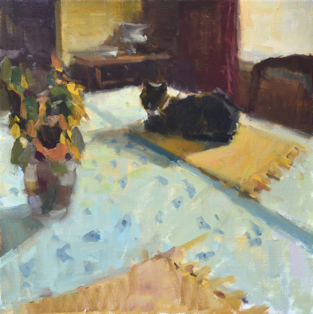
The big irony is that I have chosen a career in the arts, but I still cannot avoid math. I have begrudgingly accepted that the foundation of painting is very much about numbers, ratios, and grids. There are also charts and graphs, etc., but let’s just take things one day at a time…
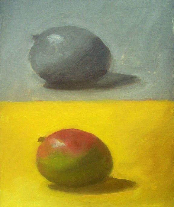
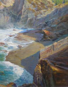
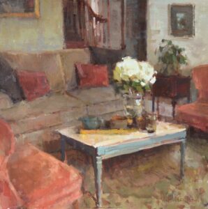
During my period of art/math-resistance, I figured if I just applied some really pretty colors to canvas with some really fancy brushwork, I was golden. Not so much. Without a balanced foundation on which to place these pretty colors and fancy brushstrokes, the painting does not hold together. A successful painting relies heavily not only on correct values (dark, light, and mid- tones), but also on correct proportional distribution of the “weight” of those values within the composition. That weight distribution can more easily be identified by isolating the basic shapes of the scene. Hereʼs where the numbers, ratios, and grids come in.
You professional painters probably know all this stuff, and I bet it has become quite intuitive. You are “unconsciously competent” in certain basic concepts, i.e. you can employ them without having to think about it. It was that way for me, too. It wasnʼt until I started teaching that I put 2 and 2 together (dang, thereʼs that math again!) and actually had to start explaining how I construct my compositions. I realized that even though I consider myself an expressive, from- the-hip painter, I had become quite the mathematician! These are the 3 basic concepts swirling in my head as I plan and execute my initial designs:
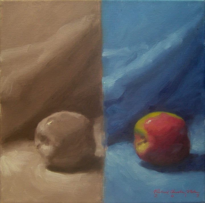
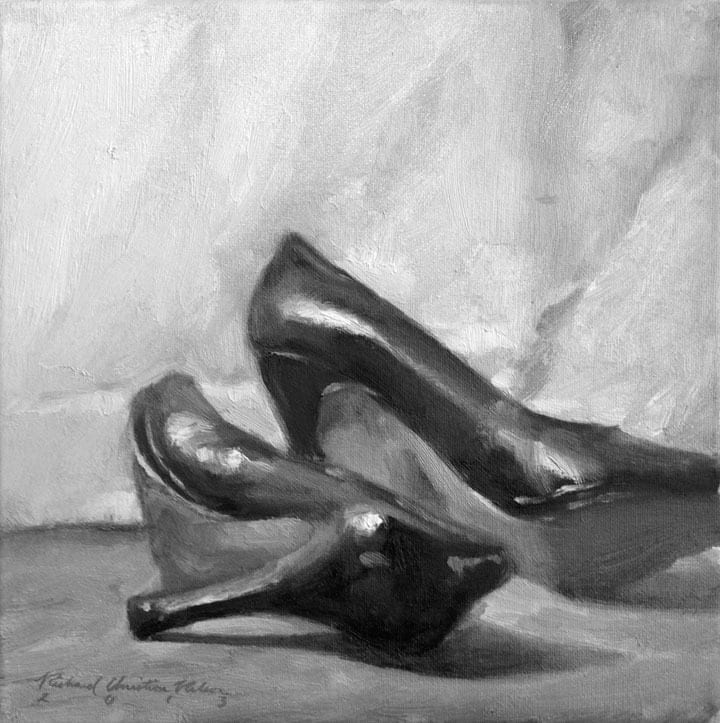
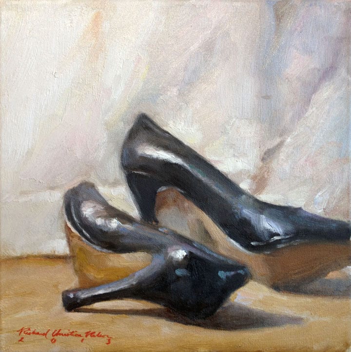
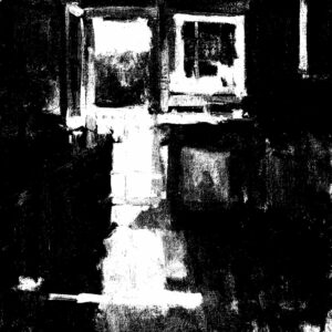
1. Notan- 2 Values
Applying this concept is the best way to see the underlying energy, or “bones”, of the design from the start. To do this you must assign the mid-tones to dark or light. A balanced painting will typically fall into a 2/3 dark and 1/3 light ratio or the reverse. *Handy Tip: there is an image setting in Photoshop under “Adjustments” called “Threshold” which gives you the black and white ratio of an image. You can get a handle on the Notan of your photo reference this way, or it is also handy to proof images of your paintings to make sure you have your ratios correct. In the field, I use Artwork Essentials ValueComp to see the Notan.
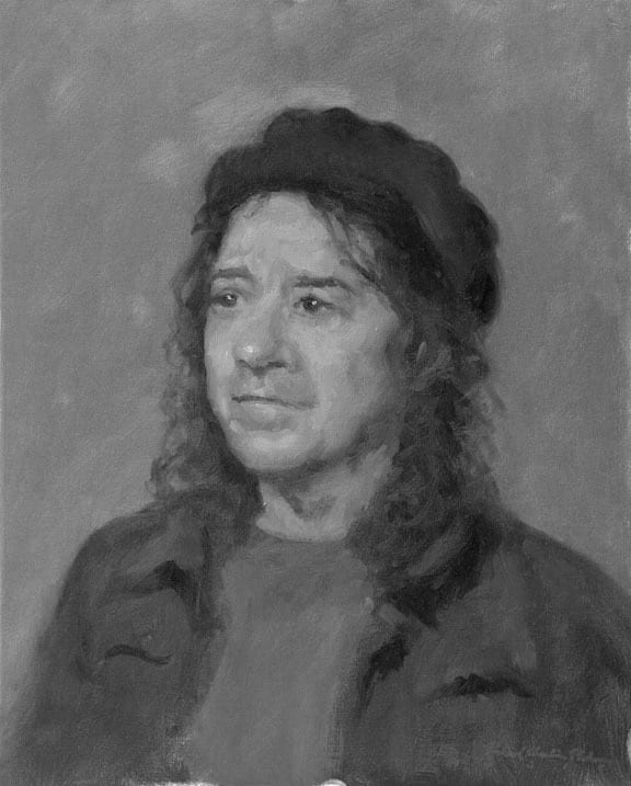
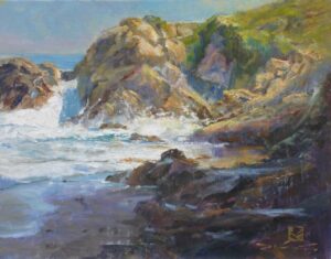
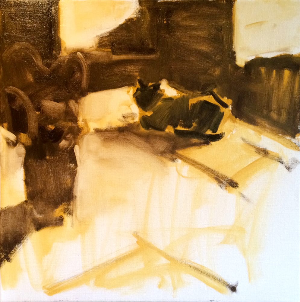
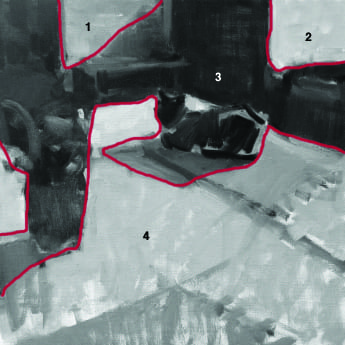
2. 4 Values/4 Shapes
It is helpful to keep your basic design initially to 4 shapes and 4 values. This creates an uncluttered foundation on which to build. This is not as easy as it sounds, especially when looking at a scene with lots of detail. *Handy Tip: An oldie but a goodie- squint! Squinting our eyes helps us see only shapes and values. You may eventually need Botox, but your paintings will be stronger!
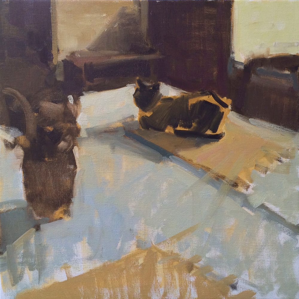
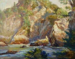
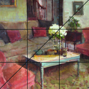
3. Rule of Thirds
The canvas is divided in 3 horizontal and 3 vertical spaces with 4 convergent points. Using these 4 points as resting places for either a focal point or a directional lead is pleasing to the eye. This is a useful guide to keep from dividing the canvas in half or placing the center of interest in the middle. Easy, right? Well, if you are like me, every now and then there is a naughty little tree that somehow places itself right in the center of your beautiful landscape… *Handy Tip: My favorite view-finder is the 6″ x 8″ viewfinder with marker pen & eraser from Artwork Essentials.
These numbers, ratios, and grids may sound creatively restrictive, but they are actually very liberating. They keep me checked and balanced from the start. By thinking academically in the first stages of the painting I set myself up for success. Then the rest, in my opinion, is playtime!
As Sergei Bongart said, “It is entirely possible, and often advisable, to spend 90% of your time merely adjusting the big, simple shapes before ever moving to the rendering.”