• Skip to primary navigation
  • Skip to main content
  • Skip to footer
  • Login
  • Join OPA

OPA - Oil Painters of America

CREATING COMMUNITY ADVANCING SKILLS ELEVATING EXCELLENCE

  • About
    • Mission, Policies & Bylaws
    • Board of Directors
    • Presidential History
    • History
    • Staff
    • FAQ
  • Membership
    • Membership Information
    • Contact Membership Department
  • Exhibitions
    • Rules and Policies
    • National Exhibition
    • Virtuosos of the OPA
    • National Salon
    • Online Showcases
    • Award Winners
  • Programs
    • Lunch & Learn
    • The OPA Blog
    • Scholarships
    • Critiques
    • Have A HeART Humanitarian Award
    • Ship and Insure Info
  • Community
    • Community Page
    • Directory
    • Workshops
    • Brushstrokes Newsletter
  • Shop
  • Sponsorship
    • Current Sponsors
    • Sponsorship Opportunities
  • Donations
  • Show Search
Hide Search

Uncategorized

Interview and Workshop with artist Linda Richichi

Ms. Eve Albrecht · Jan 22, 2018 · 1 Comment

Unleash your creative spirit to its fullest potential through Active Meditation/ Doodling
I met Linda Richichi at her solo show at the Cultural Center in Ponte Vedra Beach, FL and was captivated by her paintings and her interest in active meditation doodling and Color and Energy Workshops. Linda is a landscape artist who now resides in Sarasota, FL. Linda has attended Plein Air events since 2003 and has been teaching local and international workshops for over twenty years. She has earned many Best of Show Awards, including one at the International Plein Air Painters (I.P.A,P.) Worldwide Paint Out at Niagara Falls, Ontario, Canada in 2016. In 2012, Richichi was voted the National Best Intuitive Artist from about.com (then a NY Times company) and a NY Times article in 2015 reported on her Soul Vision workshop with great reviews.
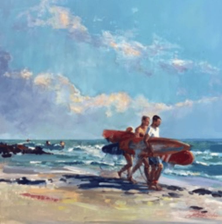
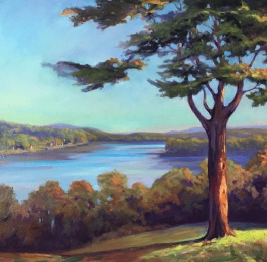
Good Day for Surfing 12” x 12” Oil
Good Day for Surfing
by Linda Richichi
12” x 12” Oil
While Linda was painting and teaching, she developed a process of connecting to her intuitive self through drawing/ doodling which she developed through her personal journey of trying to get the answers to the important questions in her life. After a decade of using this process to help guide herself through difficult times and getting assistance in decision making, Linda began showing this process to artists who attended her workshops and her college art courses. Linda explained that we can use our art making to get to know ourselves better. Using simple drawing techniques, we can move past obstacles and discover valuable “inside information”, have more success in our careers and learn how to live our lives more fully. Doodling then becomes a form of Active Meditation.
Glenmere Mansion View
by Linda Richichi
36″ x 36″

 
Linda said that, “After years of working with my open-minded students who were willing to play along, we discovered together that not only could I access “inside information” but anyone could. I began teaching this ask, doodle-and- decode technique for business coaches at their “mastermind” retreats so they could help their clients to excel in their businesses by moving past internal roadblocks.”
How does this explain why we are called to create art? Linda has found that we all have an innate language and art that works with us using symbolism through our spirit, also called our higher knowing. This part of our self wants to shed all the psychic baggage it can. Since this higher self is not verbal, it communicates through the lines and shape that we draw. Our higher self subtly tries to guide us, but we rarely pay attention to it. Those who doodle on the phone usually draw the same thing over and over and do not have a reason why. I knew this to be true because when I doodle it always big flowers with big circular petals!
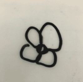
Doodle by Eve Albrecht
(While on a telephone hold…)
Linda says we are pulled to use similar shape repeatedly, and when painting we have a subconscious desire to find this shape in nature too. What does this shape mean? That is the mystery to solve in Linda’s workshop.
Linda explains, “I take people on a different kind of vision quest by unlocking the left brain’s control over the mind to free the creative spirit within. The elements and principles of art you use in paintings (or even doodles) are communicating to you and your audience in ways that most people are unaware of. Knowing how to decipher the deeper meaning of line and shapes beyond being able to translate them to canvas gives you the ability to upgrade your life. These lines and shapes tell a story. You live by stories you tell yourself daily from past experiences which color your world and shape your life. Life, like art, is a story. I’ve discovered how to play with art in such a way that it becomes a vehicle toward happiness. In my workshops you’ll go deeper to the inner landscape, gain a better understanding how the lines and shapes speak and what they want to reveal to you, what you are currently not seeing. You can experience an “aha” moment doing the exercises which gives you a whole new relationship with your art. Art becomes your mentor guiding you to a brighter way of living if you will let it.”
My workshop experience
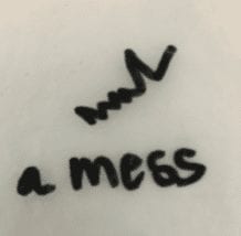
Linda holds different types of workshops. The workshop I attended focused on clearing the three centers of the body so we can see from a higher perspective. The three power centers to access are the head (what we think), the body (what we feel) and the belly (what we are being or doing). Through this process, we first doodled after concentrating on what I was currently thinking at the time and it happened to be just after my father passed away. So I was thinking heaviness and worry. I was feeling sadness and as I was grieving, I was not being social, not sleeping well and not really getting anything done. My doodles were:
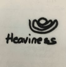
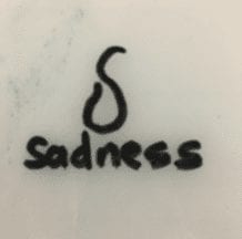
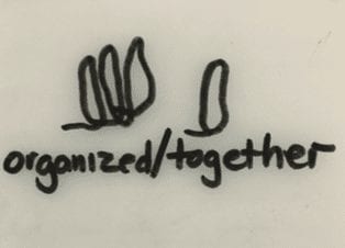
The next step was to shift our perspective through positive thinking. So we had to contemplate and write down the opposite description for each area. So clearing our minds from the first exercise, we began by thinking of our descriptive word, e.g. “lightness” and then drew without any purposeful mark making but allowing the pen to make abstract shapes. My words became “lightness”, “happiness” and “together.” My doodles were below. We were told that this shifting of perspective and drawing them out helps to keep our power centers strong.
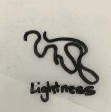
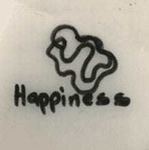
In the workshop we are guided to help explain to ourselves what these doodles mean. My “lightness” doodle appears to show a family and that someone is hugging/protecting us. “Happiness” looks like two butterflies one hovering or surrounding the other meaning that I am being looked after. My third center doodle “together/organized” shows standing tall monoliths, three together with the fourth standing close by but tall. The explanation was that I was strong enough and that I will be ok and we as a family will be together and remain strong.
As demonstrated in my experience the lines, color and shapes we use when we create art are clues to our inner world/thoughts/mind.
Other shapes such as jagged lines with sharp edges and heavy pressure usually express anger or frustration such as the ones I drew when I thought about how I was living my life at that time and I called it a ‘mess’. Lines that form circles are softer, fluid and more loving.
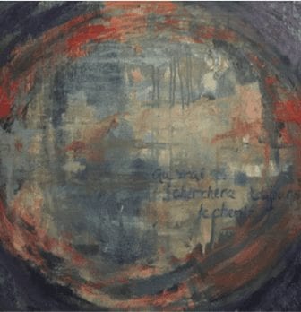
I realized that when I started painting abstracts last year one of my favorite paintings had a circle in it covering the entire panel and it was in warm colors. So my painting actually was showing the shape and color of love. I didn’t even realize it until I was writing this story and going over all my notes. Once I discovered this, I knew that the paintings needed some words to complete it. I decided to write something meaningful to me, and also depicting this process of connecting and acknowledging a connection between our soul/creative source and creativity. Why I always feel I need to write in french on my paintings is something I will find out some other day!
These exercises I did in Linda’s workshop were mind expanding and very enlightening.
Linda’s Color & Energy Workshops are held in Sarasota, FL and other destinations are being planned and can be found on www.lindarichichi.com. The Color and Energy workshops are geared toward this intuitive language as well as an emphasis on painting.
Fences and Grasses….

David Mueller · Jan 8, 2018 · Leave a Comment

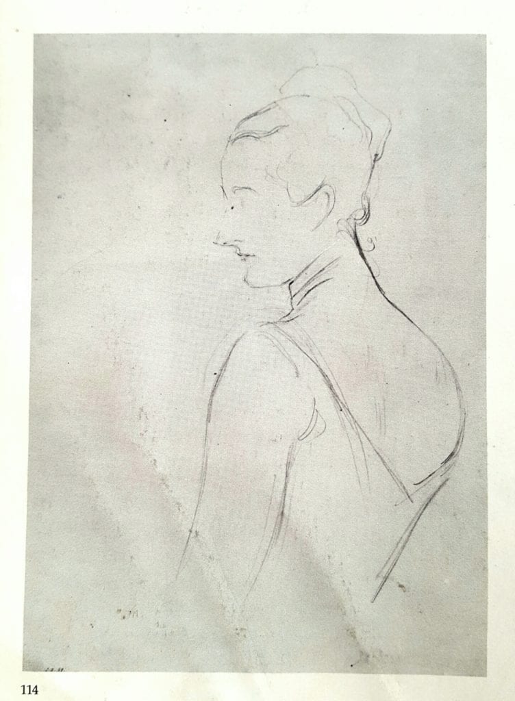
Madame Gautreau
(“Madame X”) by John Singer Sargent
Think of this…..Simple shapes of value, different sizes and edges of various softness between them. Lined up side by side, top to bottom, they form the visual image that we perceive as a “thing”.
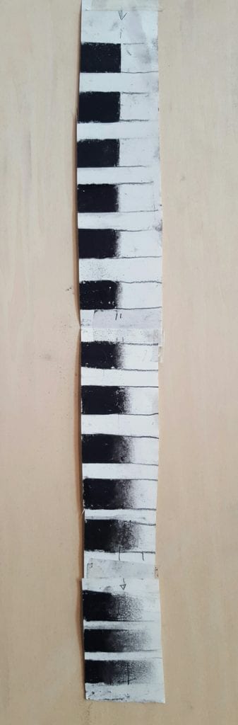
In the early sections of my teaching curriculum, I teach my students to make an edge chart. They start at the top by making a swatch of dark value on the left and light value on the right. These two values either separate immediately (sharp edge) or gradually, with transitional values in between the two main ones (soft edge). The first set of dark next to light swatches at the top of the chart having the sharpest break or “fence” between them, meaning the most immediate break from dark to light. Then 10 to 15 more sets are made below, getting softer as they go, with a progressively widening band of transitional values (softer edges) in between the two main ones.


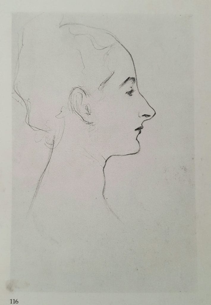
Portrait Sketch by
John Singer Sargent
In my class I call them fences. I ask my students to paint the fences (edges) first, then grow the different grasses (flat values) on each side. Some fences are sharp like razor wire fencing, while others are more blunt or rounded like split rail fencing, still others are like rock wall fences or hedge rows fences- very wide . Some grasses on either side of the fences are are “Kentucky Bluegrass” (maybe a 30 percent gray), some are “Zoysia grass” (maybe a 70 percent gray)… or if you golf, grass on one side is the rough, the other side possibly the putting surface.
This is just a fun way to help ingrain in the students mind that very different edges exist in the visual world as dividers of visual shapes and should exist, accurately, in their rendering of it.
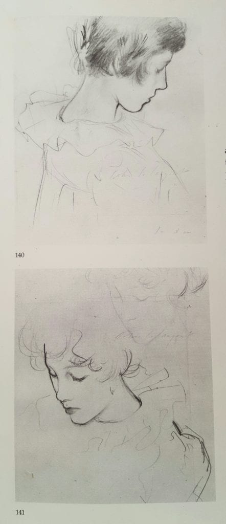
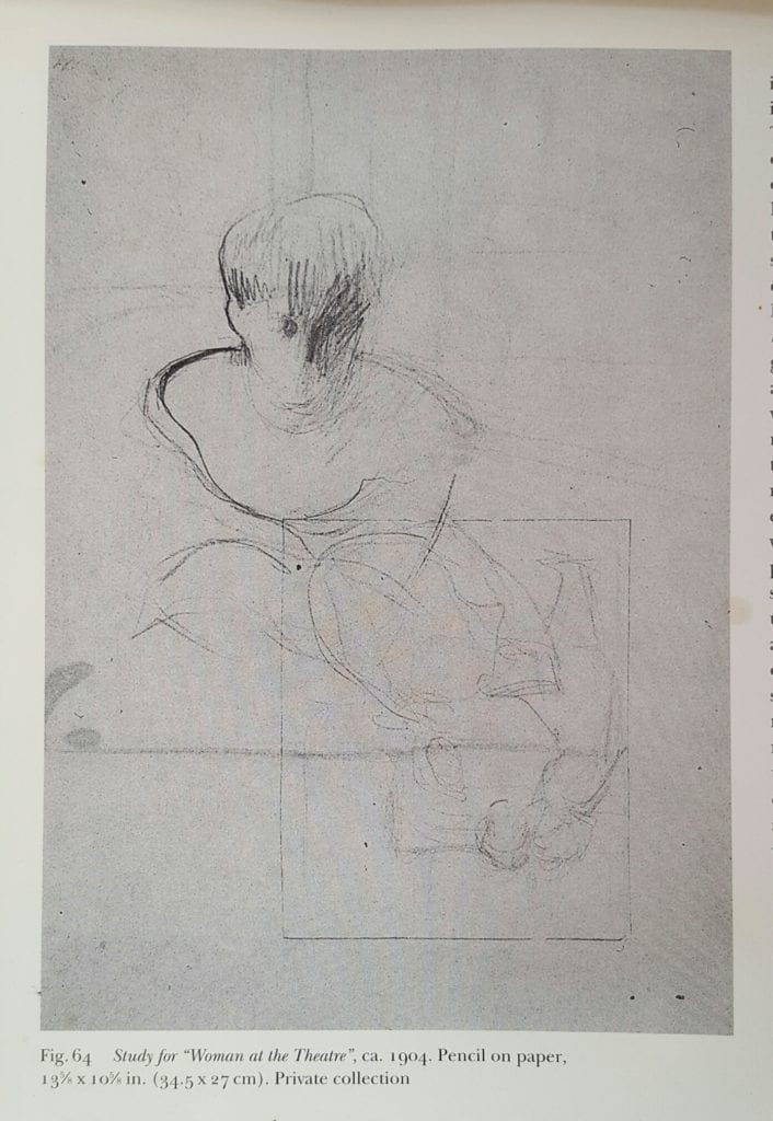
Preliminary Drawings for “Carnation Lily Lily Rose” by John Singer Sargent
Endless evidence exists in great paintings both past and present that a wide variety of understood, intentional and widely varied edges make for dynamic and convincing depictions of our world. This applies to any subject matter.
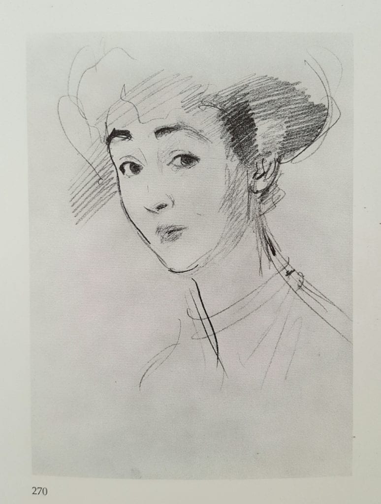
Madame Gautreau,
Portrait Sketch by
John Singer Sargent
John Singer Sargent made wonderful suggestions, plans and notations of these fences in his preliminary sketches for portraits. An “edge map” of sorts. In one place he’d push hard with a sharp graphite line to indicate an area in his composition where a hard edge and strong contrast would exisist in the final painting. In another area he would indicate a medium soft pencil line that wiggled as it moved along a shape. This would indicate a medium soft brush mark to come, a fence dividing two shapes of value in his eventual rendering displaying medium visual importance. Still other graphite lines are very subtle, hardly perceptable, but still recognizable as shapes that would be an eventual very wide and soft division between two values in his painting. Sargent is but one of many that understoood and utilized this principle and tools to indicate it.
Preliminary Portrait Sketch by
Joseph DeCamp
Simple Handmade Edge Chart

In this way he preplanned and mapped his edges before ever touching his canvas. He could then focus on the luscious brushwork that we all know and admire to convey a particular edge in a particular area. One stroke clean and sharp, another wiggled as he moved along yet another just barely scratching, scumbling a ghost of a division between two areas of value.
I try to start my paintings in this way and encourage all those that I teach to try the same. In this way we all are “aiming for the fences” in trying to “hit one out of the park” on canvas. 😉

Failure and the Power of Believing.

Bill Farnsworth · Jul 10, 2017 · 22 Comments

“Against the Tide” by Bill Farnsworth

Failure;

This is a word that makes people cringe and we all try to avoid the dreaded act. Our society is built on those who succeed and those who fell short and failed. Yet failure is part of the journey to becoming a better artist. Be kind to yourself in knowing that you succeeded at the first step. TRYING.
There’s an old golf saying that goes something like this, “You miss 100% of shots you never take”. Many people who would like to take a painting class or workshop never do for fear of looking foolish. To all those who feel this way, stop it! Take a chance, get your feet wet, and throw caution to the wind. Did I miss any other old trite sayings?
Everyone starts at the beginning and there are no short cuts to getting better as an artist. We can be taught the principals of painting and it may not come out of your brush for a while. You need the time of practice, which will yield failure after failure until the pile of bad paintings shrinks and the pile of good paintings grows.
Let me be clear, THERE ARE NO SHORT CUTS.
All your failed paintings were valuable learning experiences. If you have a painting that is not going well, wipe it out and start again. You will find that your next start will be much better because you learned something. My students that progress the fastest have an attitude that their painting is an exercise and not a precious master piece. I watched Bill Anton paint a demo that was a beauty and at the end he wiped it out, to the groan of 600 people. He said this was just an exercise. As it sunk in, the audience gave him a standing ovation.
Your painting journey will have many failures until the jewel comes to the surface and will erase 100 bad paintings.

The Power of believing;

The most incredible achievements known to man would not have been possible without the dedication of having faith they would prevail. A career in art is a hard climb with many road blocks that often lead most to taking another path. It is not a career you can successfully do without very hard work and sacrifice. There are many artists that are starting late in life these days and are finding it tough. Even the artists who have been in the business for years still are working very hard.
I know this doesn’t sound like a good intro to motivational speaking, but the good part is coming. There is no other way than total dedication to achieve success in any endeavor.
Orville and Wilbur Wright had this idea of manned flight. They faced enormous odds with trying to break the code of lift and drag. No one thought it was possible and even the Wright’s themselves had doubts. Through countless trials that risked their lives every time they took to the air, the Wright Brothers finally achieved sustained flight.
John Singer Sargent was commissioned to paint a Parisian socialite that he had hoped would have catapulted his career in Paris. He painted his client with a fallen strap and the critics were brutal. His client who had loved the painting was now attacking him. Most artists would have been ruined, but Sargent had faith in his abilities and left Paris for London with his painting “Madame X” to further his career. We all know how that turned out.
There is a gleaming common thread with successful artists and it’s not talent. It is the unrelenting faith they have deep in their gut. Where does this come from? We all should believe in something, whether it is Jesus, Allah, Buddha, the moon, sun, or even just a rock. But the most important is believing in yourself.
Nothing of substance comes easy, and your failures are the steps you must climb and your belief is the vehicle.

My Favorite Thing – An Oversized Palette Table

Kurt Anderson · Jun 19, 2017 · 1 Comment

Palette & Still Life
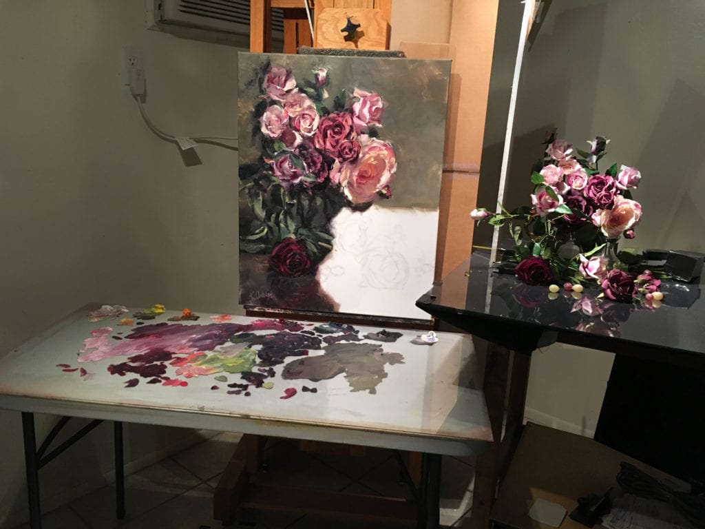
My favorite thing is an oversize palette table that sits in front of my studio easel. It is a 2 x 4 foot table covered with a sheet of glass of equal size. It is a tool that has transformed how I work and, as a consequence, the very nature of the paintings I produce. My original artistic training was in a traditional atelier or studio school. As a consequence I learned procedures which most traditional artists learn. I was taught to set my easel next to the model or subject I am going to paint, but to make all of my observation 5-6 feet in front of it. This way I am able to take in the entire canvas in a single glance, and observe the developing painting from the same distance it will most likely to be viewed by others.
Because of this there is a lot of walking back and forth from the viewing point and the canvas. And it was also for this reason that I was also taught to use a wooden thumb palette – so it is always at hand for mixing paints.
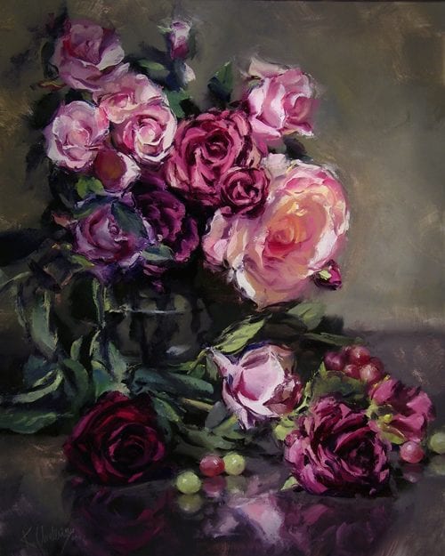
Roses and Grapes by Kurt Anderson
But over the years I have evolved as an artist. When I first began painting I used little dollops of paint and little brushes. But as time has passed I have used ever larger mounds of paint and ever larger brushes. Likewise, I graduated from a little thumb palette, to larger and larger palettes. At some point I found the larger palette too cumbersome to hold all the time so I set it on my taboret and mixed my paints at a fixed point in front of my easel. Since I wasn’t holding the palette I eventually got rid of the thumb palette altogether and started mixing my paint on a plate of glass (I think I took my cue from a book by John Howard Sanden). However, the real transformation came the day I purchased a 2 x 4 foot table and covered it with a plate of glass of the same dimensions.
This is what I now use to mix my colors. I still walk back and forth from my viewing point to the canvas, but the palette table sits directly in front of the canvas so that is where I do all of my paint mixing. I feel it has transformed my work since it has liberated me to mix copious amounts of paint with large bristle filbert brushes. I use bristle filberts of all sizes, but for the initial lay in I like to use number 12 filberts (about ¾ inch wide), and larger. I have several that are number 24 (about 2 inches wide).
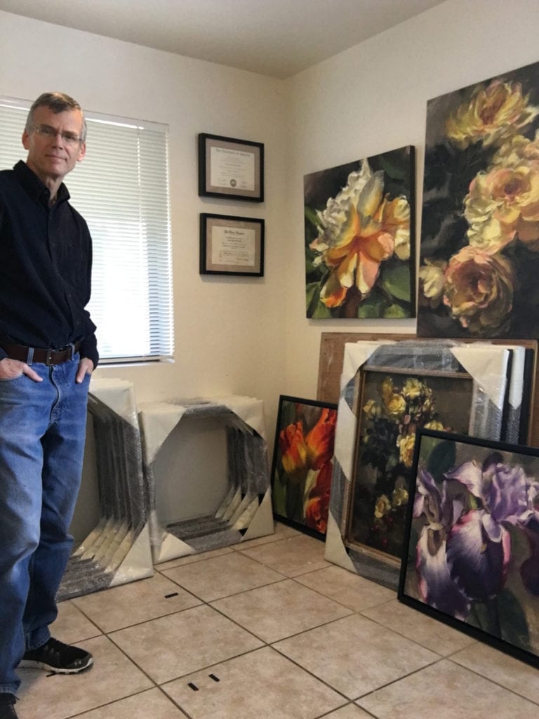
Kurt in Studio
Kurt in Studio
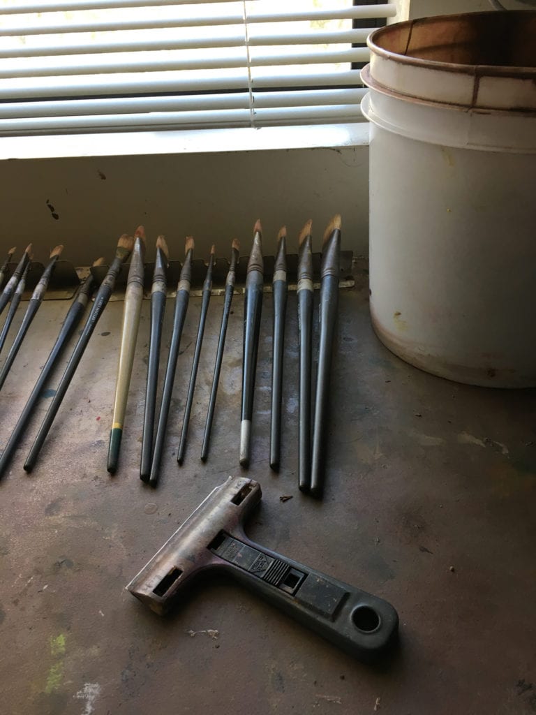
Scraper and Swirl Bucket

So my oversize palette is a favorite thing. But to make using a large glass palette practical, I have to mention another favorite tool. I used to use a small razor blade window scraper to clean my palette. It was a habit I picked up from other artists, and it seemed more efficient and effective than using a palette knife. But one day when I was at the hardware store I discovered an extra-large window scraper with a four inch blade, and I now find it indispensable for quickly scraping and cleaning the large expanse of glass.

Where did all the color go?

Mr. Will Maller · Apr 3, 2017 · 5 Comments

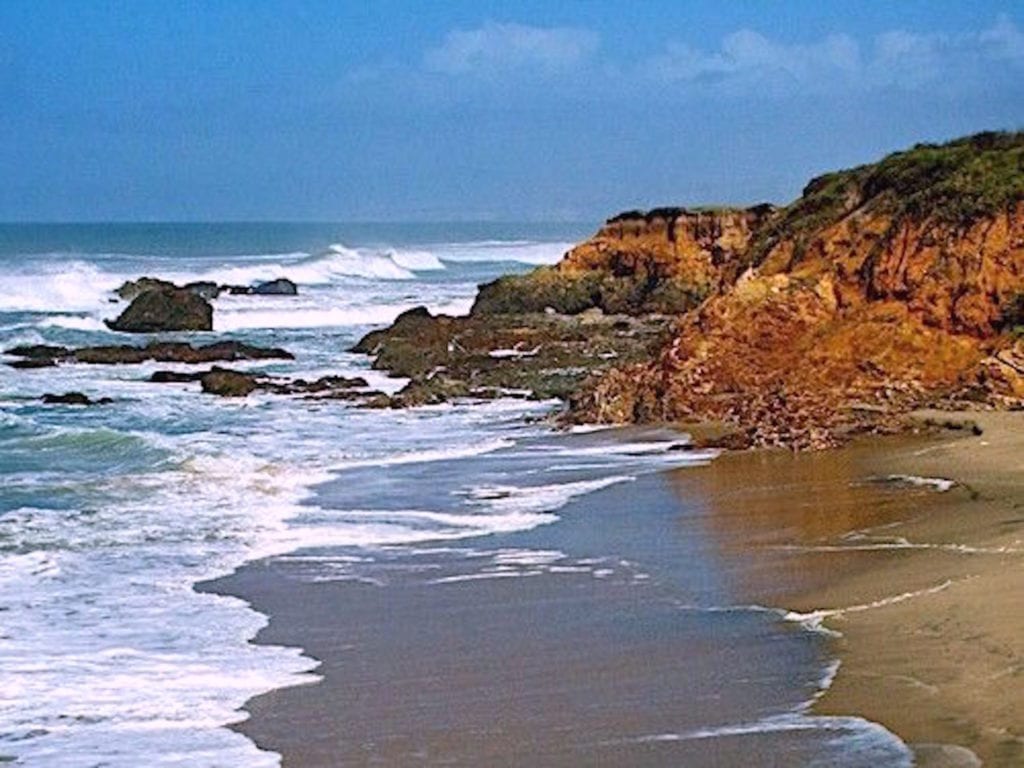
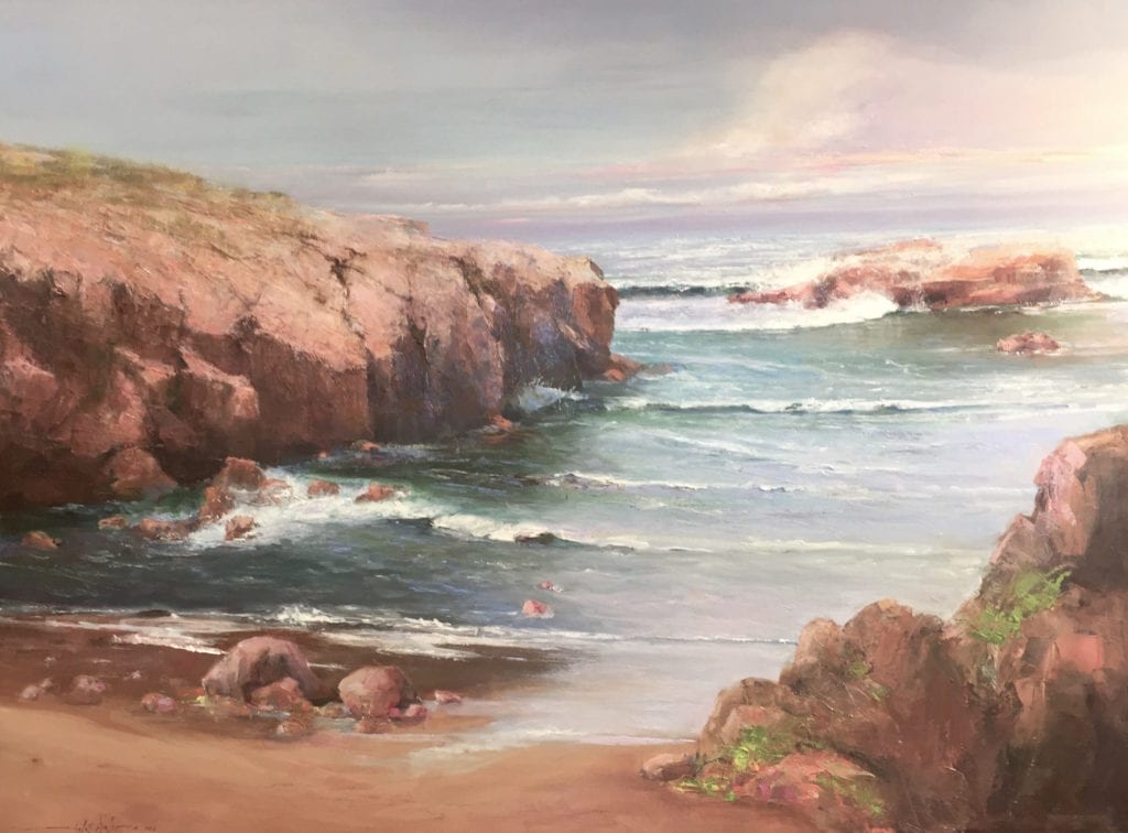
 Photo - San Mateo Coast at Pescadero
Photo – San Mateo Coast at Pescadero
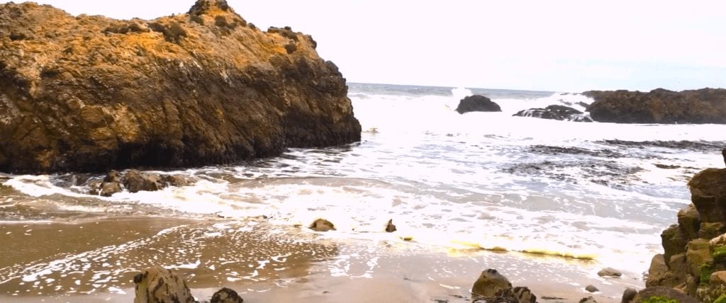
Last summer I received a personal invitation to participate in a museum show. I of course agreed. It only took two months after the invitation to work myself into a corner. This was to be a themed show: submit a larger studio work developed from two plein air studies. So it was off to my favorite Northern California coast location in San Mateo County at Pescadero. After a couple of months, I had eight or so plein air studies and a couple of starts on a larger studio piece. But the weather was not cooperating. With very few sunny days during the summer on this part of the coast, fog generally will burn off by noon and then it will just be overcast through evening. That is, until two to three weeks following Labor Day. Then the coastal fog front recedes and the fall days become warm and sunny. Color is infused into the coastal landscape, providing the perfect setting for end-of-summer beach activities including painting en Plein Air.
Not this year. After years of California drought, off-shore weather systems were now massing early off the coast. My favorite location had lost most of its sparkle and all of its high color. I am committed to this location at this point, however.
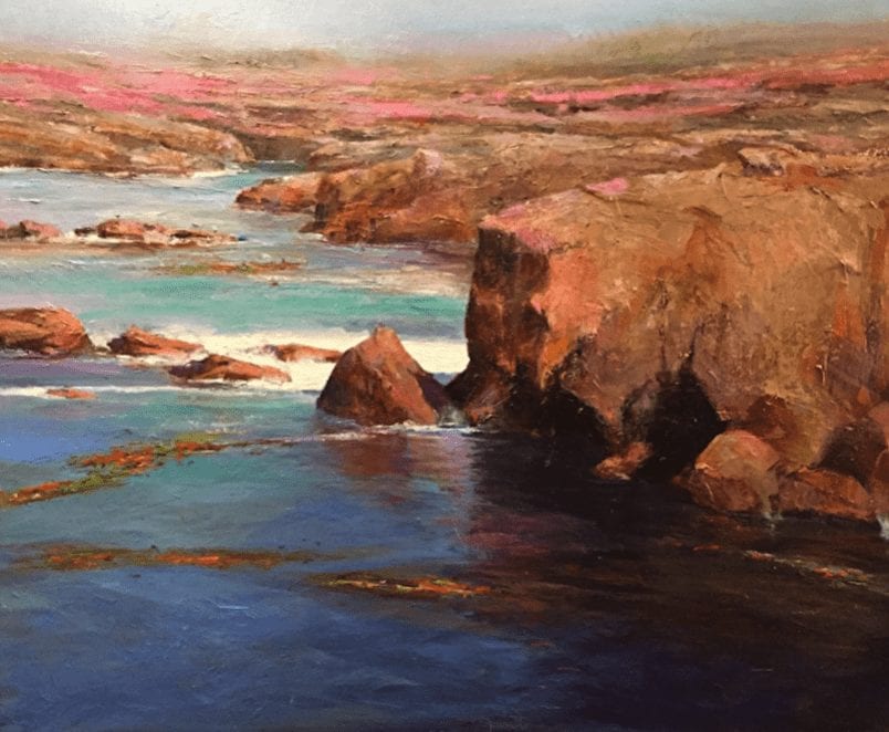
Photo - Pescadero Point
Photo – Pescadero Point
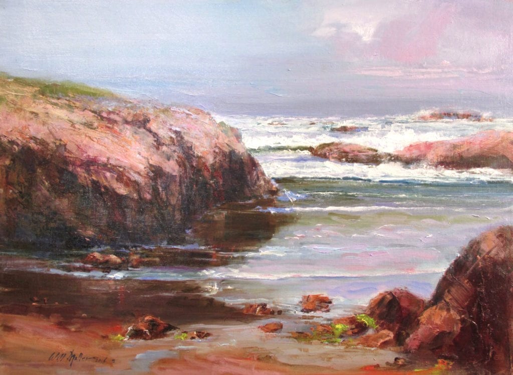
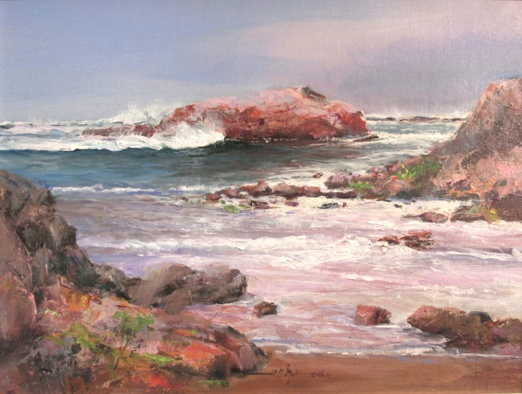
Not wanting to start making things up, I decided to complete the project and deal with all the grey atmosphere and moisture in the air as well as light fog. I struggled through another study and then decided on something I really don’t do— a limited pallet. In addition to my four colors (Cad Yellow Medium, Ultramarine Blue, Sap Green and Alizarin Crimson), I added three separate Grey’s—light, medium, and dark. Once I established a very tight value study with the Greys, I added color. The following two additional Plein Air studies were completed:
Receding Tide
Receding Tide
Incoming Tide
Incoming Tide

The next task was to paint my large studio piece. I used the same process as with the Plein Air studies—limiting my pallet, holding very tight with Grey mixtures, then adding color to complete San Mateo Coast.
30” x 40” San Mateo Coast

After completing my work for the museum show, I decided to apply the strategy to another painting at a different site. I was especially happy with Point Lobos Calm No. 2 and have since been using the limited pallet with a couple of accent colors for all of my Plein Air work.
24” x 30” - Point Lobos Calm No. 2
24” x 30” – Point Lobos Calm No. 2

I have just received notice that Point Lobos Calm No. 2 has been accepted to the Oil Painters of America 26th Annual National Juried Exhibition of Traditional Oils.
I think I’ll stick with this approach for awhile!

  • « Go to Previous Page
  • Page 1
  • Interim pages omitted …
  • Page 3
  • Page 4
  • Page 5
  • Page 6
  • Page 7
  • Go to Next Page »

Footer

  • Join OPA
  • Contact
  • Donate

© 2026 OPA - Oil Painters of America · Design by Steck Insights Web Design Logo