OPA will be taking Deep Dives into our archives and sharing our favorite posts from years past. Please enjoy this Deep Dive by Adam Clague OPA from 2019.
Mixing skin colors can be challenging. Flesh often contains hints of every color of the rainbow! Plus, it’s easy for skin tones to become “chalky” or “muddy.” In this article, I’ll share information to help you mix realistic, lively flesh colors.
Simplify
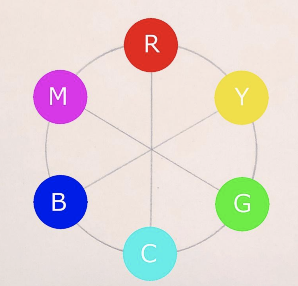
When I’m mixing skin colors, I often find it convenient to dip into every color on my palette. To simplify this process, I think of flesh as containing just three types of colors:
1. Reds
2. Yellows
3. “Nudge Colors” (I’ll define this in a second)
I find simplifying like this is an efficient approach to painting any skin color under typical conditions.
Mix Up Big Piles Of Average Colors
By “average” colors, I mean colors that represent the colors in the subject generally. I know you can see dozens of colors in your subject. But in the beginning, keep things simple and don’t try to match every color you see right away. You can mix more specific colors later with those “nudge colors” I’ll talk about.
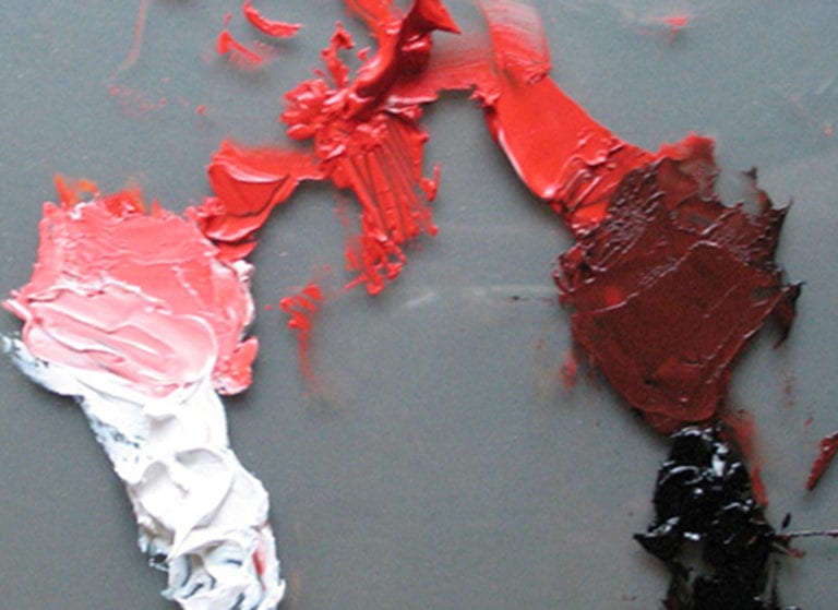
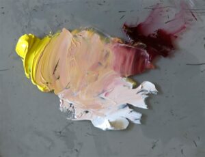
At the start, I mix up just 2 big piles of average color–1 average color for the lit side of the head and 1 average color for the shadowed side (below, you can see these two colors applied in broad, blocky shapes).
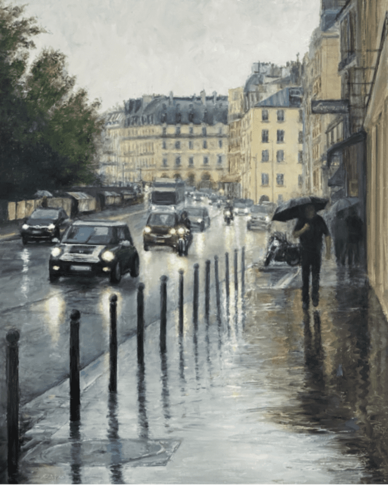
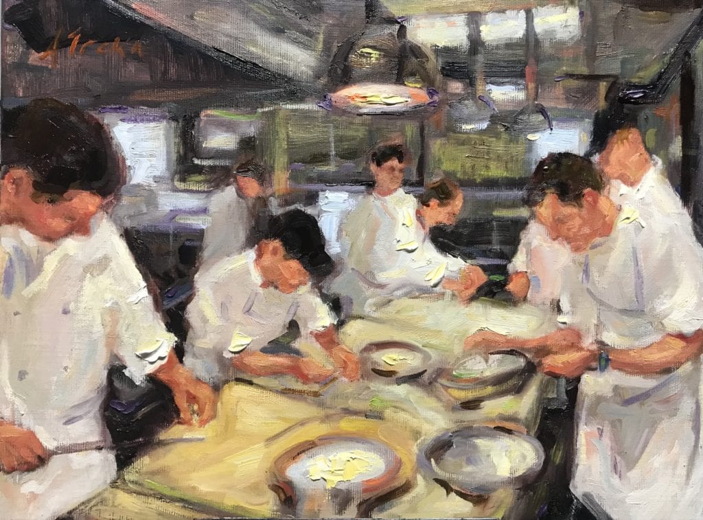
by Adam Clague OPA
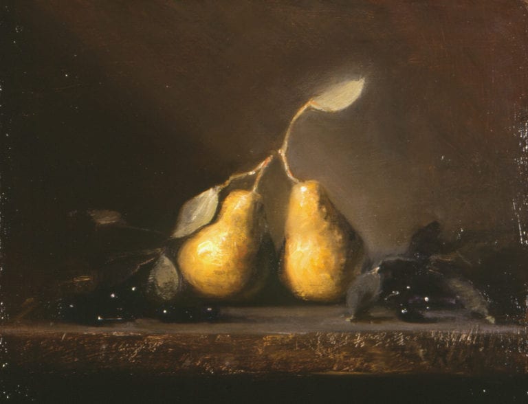
Oil – 12″ x 11″
Nudge as Needed
So what is a “nudge color” anyway?
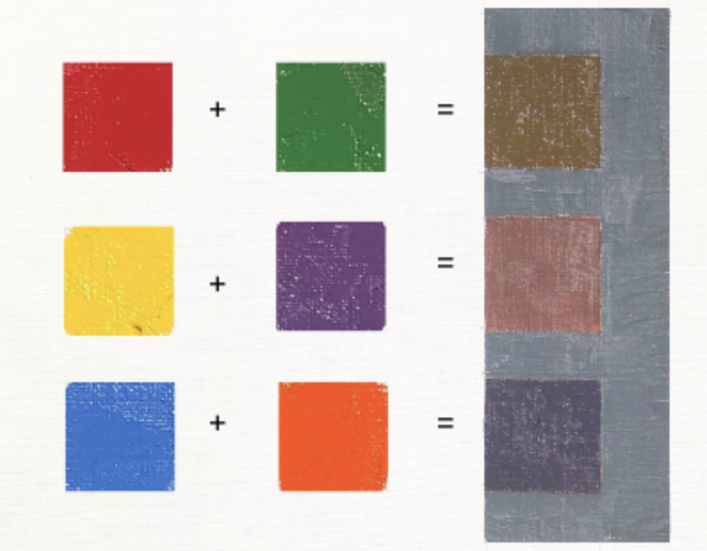
Well, mixing just red and yellow together can produce some pretty intense oranges that may not look natural as flesh colors. For this reason, it’s usually necessary to “nudge” your mixture toward one color or another by mixing in
Below are two examples of average color mixtures I often start out with. In both cases, white is used as a
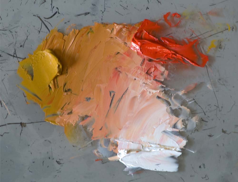
Now, although I often start with the above mixtures, I certainly also mix in various other nudge colors as necessary. Sometimes your subject will dictate a nudge toward green in places. Or blue. Or violet. In fact, any other color on your palette is a candidate for a nudge color.
How Do I Know Which Reds, Yellows and Nudge Colors to Use?
Excellent question. My best answer is let your subject be your guide. Choose colors that are appropriate for the values, temperatures and colors in the subject. In the end, observe your subject with care and faithfully paint the colors you see before you. Much more important than any formula is the process of training your eye to observe and paint faithfully.
Now that we’ve explored how to simplify and mix skin colors, let’s take a look at a common difficulty:
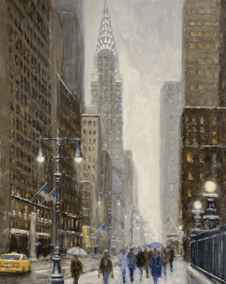
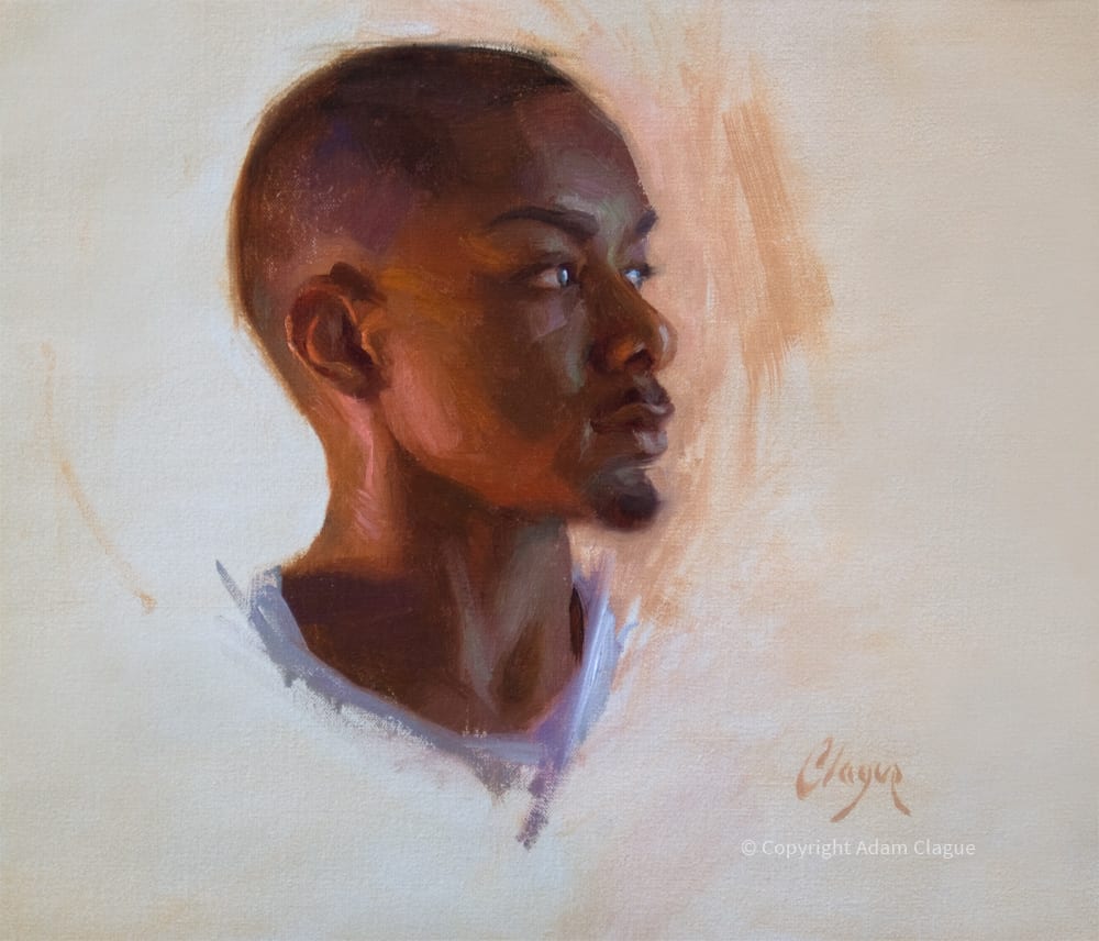
Muddy & Chalky Skin Tones
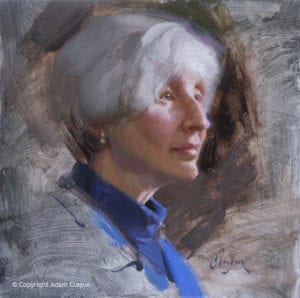
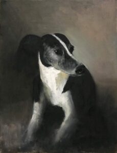
Oil – 12″ x 12″
It’s happened to all of us who have ever attempted to paint a portrait…
You’ve been painting that cherub of a child. You’ve been carefully trying to match the colors of that perfect, unblemished skin. You think you’ve nailed those rosy cheeks, that fair flesh, that sandy blonde hair.
But then you stand back from your work and… wow. Those cheeks are definitely rosy… like the red soil of Arizona. That
If only you had a chart of “skin-tone recipes” written by some Betty Crocker of the art world that would tell you exactly how to whip up big batches of “Satin Skin” and “Ethereal Epidermis” instead of the “mud,” “dirt” and “chalk” currently on your palette.
Fortunately, the cure for “muddy” or “chalky” color is not an unobtainable fantasy. In his book Alla Prima: Everything I Know About Painting, master artist Richard Schmid sheds light on this topic…
“’Muddy color’… is simply a color that is inappropriate in temperature” —Richard Schmid
“Muddy” and “chalky” color is not so much a color issue as it is a temperature issue. So let’s talk temperature…
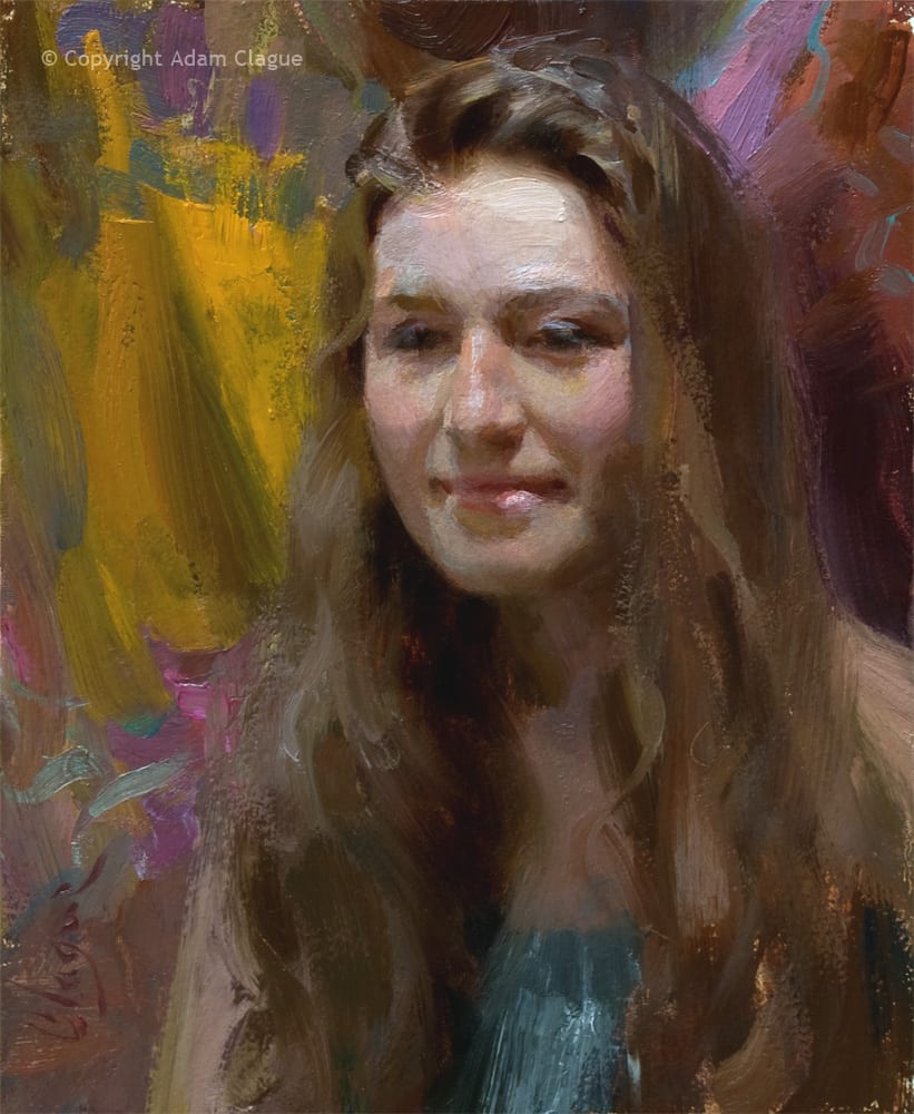
Temperature Basics
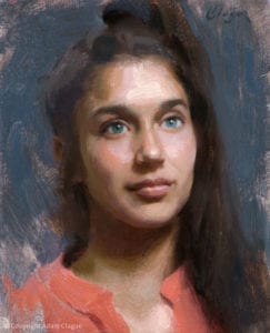
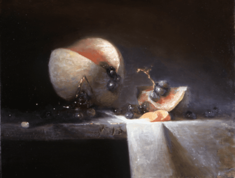
Oil – 10″ x 8″
Here is the first thing to understand about temperature: When you’re painting, there is no such thing as “warm” and “cool.” Th
Th
Side-Note: A color might also look “muddy” or “chalky” if it’s the wrong value. For example, a shape that’s too dark on a portrait will look like just that–a dark smudge on the face. But given the value is correct, the reason a color looks “muddy” or “chalky” is that it’s either too warm or too cool in comparison to the surrounding colors.
But of course, this information is useless unless you know how to fix a mixture that’s too warm or too cool…
Two Ways You Can Make A Color Warmer Or Cooler
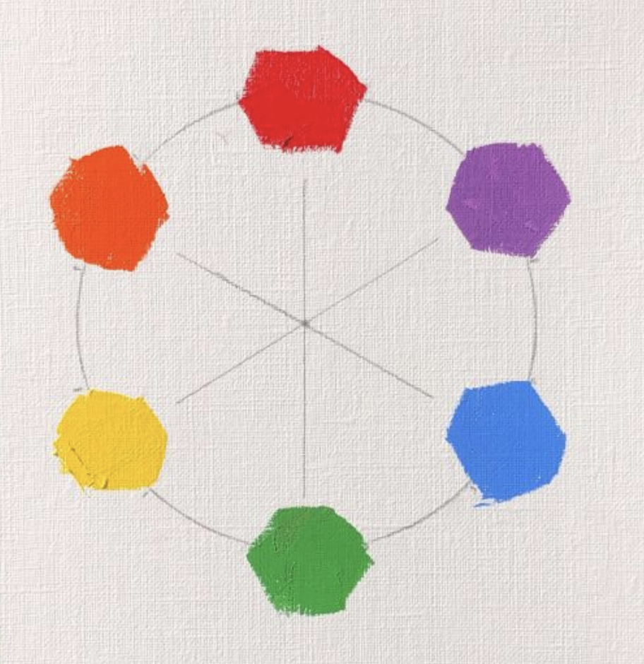
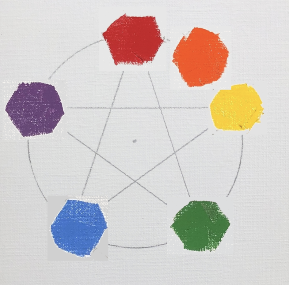
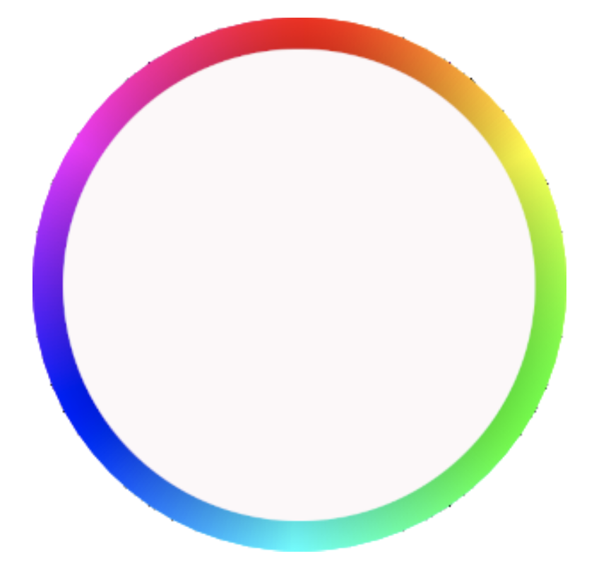
1: By Moving Around the Color Wheel Like a Clock
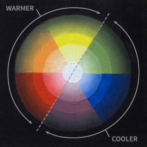
First, however, here are two important things to know: 1) the red-orange-yellow side of the color wheel is considered “warmer” than the green-blue-violet side, which is considered “cooler.” 2) Most consider either bright yellow or yellow-orange the very warmest color. Blue is considered the coolest color (However, there’s an exception that I’ll mention in a bit…)
Now, imagine you’re traveling around this color wheel like the hand of a clock. The closer you move toward the cooler side, the cooler the color will become. The closer you move toward to the warmer side, the warmer the color will become.
Here are two examples:
Let’s say you’re standing on that very warmest color–a bright yellow-orange. You take one step clockwise toward the green. Now, you’re standing on a yellow that’s tinted with a hint of green. This yellow-green is cooler than the yellow-orange because you’ve moved closer to the cooler side of the color wheel.
This time, start out on violet. Take one step counter-clockwise toward the blue. Now, you’re standing on blue-violet, which is cooler than violet because it’s closer to blue and because you’ve moved further away from the warmer side of the color wheel.
The 2nd way you can make a color warmer or cooler is…
2. By Moving Along Imaginary Spokes of the Color Wheel
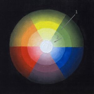
Earlier, I said blue is considered the coolest color, but I mentioned there’s an exception…
It’s true that blue is the coolest color of the rainbow. However, for the painter, there is one other color so icy, it gives blue frostbite… pure white.
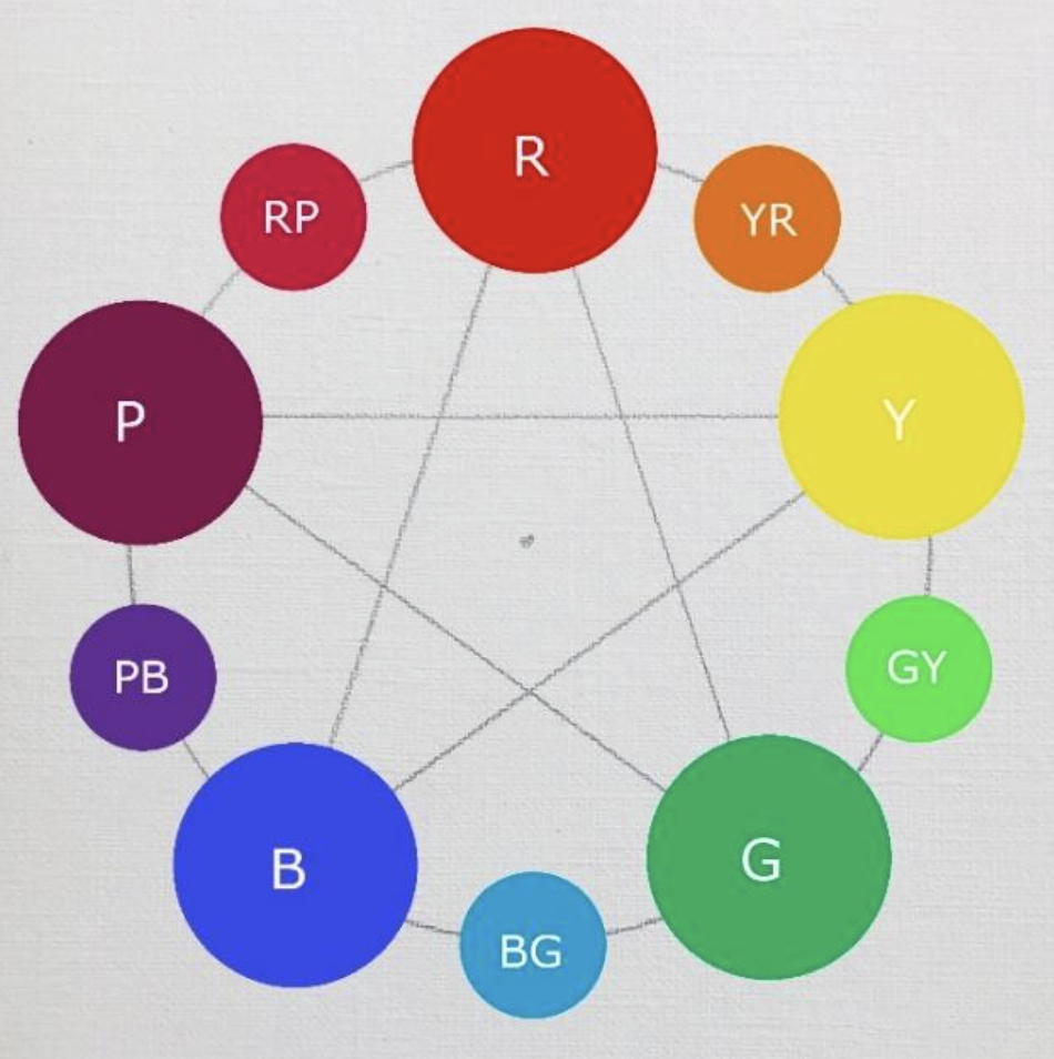
In this particular color wheel, you’ll notice there is a narrow ring that contains the main colors in their most saturated forms (1)…
The farther you travel away from this ring toward the center of the circle, the more white is added (2).
Adding white will cool any other color… even blue!
Did you find this lesson valuable? Watch me demonstrate these
principles on video in my online course, “Learn to Paint Dynamic
Portraits & Figures in Oil.” You can access the first unit for free! To
learn more, please visit ClagueFineArt.com.
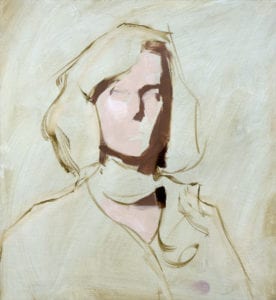
by Adam Clague OPA
Oil – 12″ x 9″