Do you wish your studio space were more functional? Do you want to paint more comfortably? Do you have limited space and wish to utilize as much of your available space as possible? I have found some fantastic ideas for my art studio space that I would like to share, and I would love to hear from you. What are your favorite things in your studio that make your life easier?
I’ve been oil painting since the age of 11. I have had everything from a walk-in closet as a “studio” to using a small corner space in a studio apartment. I now work in a spare bedroom that I converted into my studio space. I spent most of my painting life with my tubes of paint in a tackle box or scattered about in random drawers. I have had canvases and frames scattered about so much at times that I have walked through a maze to get to my easel. The biggest struggle I have had is being comfortable at my easel! I stand when I paint, and I paint from life. I have stacked boxes on top of boxes to get a setup at the eye level I desired. I even spent one painful time painting with my knees bent and back hunched so that my eye level was ideal to my desired painting.
There were a few years where I had the same “bird’s-eye” view because I couldn’t figure out a functional way to stand and paint with any other view. So, wherever you are, in a tiny studio or corner of a room or even if you have the luxury of a large studio space, we can all use some tips and tricks to make our lives easier. What I am about to share is affordable and easily obtained.
MY #1 ALL-TIME FAVORITE STUDIO IDEA THAT HAS MADE A SIGNIFICANT IMPACT ON THE WAY I PAINT IS: a simple rack/ shelving system that can be found at any hardware store. I think these were originally designed for closets. I saw the studio of a dear artist friend of mine, Trish Wend. She also likes to stand when she paints and with her contractor designed a functional way to hang brackets on a wall and use adjustable bracket holders for any eye level she desired. Well, I immediately thought, “I want that!” I had a spare wall in my studio, so I excitedly went into the hardware store and purchased the simple items that changed my painting life forever. (I realize I am being dramatic, but it is the truth. I treasure painting from life and I am so happy with this little invention.)
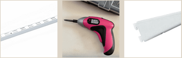
I hung the bracket holders on the wall at various distances apart. For those who like to work from a computer monitor or photos, you can put your device at any eye level you wish and paint comfortably – no matter your height or stance.
The brackets themselves run about $5 a piece as well. I bought four standard sizes and I did buy two special order 24″ brackets for my heavier table scenes. I think these were $10 a piece.
Don’t judge. 🙂 My engineer husband had to leave the room when he saw how I was hanging them. In case you’re curious too, there were already nail holes from a previous shelf. I used those holes for two of the bracket holders and the other two bracket holders are in studs. I love it because it gives me great flexibility in what I want to create and, also, the option to have two setups at the same time if I desire.
So, for about $50 – I finally have a comfortable, interchangeable system for any and all of my still life setups. The moment of reckoning occurred as I tested my contracting skills to see if they would actually hold weight. I was quite proud of myself, pink drill and all.
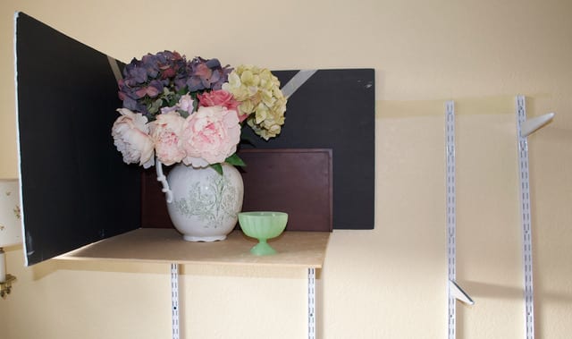
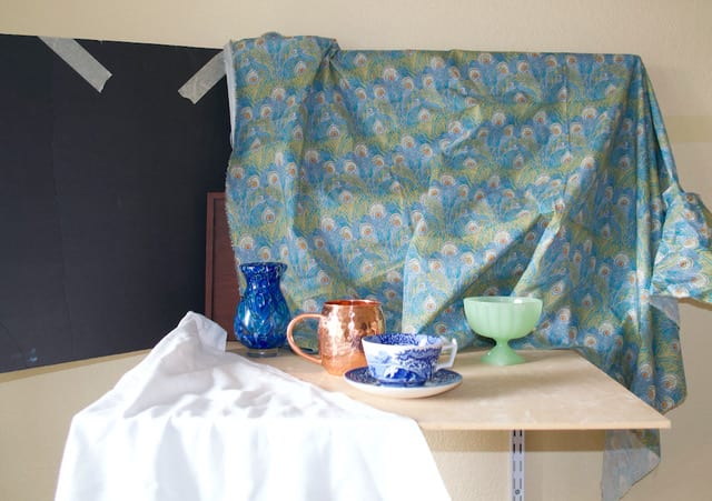
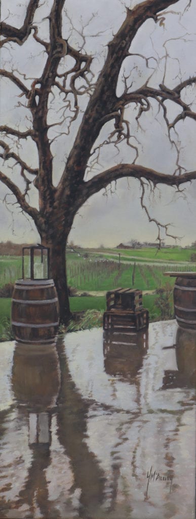
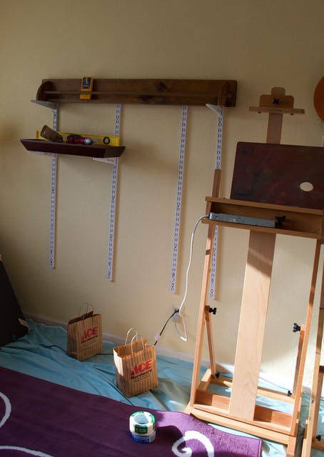
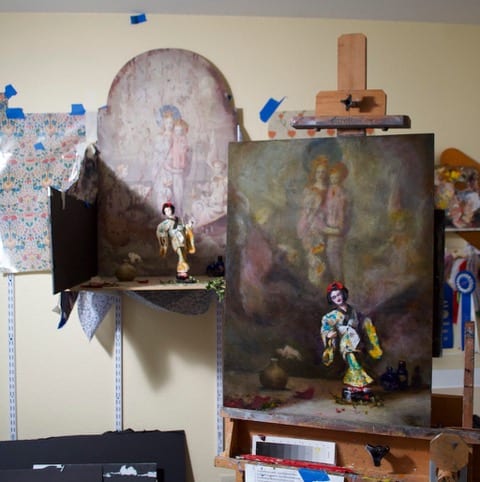
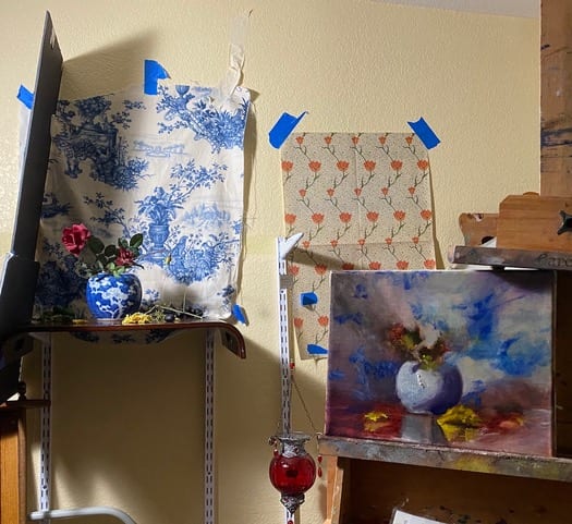
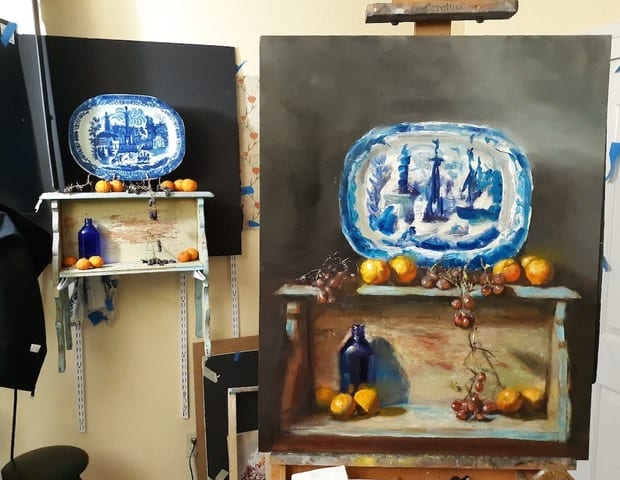
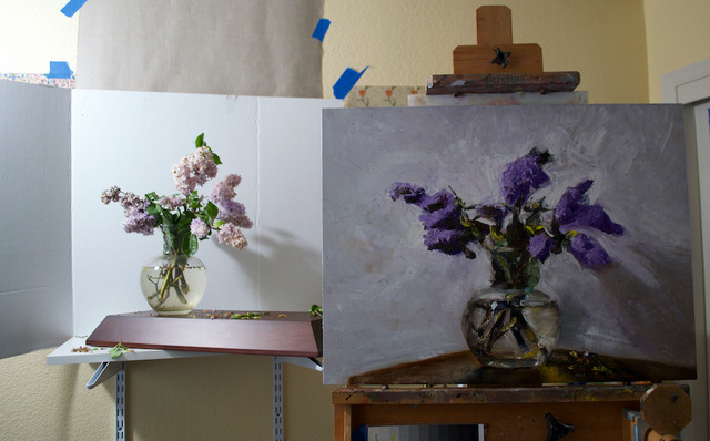
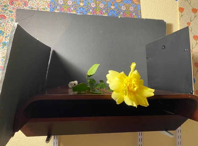
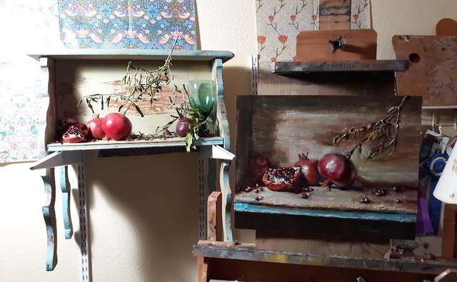
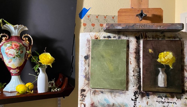
Some examples of the shelving system in action:
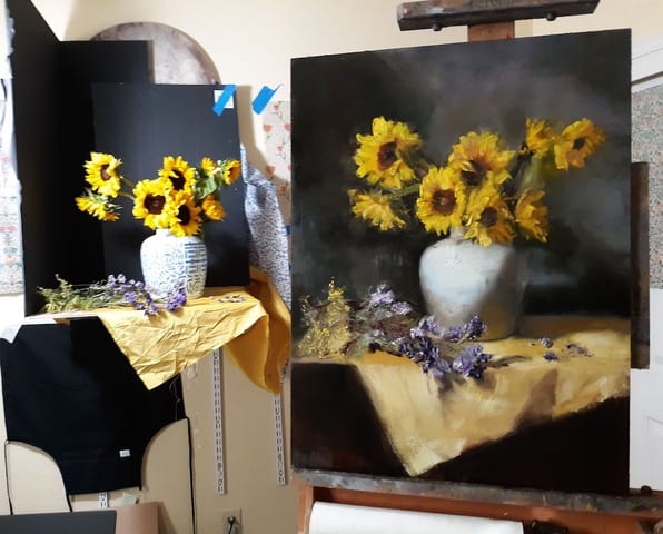
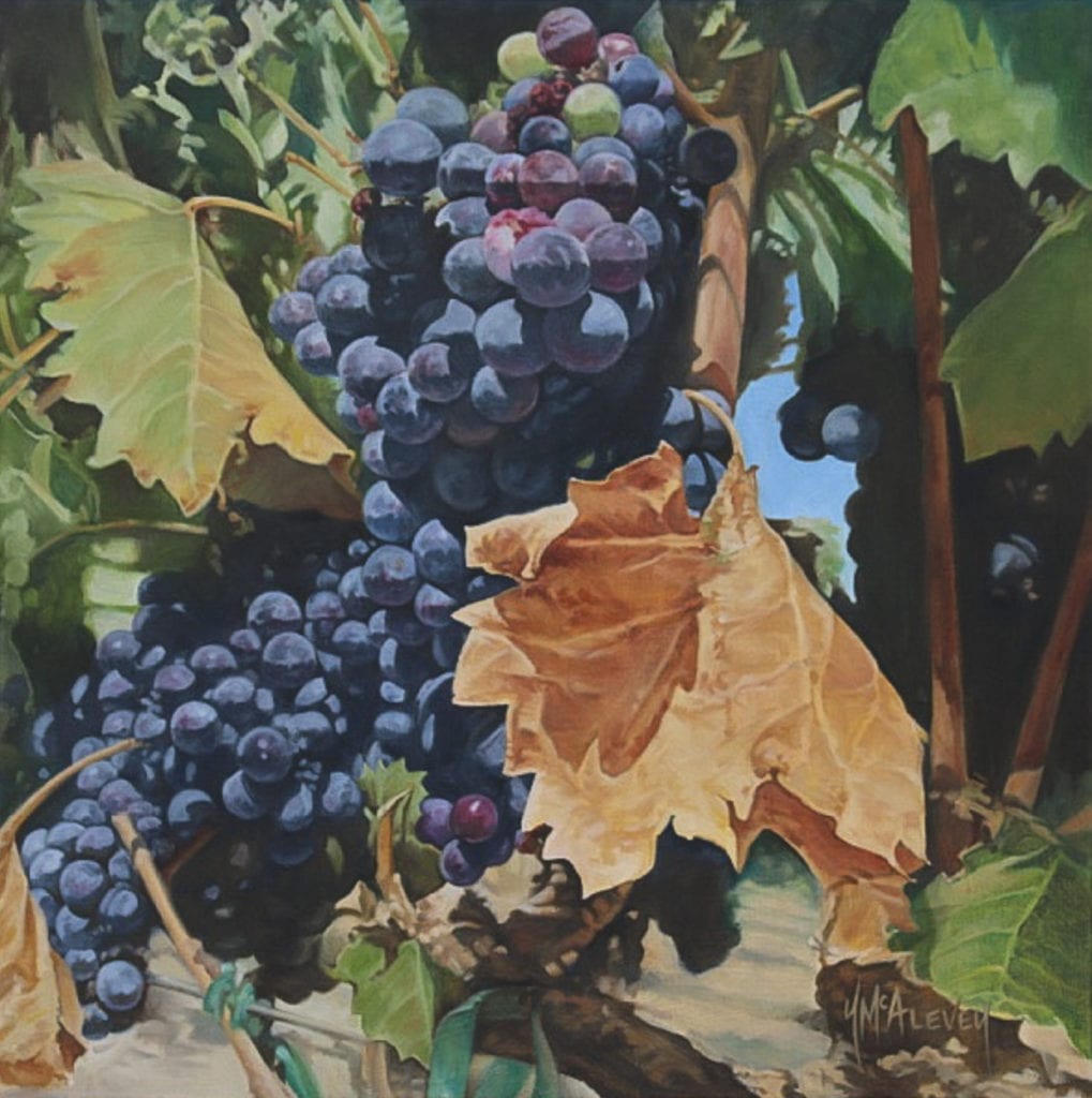
I would guess the above entire “scene” weighed about forty pounds. That back panel is an antique and heavy. I have not run across any issues with weight limitations. Now, I suppose if I had a model sit on a table, there may be some buckling walls or falling debris; but I’m not that silly.

I know many artists are fancy; but I just use fabrics and cheap foam core from the dollar store for my shadow box configurations. I also use the dollar store foam core as my light blockers, and I have a collection of gorgeous fabrics that I love to play around with in scenes. The possibilities are endless. I have even used towels or shirts as “drapery” or “tablecloths”. There have been times in my life where I felt that I didn’t have the “perfect” props or supplies. Now I know what a huge waste of time that was for me. Nothing is perfect. Make do with what you have and believe me, you have a lot!
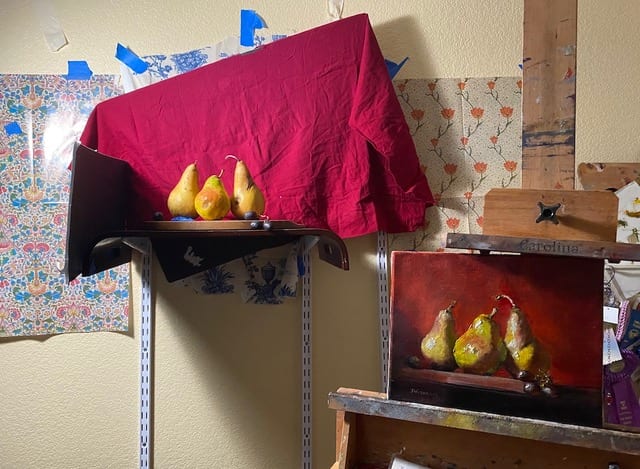
The above red cloth is from an old ottoman I used to have. I cut the fabric off the top before throwing the ottoman away. I then just wrapped the cloth around a piece of foam core. The pears are sitting on an old cutting board and I have blue painter’s tape keeping them upright. I called this one “The Pears From Hell, and Grapes” Gosh, those things were changing colors on me by the hour! Anyway, I digress…. back to the studio shelf examples:
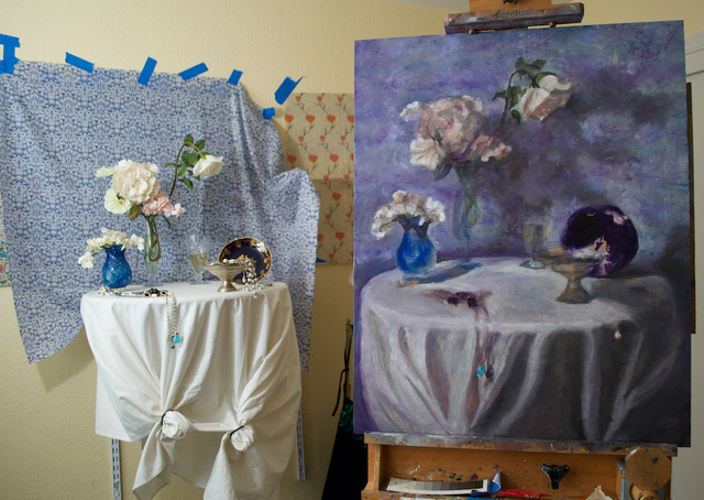
So, you get the idea. I can do anything and everything with these brackets and bracket holders. I do recommend getting the 24″ bracket for the heavier projects – the additional depth is very helpful for tables or furniture.
My other favorite things in my studio are:
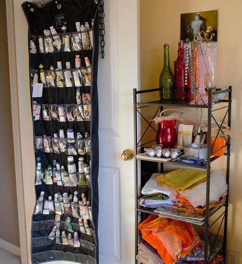
PAINT TUBE STORAGE – I’ve seen some artists use shoe holders. I found this at an art supply store (Artist’s Loft makes it) and don’t know how I lived so many years digging around for paint in drawers or toolboxes.
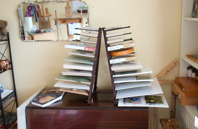
SPACE SAVERS – I love, love, love this panel/canvas holder. This can be configured in three different ways, and I personally like this version for my specific needs. This is called “Rue Panel Ladder and Storage Rack”.
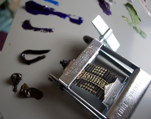
TUBE WRINGER!!! – I’d love to know what took me so long to get one of these babies. Goodness gracious! The amount of paint I can get out of an otherwise “empty” tube is amazing!
My favorite one is: “TubeWringers Metal Rollers By Gill Mechanical Co”. I know some artists who use plain ole’ toothpaste tube wringers. I also cut the cinched part and fold the bottom.
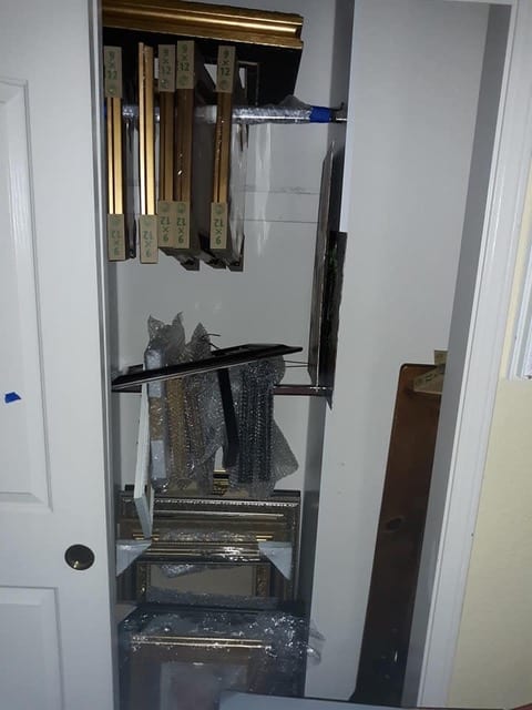
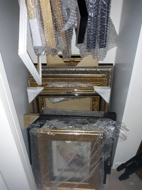
FRAME STORAGE – One other thing that I love that saves me so much space is hanging my frames in a closet. It just so happens those bars lift up, so I decided to stack some frames on them with bubble wrap on the bars to stop scratching. Frames used to take up an inordinate amount of space in my studio.
CONCLUSION – The possibilities are endless for more efficient art studio space and I have discovered my favorite things by implementing ideas from so many clever artists. Save interesting old fabric, save beautiful vases and props, and maybe get art supplies up off of flat surfaces into accessible, vertical storage of some kind.
I would love to hear your favorite Studio Tips and Tricks in the comments below.