Prior to becoming a full-time artist I spent 12 years as a Digital Imaging Technician for a professional photo lab. It explains, at least in part, how I can get excited about things like matching the temperature of my studio lights to the white-point setting of my camera. My day to day job was basically “all things Photoshop” – from scanning, to color management to image editing and pre-press. And I worked with many well-known local artists, like Skip Whitcomb and Richard Schmid. In fact I did all the scanning and color work for Schmid’s books: Alla Prima and The Landscapes. The knowledge I gained during those years has proven invaluable to me as a fine artist. One area of particular benefit has been in setting up a consistent work flow – from studio lighting to photograph-ing my own work and ultimately preparing and perfecting the images for advertising, printing and submitting to shows or magazines. So I thought it would be useful to share some of the things I’ve learned along the way, and I’ll begin at the beginning with studio lighting.
But before going into my own studio lighting setup, it’ll be helpful to touch on a few lighting basics. If you want to skip ahead to my setup I won’t be offended. But for the rest of us geeks here we go.
Source: Medium.com (https://medium.com/@Dropality/matching-lights-color-temperature-to-your-home-8ee80cc79474)
Color Temperature
There’s a lot of technical info on the web about how the temperature of a light source – expressed in Kelvins – corresponds to the hue of the light emitted. If you are interested feel free to investigate this more in your spare time and learn about things like “black body radiators” and “Planckian locus”. But let’s face it, we’re artists not scientists. All we need to know is what color is our light and how will it affect our paintings.
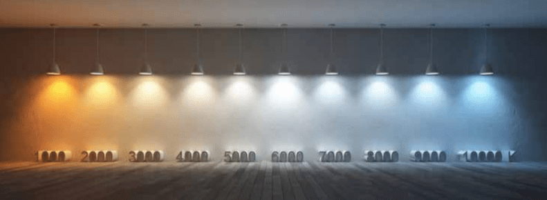
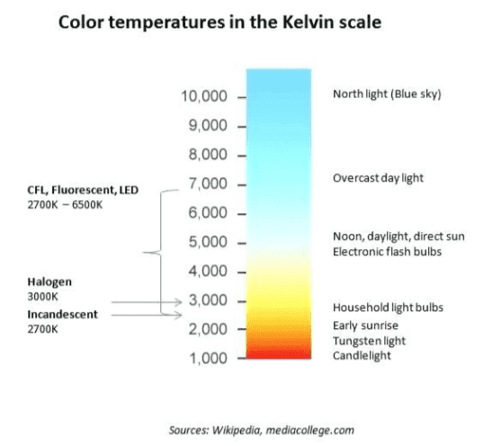
As it applies to artificial light like LEDs we are talking more specifically about Correlated Color Temperature (CCT) which is a visual color approximation of these Kelvin temperature hues. And, as if to confirm that none of these scales were created by artists: the higher the temperature on the Kelvin scale the cooler or “bluer” the light; a paradox that I assure you makes sense to scientists. Temperatures at 5000K and above begin to shift towards Blue and below 5000K towards red. On opposite ends of the scale, Candlelight would be approximately 1000K and North light would be 10,000K.
The ideal light source for accurate color rendering will have a color temperature between 5000K-6500K (natural daylight) and a high CRI value – which we’ll get to next. (Source: https://www.fullspectrumsolutions.com/pages/cri-explained)
Color Rendering Index (CRI)
This is a scale between 0-100 that measures a light’s ability to reveal colors accurately. And it’s not a subjective scale – there’s actual math involved. Basically the higher the number here the better. Sunlight, natural light and incandescent light all have CRI values of 100. For art studios, anything above 95 is ideal. Above 80 is OK. But CRI is only part of the equation. For example incandescent bulbs have a CRI of 100 (since they use thermal radiation to produce light) but their temperature is limited to only around 2700K leaving them deficient in revealing the blue spectrum of color. North Light also has a CRI of 100 but with a color temperature of 10000K it lacks the ability to accurately reveal the yellow/red color spectrum. Daylight which is the basis for all of our color perceptions has a CRI of 100 and a color temperature between 5000K-6500K revealing the most accurate color. (Source: https://www.fullspectrumsolutions.com/pages/cri-explained)
Lumens and Lux
Lumens describes how much light is emitted by a light source and Lux is how much of that light is actually falling on a particular area. Lux should always have a distance associated with it (i.e. 2450 lx @ .5 meters). There’s no perfect amount of Lumens or Lux that I’ve seen expressed in a way that would describe an ideal for every artist in every studio. But some consideration for common tendencies is helpful. For example, if you paint in a studio that is too brightly lit the tendency is to compensate with a very dark or low-key painting. If your paintings look consistently too dark in their final destination, you’ll want to lower the brightness in your studio. You’ll compensate with a lighter painting. Conversely, a dimly lit studio may lead to a high-key painting. From my own experience and research, it seems that 7500 LM is a good number for an average-sized room and depending on distance of this light to your painting this equates to somewhere in the neighborhood of 600-1000 lux on your canvas. Here’s a link to a handy Lux to Lumens calculator: https://www.bannerengineering.com/us/en/company/expert-insights/lux-lumens-calculator.html
My Studio Set-up
My studio is in the unfinished basement of my home with my easel set near a small north light window well. Although north light has a consistent color temperature throughout the day, I’m not a huge fan of the blueness of the light and I’ve found the brightness varies greatly. So even with the small amount coming in the window well I rely mostly on artificial light at the easel. When you’re relying on artificial light or even supplementing natural light it’s very important to find the right artificial lights. Which leads to my current setup. About a year ago I replaced two giant, boat-anchor sized fluorescent lighting units (I’m guessing the CRI was at or below 80), with three small, 8×10-inch, flat panel, LED lights from Viltrox (About $200 on Amazon for 3 lights, including stands and remote controls). They have a high CRI (95+), Color temperature adjustable from 3300K to 5600K and brightness adjustable from 20%-100% (up to 2500 Lumens each).
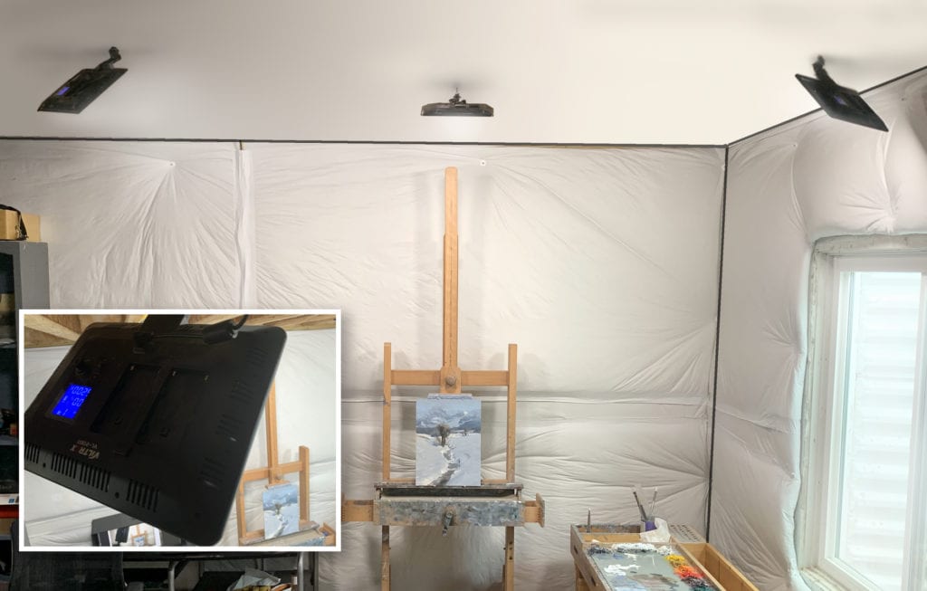
I’ve photoshopped in a ceiling over the framework of my unfinished basement to better show the positioning of my LED lights: 2 at 45-degree angles to my canvas and 1 overhead. The inset shows a closeup of the Viltrox LED light panel.
Although they are intended as mobile, stand lights, I mounted them on the ceiling to free up studio space (2 on either side at 45-degree angles and one overhead) – a luxury afforded by working in an unfinished basement. But if you have a finished studio you’d probably want to consult an electrician to do this as they are not originally designed for that purpose. That said they work perfectly well on the floor too. In fact, I also purchased two slightly larger and brighter panels (400t) that remain on their stands. I use them for doing workshop demos as they are easily portable – In fact they’ll fit in a regular laptop bag. I also purchased some battery packs in case I can’t be near an outlet. In the studio they are great for lighting models and still life setups. And you can control them individually or as a group with the included remote control. For example, I can turn off the light directly over my easel and keep the angled lights on.
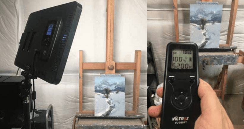
Image on the left shows the larger 400t LED light panel which I use on the stand that comes with it. Image on the right shows the remote control that also comes with these light panels.
By far the biggest advantage with these lights is the ability to adjust both the brightness and color temperature. With my old florescent and incandescent units the only way to do this was to change the bulb. And with these old units I would always opt for 5000K bulbs since the alternative choices for natural daylight were either too cool (6500K) or too warm (4100K). Now that I can be more picky I generally set mine to 5200K at 100% (I tend to paint on the cool side and this evens me out a bit). But, again, figuring out your tendencies is important especially if you are able to adjust color temperature on-the-fly and with precision. In fact you might be able to paint a nocturne during the day if you set your lights warm enough (you’ll compensate with a nice blue, nocturne-like painting!) And once you’ve finished a painting and it’s sitting on the easel ready to be photographed, there’s one more very unique advantage to being able to adjust the color temperature of your lights – you can set your camera white-point to “Daylight” (approx. 5200K) and set your studio to 5200K and take perfectly color balanced photos. But that’s a topic for another day.
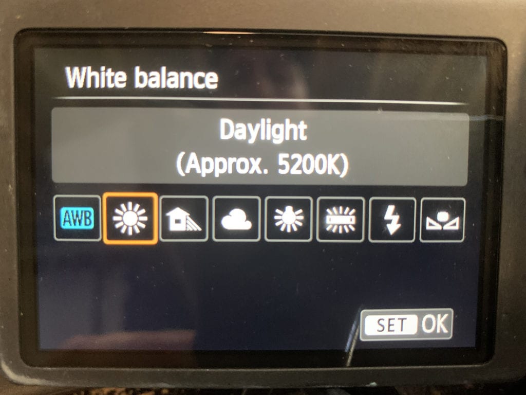
This is the setting I use on my digital camera for shooting my work. I used to set a custom white- point using a gray card (icon on the far right). But there’s no longer a need since I can set my studio color temperature to match my camera setting.