Perhaps one of the more perplexing problems for new and developing landscape artists is how to effectively depict grasses. It’s easy for grasses to come out looking contrived or worse, like a bad hair transplant. I know, cuz I’ve been there, done that. Not the hair transplant, the contrived looking grasses. Here’s a workable solution for painting more natural looking grasses:
Try Painting Masses Not Grasses!
Sergei Bongart
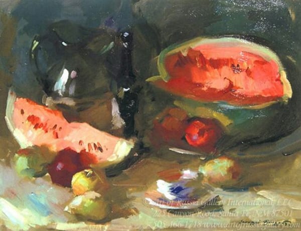
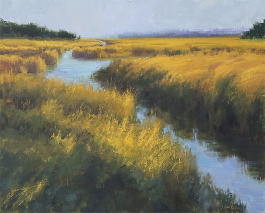
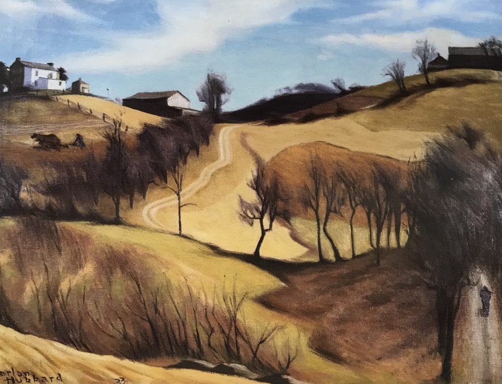
In my painting, Low Country Marsh, the big mass on the right has the look and feel of grass even though individual blades are not really painted. But the irregularly shaped box with it’s vertical side and horizontal top is well defined. The sides are in shadow, the tops are in light. It’s the irregular, relatively soft juncture (edge) between tops and sides that gives the feel of grass. A little detail in the foreground mass helps the viewer infer detail in that mass, too. The same idea plays out in the background tufts of grass as well. The only detail is in the foreground and even there, it’s pretty sparse mostly suggested.
Robert Simone
16″ x 20″
In short, “Painting Masses Not Grasses”, means keeping all detail subordinate to the overall mass. Your viewer’s mind will fill in what’s lacking.
Uncategorized
Choosing a New Direction
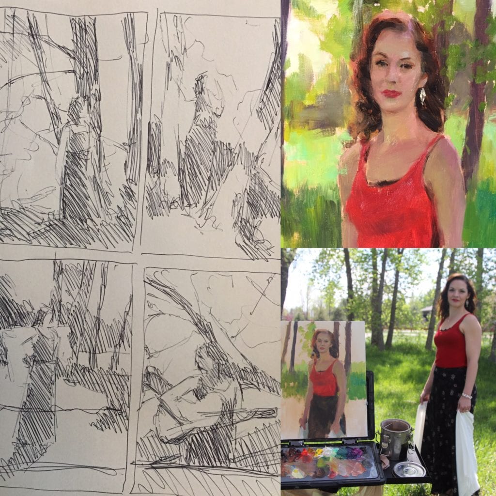
One of the biggest lessons I’ve been learning lately as an artist is to be patient with myself and the process. While patience often comes naturally with age and experience, it can also be developed intentionally in your art by forcing yourself to step back from a painting and allow it some time and space. In a previous blog post called “Let the Dead Paintings Die,” I discuss letting go of paintings for good. But in this post, I address giving the work a second chance. Sometimes it takes weeks or months before a painting can “tell” me what it needs. My recent painting, “A New Road,” is a great example of this.
I began this piece nine months ago. I am usually a very fast painter, especially when I am excited about the subject. Sometimes I can finish a large scale painting in a matter of 1-2 weeks… so nine months is a ridiculous amount of time for me. From the start, I was excited about the painting’s potential, but here’s the story of why it took me so long to complete it.
bottom right.
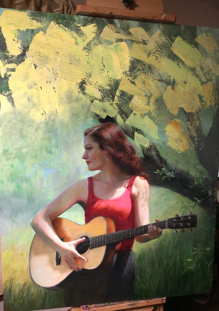
But execution of the idea proved to be disastrous. First of all… I’ve never been the kind of artist who delights in painting every single leaf (I am all about shortcuts!). Second, I’ve never attempted to paint a tree this large, in a portrait, with the tree having this much importance in the design. Given that my model, Corinne, had posed for me in the spring, the leaves were not even fully developed yet, they had an airy, wispy look to them—in other words—no structure. No defined shapes. It was a nightmare. At first, I attempted to paint every branch and leaf, still trying to “design” the diagonals and shapes as I went but becoming quickly exhausted and annoyed with it. I let the painting sit for a while, only working occasionally on the figure or the guitar, which both came much easier to me! Then, I decided to go back to my original location and re-shoot the tree. I went back twice, but the summer weather proved a nuisance each time, clouding over when I needed sunshine. Additionally, the tree had filled out and didn’t even look remotely close to the way it had in the spring. I found other trees with similar branch structures to photograph and use as reference.
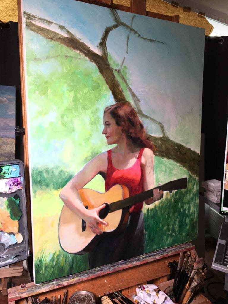
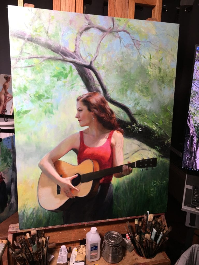
Above are some photos of the painting during its initial block in, and work on the tree.
Months went by. I kept trying one approach after another. I changed the shapes of the larger branches. I tried making everything lighter… then I tried making everything darker. I hated everything I was doing. As I type this, I realize how pathetic all of it sounds!
Finally… this past week, after another failed attempt at resuscitating that stupid tree, I mixed up a giant glob of pale yellow and painted over the entire background with a palette knife. It was invigorating. I was finally willing to let go of my initial design and allow the painting to take a direction of its own (hence, the painting’s title, “A New Road”).
In summary, if a painting is worth rescuing, then do it, no matter how long it takes. And be willing to think beyond your initial concept. Let go of the thing that’s holding you back from making it great, and allow yourself creative freedom to do whatever it takes to bring the painting to the next level! In this case, I repainted the entire background, creating an impressionistic rendition of a sun-dappled path… and it fit the painting perfectly. Hopefully the lessons I learned from “A New Path” will prevent me from scrapping future paintings when all they need is a little time and patience.
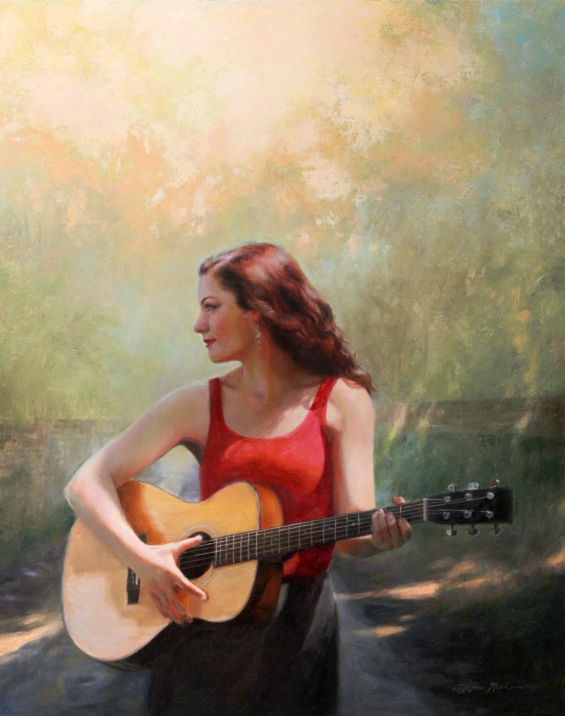
Anna Rose Bain
38″ x 30″
oil on linen (2018)
Alla Prima: Everything I Know About Painting (Richard Schmid) Chapter 1 “Good Ideas and Free Advice”, p. 19.
Dear Harlan,
Buddy is the husband of oil painter, Kathie Odom. His habits include letter-writing, talking about himself in third-person and over-using hyphens.
Sometimes I find it hard to gather words sufficiently. But I decided long ago not to let that shut me down in speaking or writing. Thus my brief letter to you.
I like the way you lived.
1900 – 1988
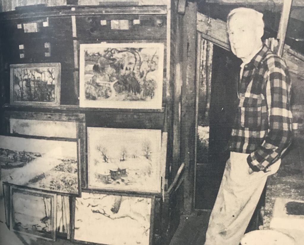
In my mind’s eye I can see you now stepping Thoreau-ish into the woods with an axe in one hand and a paintbrush in the other. That plaid flannel shirt was your go-to and there was such resoluteness in your ways. At first glance one might call you a quiet farmer. But your silence was of the contemplative nature that longed for bird song to echo around in your soul. And your farming was simply an expression of your hunger to create, as you also did with watercolors and oils. You once said, “A painting, to be good, must be done with dash and abandonment, even one which has meticulous detail. If one niggles over it, the result is dull and lifeless.”
Well, dull and lifeless you were not! After building a shantyboat out of whatever was at hand, you and Anna took years to actually float the Ohio River from Kentucky clear to New Orleans… stopping only to grow summer crops on a south-facing slope! You loved the earth and treated her as a loving mother, receiving not taking.
In your paintings I see that non-niggling dash and abandonment, sort of like author Annie Dillard describes,
Oil on Canvas,
22″ x 28″
One of the few things I know about writing is this: spend it all, shoot it, play it, lose it, all, right away, every time. Do not hoard what seems good for a later place in the book, or for another book; give it, give it all, give it now. The impulse to save something good for a better place later is the signal to spend it now. Something more will arise for later, something better. These things fill from behind, from beneath, like well water. Similarly, the impulse to keep to yourself what you have learned is not only shameful, it is destructive. Anything you do not give freely and abundantly becomes lost to you. You open your safe and find ashes.
As far as I am concerned, Harlan, you emptied your creative savings account on Campbell County Hill Farm. And for that I am indebted. You see, that’s me taking the final trek to where Papa plows the team. When I make the turn toward Dale Ridge he will see me, and I will be home.
When painters like yourself give it all, it serves us all. When artists speak story into us, it calls story out of us. When the hours of mixing and dreaming and wiping out and starting over and story-telling with your brush turns into days, you are doing a good work of inviting others like me into living more fully alive.
That fully-alive thing happens in me too when Kathie calls out, “I just saw something! Turn the car around!” My blood starts to pump as well knowing we just passed an old forgotten home or a partially hidden trail marked by scores of yesterdays. As I pull over I’m aware that she has already begun to shoot it, play it, lose it, all. The foot of her dash and abandonment is tap-tap- tapping against the floorboard. And it affects me as well.
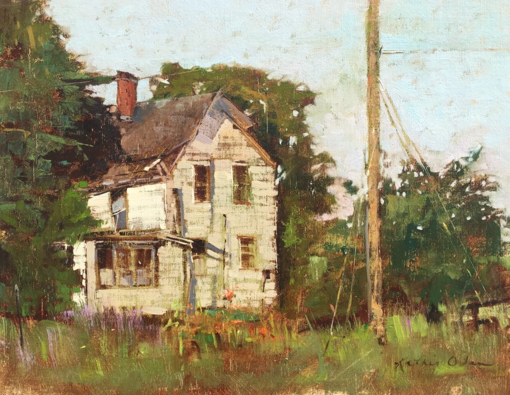
Kathie Odom
Oil on Linen,
14″ x 18″
Countless times I have witnessed a sort of seed-to-fruit moment as a bystander gets caught up in the excitement of my wife bringing a blank canvas to life. Like you, Kathie wants her story- telling to come from her deepest places… all the way from her toenails, she likes to say.
The nature of the created universe is to give, not take. Hard to tell exactly what the result is from all your giving, Harlan, all your painting-what-I-feel-inside. But, whatever it is, it’s good. Give a little and more follow. And souls like mine expand on account of that giving. Yeah, that’s the end-product… an expanded soul!
And my expanded soul is grateful.
May you and Anna now somehow be creating in your rest and resting in creation,
~ Buddy
PS – Thank you, Wendell Berry, for introducing me to your good friend.
- Photo Credit: Guy Mendes.
- Annie Dillard, The Writing Life, 1989, HarperCollins Publishers.
- Campbell County Hill Farm, Harlan Hubbard, 1933, Collection of Anne Ogden.
- KathieOdom.com, 2017.
- Wendell Berry, Harlan Hubbard, Life and Work, 1997, The University Press of Kentucky.
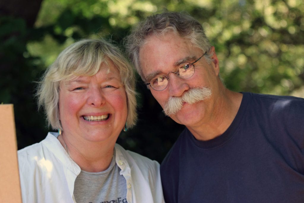
- Kathie and Buddy Odom, Photo Credit: Amanda Lovett.
Interview and Workshop with artist Linda Richichi
Unleash your creative spirit to its fullest potential through Active Meditation/ Doodling
I met Linda Richichi at her solo show at the Cultural Center in Ponte Vedra Beach, FL and was captivated by her paintings and her interest in active meditation doodling and Color and Energy Workshops. Linda is a landscape artist who now resides in Sarasota, FL. Linda has attended Plein Air events since 2003 and has been teaching local and international workshops for over twenty years. She has earned many Best of Show Awards, including one at the International Plein Air Painters (I.P.A,P.) Worldwide Paint Out at Niagara Falls, Ontario, Canada in 2016. In 2012, Richichi was voted the National Best Intuitive Artist from about.com (then a NY Times company) and a NY Times article in 2015 reported on her Soul Vision workshop with great reviews.
by Linda Richichi
12” x 12” Oil
by Linda Richichi
36″ x 36″
Linda said that, “After years of working with my open-minded students who were willing to play along, we discovered together that not only could I access “inside information” but anyone could. I began teaching this ask, doodle-and- decode technique for business coaches at their “mastermind” retreats so they could help their clients to excel in their businesses by moving past internal roadblocks.”
How does this explain why we are called to create art? Linda has found that we all have an innate language and art that works with us using symbolism through our spirit, also called our higher knowing. This part of our self wants to shed all the psychic baggage it can. Since this higher self is not verbal, it communicates through the lines and shape that we draw. Our higher self subtly tries to guide us, but we rarely pay attention to it. Those who doodle on the phone usually draw the same thing over and over and do not have a reason why. I knew this to be true because when I doodle it always big flowers with big circular petals!
(While on a telephone hold…)
Linda explains, “I take people on a different kind of vision quest by unlocking the left brain’s control over the mind to free the creative spirit within. The elements and principles of art you use in paintings (or even doodles) are communicating to you and your audience in ways that most people are unaware of. Knowing how to decipher the deeper meaning of line and shapes beyond being able to translate them to canvas gives you the ability to upgrade your life. These lines and shapes tell a story. You live by stories you tell yourself daily from past experiences which color your world and shape your life. Life, like art, is a story. I’ve discovered how to play with art in such a way that it becomes a vehicle toward happiness. In my workshops you’ll go deeper to the inner landscape, gain a better understanding how the lines and shapes speak and what they want to reveal to you, what you are currently not seeing. You can experience an “aha” moment doing the exercises which gives you a whole new relationship with your art. Art becomes your mentor guiding you to a brighter way of living if you will let it.”
My workshop experience
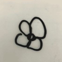
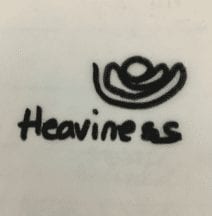
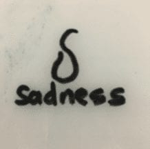
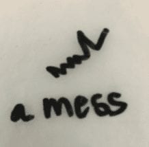
Linda holds different types of workshops. The workshop I attended focused on clearing the three centers of the body so we can see from a higher perspective. The three power centers to access are the head (what we think), the body (what we feel) and the belly (what we are being or doing). Through this process, we first doodled after concentrating on what I was currently thinking at the time and it happened to be just after my father passed away. So I was thinking heaviness and worry. I was feeling sadness and as I was grieving, I was not being social, not sleeping well and not really getting anything done. My doodles were:
The next step was to shift our perspective through positive thinking. So we had to contemplate and write down the opposite description for each area. So clearing our minds from the first exercise, we began by thinking of our descriptive word, e.g. “lightness” and then drew without any purposeful mark making but allowing the pen to make abstract shapes. My words became “lightness”, “happiness” and “together.” My doodles were below. We were told that this shifting of perspective and drawing them out helps to keep our power centers strong.
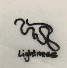
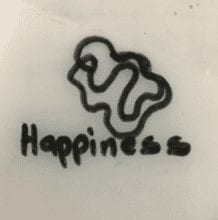
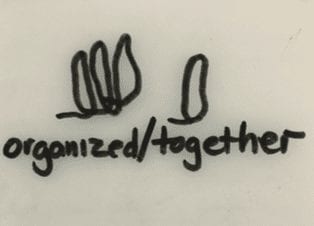
In the workshop we are guided to help explain to ourselves what these doodles mean. My “lightness” doodle appears to show a family and that someone is hugging/protecting us. “Happiness” looks like two butterflies one hovering or surrounding the other meaning that I am being looked after. My third center doodle “together/organized” shows standing tall monoliths, three together with the fourth standing close by but tall. The explanation was that I was strong enough and that I will be ok and we as a family will be together and remain strong.
As demonstrated in my experience the lines, color and shapes we use when we create art are clues to our inner world/thoughts/mind.
Other shapes such as jagged lines with sharp edges and heavy pressure usually express anger or frustration such as the ones I drew when I thought about how I was living my life at that time and I called it a ‘mess’. Lines that form circles are softer, fluid and more loving.
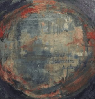 I realized that when I started painting abstracts last year one of my favorite paintings had a circle in it covering the entire panel and it was in warm colors. So my painting actually was showing the shape and color of love. I didn’t even realize it until I was writing this story and going over all my notes. Once I discovered this, I knew that the paintings needed some words to complete it. I decided to write something meaningful to me, and also depicting this process of connecting and acknowledging a connection between our soul/creative source and creativity. Why I always feel I need to write in french on my paintings is something I will find out some other day!
These exercises I did in Linda’s workshop were mind expanding and very enlightening.
Linda’s Color & Energy Workshops are held in Sarasota, FL and other destinations are being planned and can be found on www.lindarichichi.com. The Color and Energy workshops are geared toward this intuitive language as well as an emphasis on painting.
Fences and Grasses….
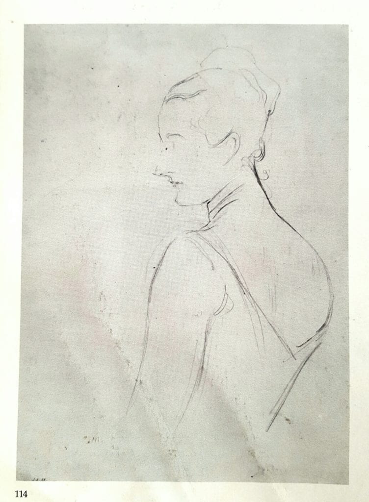
(“Madame X”) by John Singer Sargent
In the early sections of my teaching curriculum, I teach my students to make an edge chart. They start at the top by making a swatch of dark value on the left and light value on the right. These two values either separate immediately (sharp edge) or gradually, with transitional values in between the two main ones (soft edge). The first set of dark next to light swatches at the top of the chart having the sharpest break or “fence” between them, meaning the most immediate break from dark to light. Then 10 to 15 more sets are made below, getting softer as they go, with a progressively widening band of transitional values (softer edges) in between the two main ones.
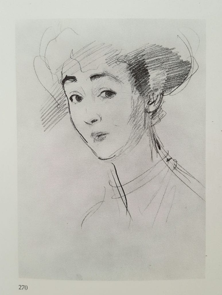
John Singer Sargent
This is just a fun way to help ingrain in the students mind that very different edges exist in the visual world as dividers of visual shapes and should exist, accurately, in their rendering of it.
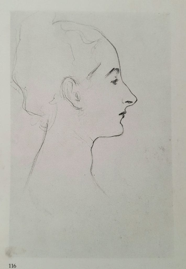
Portrait Sketch by
John Singer Sargent
Joseph DeCamp
In this way he preplanned and mapped his edges before ever touching his canvas. He could then focus on the luscious brushwork that we all know and admire to convey a particular edge in a particular area. One stroke clean and sharp, another wiggled as he moved along yet another just barely scratching, scumbling a ghost of a division between two areas of value.
I try to start my paintings in this way and encourage all those that I teach to try the same. In this way we all are “aiming for the fences” in trying to “hit one out of the park” on canvas. 😉