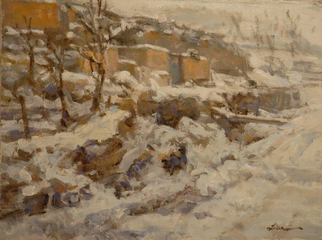
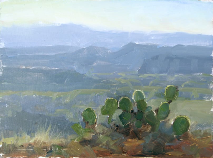
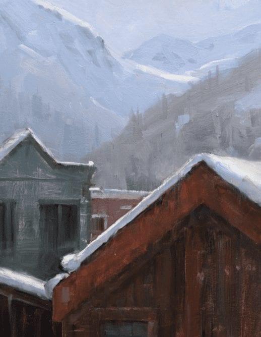
• Skip to primary navigation
  • Skip to main content
  • Skip to footer
  • Help Desk
  • My Account

OPA - Oil Painters of America

Dedicated to the preservation of representational art

  • Home
  • About
    • Mission, Policies & Bylaws
    • Board of Directors
    • Presidential History
    • Frequently Asked Questions
    • History
    • OPA Staff
    • Contact Us
  • Membership Services
    • Member Login
    • Membership Information
    • State & Province Distribution For Regionals
    • Update Member Information
    • Membership Directory
    • Contact Membership Department
  • Events
    • Exhibitions
    • Online Showcase
    • Lunch and Learn
    • Virtual Museum Road Trip
    • Paint Outs
  • Resources
    • Brushstrokes Newsletters
    • Ship and Insure Info
    • Lunch & Learn Video Archives
    • Museum Road Trip Video Archives
  • Services
    • Scholarships
    • Critique Services
    • Workshops
    • Have A HeART Humanitarian Award
  • Sponsorship
  • Online Store
  • Awardees
  • Blog
    • Recent Blogs
  • Show Search
Hide Search

Oil Painting

What’s the Big Idea?

Barbara Jaenicke · Oct 31, 2022 · 27 Comments

Frosted Rocks on the Hill by Barbara Jaenicke OPA
9”x12” – Oil

My first career was as an art director for advertising agencies in New York City in the mid-1980s. Around that time, I took classes at night at the School of Visual Arts. These classes were primarily for aspiring art directors and copywriters, and focused on developing creative, original concepts with strong advertising messages. And as with painting, that was a skill that required practice, experience, and knowledge of what’s been done in the past. 

The title of my article, “What’s the Big Idea?” was actually the title of one of those classes. The class’s instructor did an amazing job of getting across to us—sometimes with humor, and sometimes more bluntly—that the best advertising begins with a very focused concept. 

This instructor and others (all of whom were full-time art directors, copywriters and creative directors at successful agencies) stressed that it’s vitally important to first zero in on one succinct statement, and then develop individual messages from that overall umbrella idea. This is basically how an ad campaign is developed. If the advertising relies too heavily on only catchy phrases or flashy graphics, the message isn’t as powerful as when there’s one specific, overall concept that serves as the driving force behind each individual ad. Clever wordplays, or even humor can sometimes augment the message, but a focused concept is always the most important.

If you’ve ever seen the movie “What Women Want” (a film that came out in 2000 with Mel Gibson and Helen Hunt) the plot is set in an advertising agency, and I think it is one of the few movies that accurately portrays the thought process that advertising creatives use to come up with a “big idea”. Maybe it’s done differently these days, but this is how we did it when I worked in the field. The comical premise of the movie leverages how much of that process of conceptualizing an initial idea is a mental challenge that has to come first before anything visual or written can be developed. Mel Gibson’s career-greedy character suddenly has the magical ability to read the inner thoughts of Helen Hunt’s character. In the movie, they develop an ad campaign concept for Nike directed toward women. Their concept is “No Games. Just Sports.” That concept would become the umbrella idea for the individual advertising messages from Nike to their female demographic. 

Now, after nearly 30 years from when I moved on from my advertising career, I’m realizing that my most successful landscape paintings are those for which I first identify a distinct visual concept. Since I love to paint light in the landscape, my concept usually revolves around light in some way. My goal however, is to pinpoint a very specific visual idea regarding what’s special about the landscape, and how I’m responding to it. Whatever idea I choose to use, that idea becomes the driving force for how I handle each area of the painting, so that the painting as a whole will clearly convey the original big idea. Some areas of the painting will simply serve a supporting role to the main concept. 

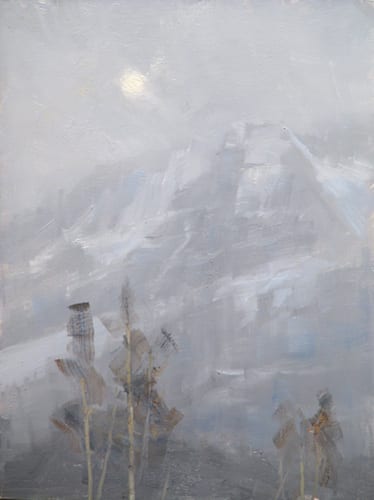
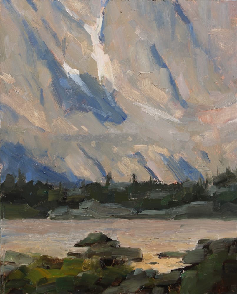
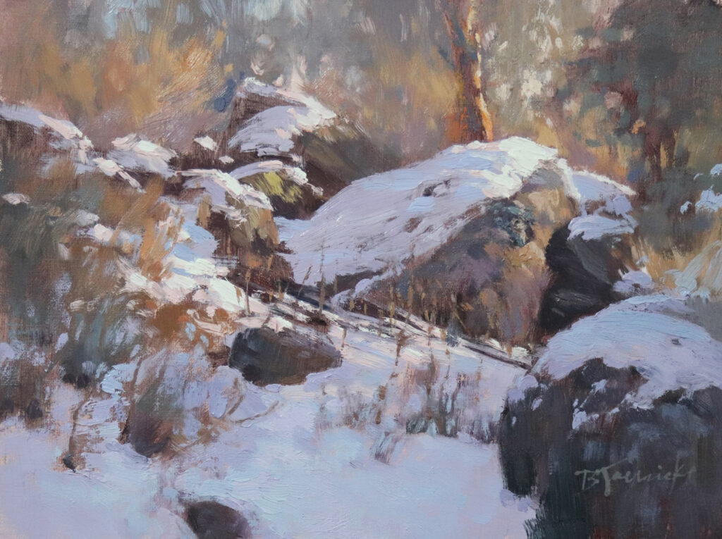
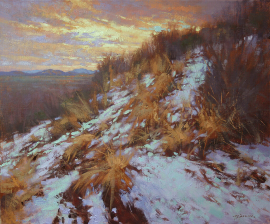
For example, if I were to identify light skimming the top of a snow-covered rocky slope as my big idea, I would address the overall composition, and each supporting area of the painting so that it best showcases that light skimming the snow and rocks on the slope (as I did with the painting shown at the top of this article). The composition may also have trees and grasses, and the sky peeking through the trees, but those elements would be edited so they support the central theme.  If instead my concept was to feature the light peeking through the trees, I would create a very different composition that emphasizes that area as the star of the show, with alternative portions of the composition edited to supporting roles. 

To further explain, I’ll show examples of my paintings and describe the big idea behind each:
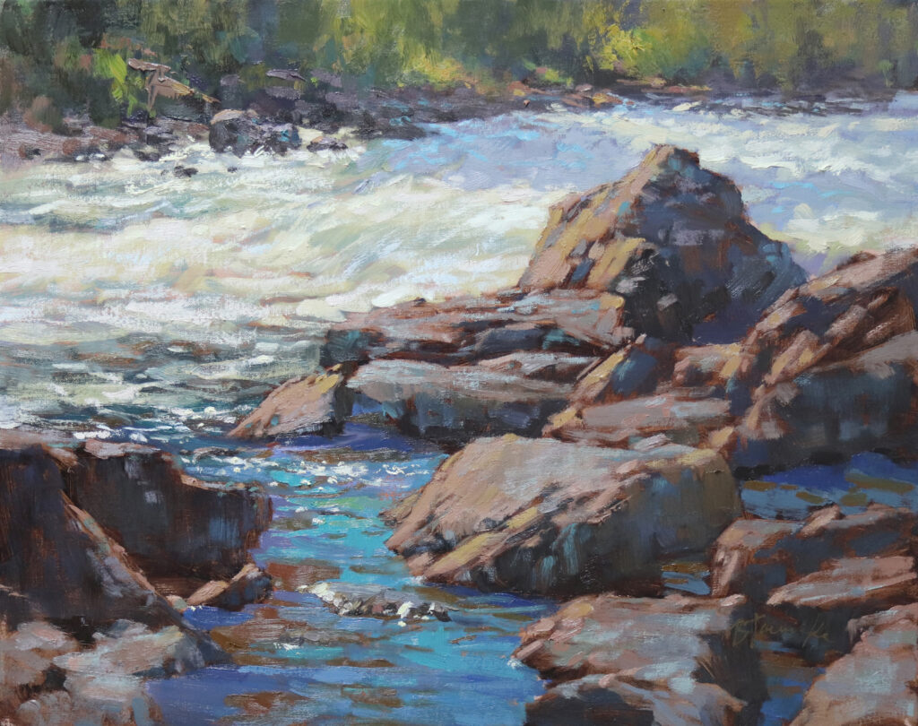
Rocks and Rhythm by Barbara Jaenicke OPA
16”x20” – Oil

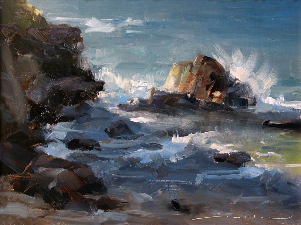
Big Idea: Radiant light reflected from the rocks and water. I set up the composition for this piece purposely to showcase the patterns of strong light and brilliant blue sky bouncing off of the rocks and water. It’s tempting to define more of the distant area on the other side of the river, but that part of the composition plays only a supporting role so was kept at a minimum.
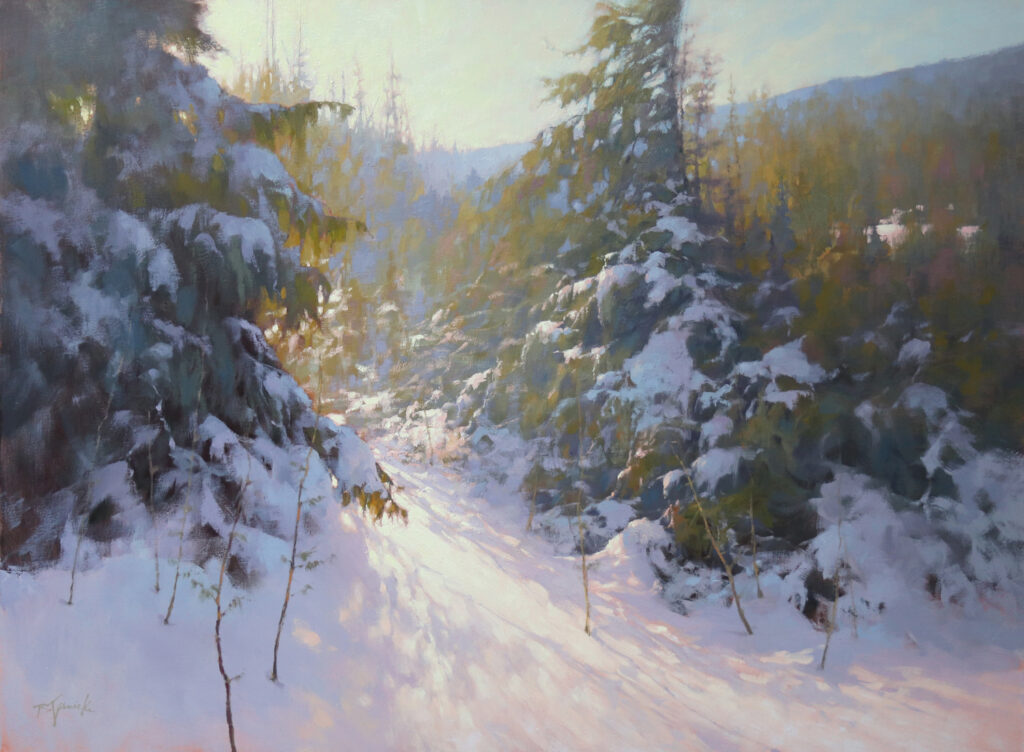
Passage of Light by Barbara Jaenicke OPA
30”x40” – Oil

Big Idea: As stated right in the title, the passage of light. Sometimes the title comes first before I pick up a brush, which helps me stay on track with my concept. This painting’s message revolves around the pull of the sunlit pathway into the trees, summoning the viewer to follow the light and explore further into the landscape. Notice that I continued the light into the distance, but edited it quite a bit to keep the initial passage of light as the main idea.

Okay, so painting concepts aren’t usually as clever as advertising ones (although some certainly can be). And it may seem like my painting concepts are fairly obvious. But when an artist looks across an overwhelming view of a landscape, a distinct painting idea (what to emphasize about the landscape) may not be readily apparent. There are often many different directions the artist can take regarding how to portray a portion of that landscape. The point I hope to make here is that the more you can focus a visual idea, the bigger the impact your painting will have.

I paint outdoors regularly so that I can gain a genuine understanding of my subjects. But many of my own favorite pieces that I feel have a strong visual message resulted from long hikes during which I took many hours to absorb what’s particularly striking about the landscape I explored. Sometimes I bring a small painting kit for mini color studies on these hikes, but more often it’s quick pencil sketches and detailed notes that accompany my reference photos that I bring back to the studio. With this approach, I can hone in on a certain magical element that stuck with me during my outdoor experience. Then back in the studio, I take my time to carefully explore studies that clearly convey that specific observation.
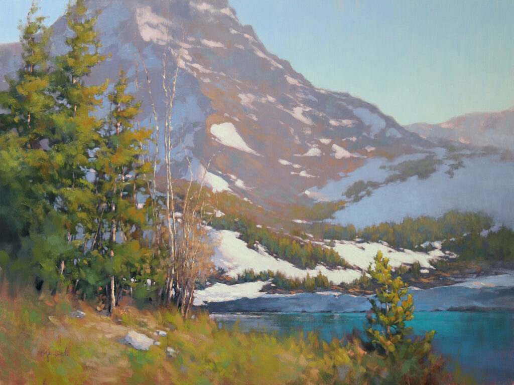
Mountainside Iridescence by Barbara Jaenicke OPA
30”x40” – Oil

Big Idea: Magical evening light reflected on the mountainside. The colors on the mountain are quite elusive to photograph but breathtakingly magical in person. For this scene, I relied on careful notetaking with color charts along with sketches on location during an all-day hike. I followed that with multiple studio studies. Besides recording the color information firsthand, absorbing the brilliant visual effects throughout that day contributed to how I expressed my response to the subject.

Alpine Haven by Barbara Jaenicke OPA
20”x20” – Oil

Big Idea: Delicate branches showcased by strong backlighting.  On location, an array of possible compositions presented themselves to me. Some of those compositions would have had me use the long cast shadows as the main idea. However, for this painting, I used the backlighting to feature the delicate edgework of the lacy branches, both in front of the light and within the resulting deep cast shadows. 

A Higher Calling by Barbara Jaenicke OPA
20”x24” – Oil

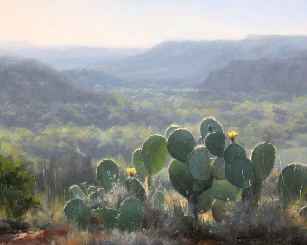
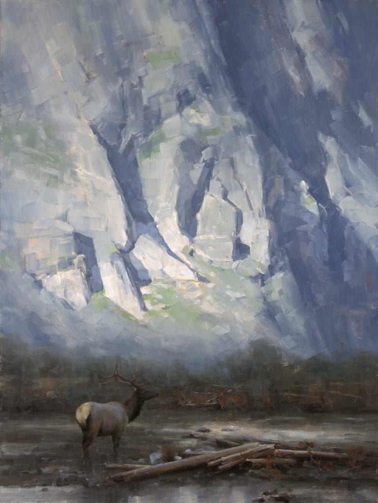
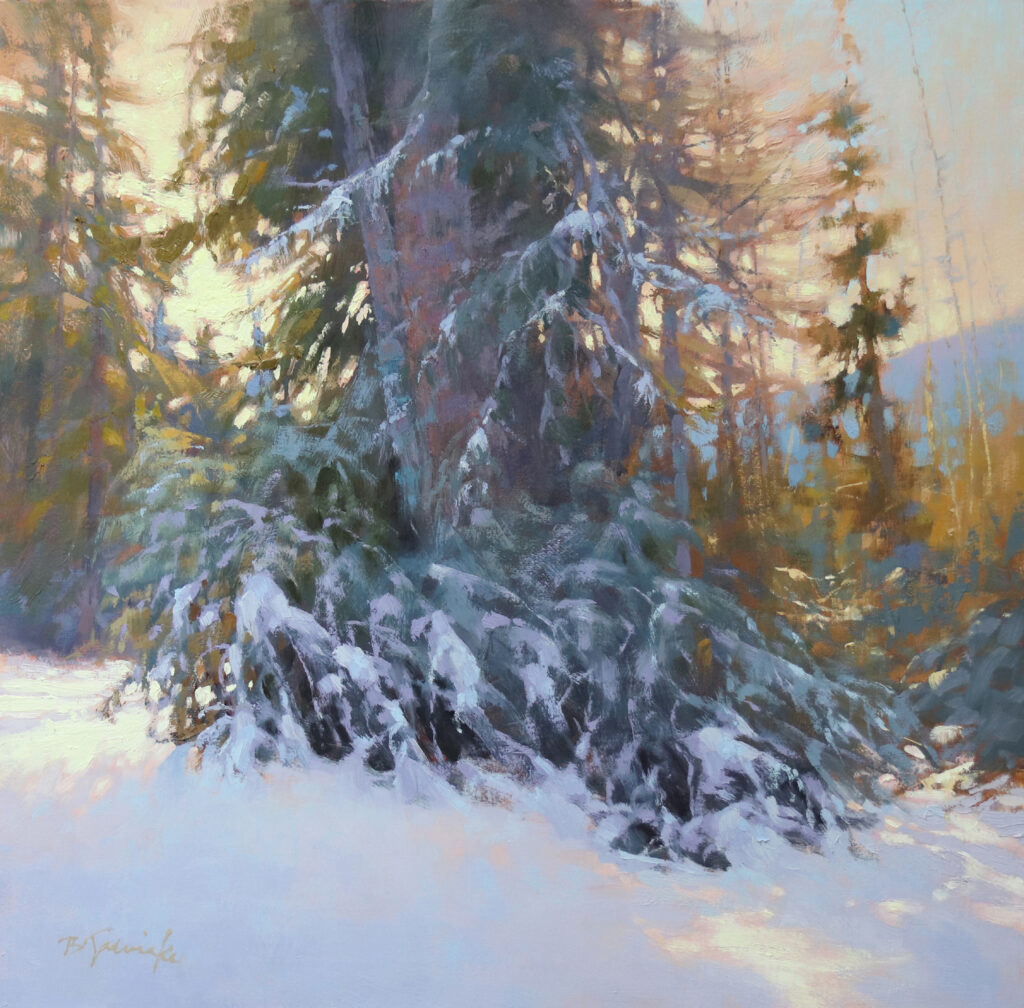
Big Idea: Way up high. This one is all about being way up near the top of this mountain, and that feeling one gets when standing on a mountain high above everything else and can see for miles. The arrangement of the grass and snow patterns, and their converging sizes, as they lead toward the sliver of light in the sky all contribute to that feeling.

I have to admit that sometimes when I’m painting outside with my full gear, I can get caught up in the technical particulars as I’m racing against the light. Again, it’s only when I nail down a specific visual idea and use the short window of time wisely that I produce what I feel is a successful field study.

October Morning at Smith Rock by Barbara Jaenicke OPA
8”x10” (plein air) – Oil

Big Idea: Colorful shadows in the rock. Although I often like to focus on the light hitting the rock structures when I paint at this locale, the large shadow mass here had such varied yet subtle temperature shifts, that I focused on nudging the range of color temperatures to show off those shifts. I kept all else in the composition secondary to this main idea.

Thinking back to my advertising days, I remember poring over the most creative, award-winning ads of the time, aspiring to reach that level. And now, of course, I do the same with the work of my favorite painters. In both fields, I realize that the work that packs the biggest punch always starts with a big ole solid idea! 

Endless Pursuit

Cheng Lian · Oct 17, 2022 · 12 Comments

Classical, impressionist, and hyperrealist works are all now considered “traditional” painting. I am a member of this field who has been working tirelessly and persistently to hone my passion, which is somewhat of an inheritance from my father. I never stop painting because I want to create the perfect artwork. Although the process is mixed with distress and excitement, frustration and happiness, I never grow tired of it. 

Girl with Silk Headscarf by Cheng Lian OPA 36″x24″, Oil on Canvas
(I wished to express a sense of calm and peacefulness while highlighting interests in the hair, skin tone and scarf.) 

The standards for what is considered a “good painting” can incorporate many diverse styles and concepts. And while I appreciate various styles, in terms of personal pursuit, I prefer works which are subtle and concise, yet vivid and insightful, hiding their ingenuity and skill in simplicity. The “hidden edge” in East Asian aesthetics is something that I greatly appreciate. For example, in calligraphy and painting, in order to make the work more meaningful, the edge of the brush stokes will be intentionally reduced, so all the lines and colors express the artistic conception of the work with grace and restraint. 

Red and White by Cheng Lian OPA 36″x24″, Oil on canvas
(My goal was to reflect the child’s demeanor under the simple contrast of colors.) 

Classical religious painting is a perfect example of this philosophy. I believe it was less influenced by the commercial market and instead created by the artists to show their faith and reverence, thus the sense of meaning and authenticity are more strongly reflected in those works. I have always viewed such masterpieces with admiration, trying to learn from them, and comprehend their true meaning.

A Girl from the Shoton Festival by Cheng Lian OPA, 12″x9″, Oil on Canvas
(I seized the moment to express the youthful vigor of the girl using loose brushstrokes.) 

It is undeniable that artists do not live in a vacuum and need financial support. Often, we consciously or unconsciously meet the needs of various markets by bringing commercial influences into our paintings, such as the over-emphasis of bold and exaggerated brush strokes, tones, over-thickened pigment stacks, and over-enhanced color, light, and other surface effects, which I believe weaken the artistry of the work. I have personally experienced painting such works to please the market for the sake of livelihood 25 years ago. 

Old Man by Cheng Lian OPA, 14″x11″, Oil on Canvas 
(I strove to emphasize three-dimensionality and a sense of light.) 

Over my many years of teaching and judging art, I not only pay attention to the basic elements of the painting, such as space, perspective, color, composition and overall processing, but also to the style level of the work. The style level reflects a person’s understanding and attitude towards art. Understanding and self-cultivation are not only shown by skills, but by the combination of style and technique which creates classic and timeless works. 

Snow by Cheng Lian OPA, 12″x16″, Oil on canvas
(I reduced the contrast between cool and warm colors, added rough and seemingly random brushstrokes, and emphasized the sense of heaviness.) 

The best ways to improve one’s self-cultivation are to be more optimistic and open-minded about learning from classic works, to visit major art museums where the best “teachers” are often found, and to never stop striving to see and understand more. 

Higher Levels!

Christopher Mooney · Oct 3, 2022 · 6 Comments

Grip on Reality II by Christopher B. Mooney
30″ x 40″ – Oil

“Do a large piece of smokestacks, Chris!” said David Passalacqua, one of my favorite teachers during my senior year at Parson’s School of Design.

What? I just looked at him, feeling a bit awkward. I wasn’t sure why he said that. I looked at my work in progress. I had a decent, albeit slightly boring, illustration going. I wasn’t ready to give up on it.

David was an excellent and very extroverted teacher. His friendly eyes had an uncanny ability to bore a hole into your soul by looking at you with the surety he had for his craft, and then yank the guts of your creative instincts to the fore. 

That is what happened to me when I looked at him.

He was brutally honest with me—as he was known to be with students—through just a mischievous smile and an electric energy spilling from his deep knowledge of illustrative art. He made it his mission to challenge students to higher levels.

“OK,” I said to him calmly, while energy surged through my body. Something central changed that day for me. My journey as a painter became a passionate adventure—a mission to capture the unimaginable. I completed three paintings of the Con Edison Power Plant on 14th Street, not too far from Parson’s, and received an A. That was 40 years ago.

Columbia River Crossing by Christopher B. Mooney
48″ x 36″ – Oil on Canvas

I was born and raised in New York State, surrounded by an artistic family and a richly influential environment. My mother, during her first trimester of pregnancy with me, contracted measles. As a result, I was born without hearing. I neither heard nor spoke until I was about four years old when I started wearing hearing aids. Today, I wear corrective devices and speak well.

When you’re deprived of one sense from an early age, the other senses compensate by growing stronger. In my case, it was my eyes. They taught me everything I knew about the world I had been born into. My sight continues to be my dominant sense, the only truly reliable way I have to perceive my world, and the sense that informs my work. I work very hard in my paintings to convey the strength and the beauty that I see.

Living in Portland, Oregon, for most of my adult years, I have established a niche in the art community as a painter of contemporary realism. A significant body of my work showcases Oregon’s diverse architectural styles, especially its bridges. The rivers and twelve bridges of Portland are crucial to the city’s character and function, and they provide a great source of inspiration for me. 

Broadway and Pink by Christopher B. Mooney
36″ x 48″ – Oil on Canvas

These bridges compel us to stop and look, be still in the moment, and breathe in the ingenuity of a grand structure. Hiking around the city, I carry my camera for photo references I use for inspiration. I step off the sidewalks to get different perspectives of the city and its bridges with the intention of adding a new dimension to my work.

I am fascinated by the complex steel girders and geometric shapes that underpin the majesty of the bridges. Building dramatic perspectives in my paintings, I illustrate the steel girders in compositional perspective, and capture the transition between the landscape and the cityscape. I strive to deliver unusual points of view, and render exciting realistic and abstract portrayals. 

Freemont Bridge Reflections by Christopher B. Mooney
36″ x 48″ – Oil on Canvas

To me, building and maintaining bridges represents a fantastic human achievement. Having the opportunity to be on a bridge during construction or repair also puts me in close contact with the crews—the working heroes—who maintain it. 

On one occasion, the Multnomah County Bridge Maintenance crew of Portland invited me to go with them to the top of Hawthorne Bridge and watch them do the greasing of the bridge’s bearings, and the maintenance of the operating mechanisms. I felt privileged to be able to document the maintenance of a bridge and then create art illustrating these American workers, who often go unrecognized and are forgotten.

Greasing. Hawthorne. by Christopher B. Mooney
24″ x 18″ – Oil on Hot Press Arches Paper

I have a mission to recognize the people who are an essential part of the creation and maintenance of these important structures. This mission led to a grant I received from the Regional Arts & Culture Council for a project called Tributes: Portraits of Working Heroes of the Tilikum Crossing. I created a visual record of building the Tilikum Crossing for a Portland light rail bridge over the Willamette River. I painted portraits of the designers, engineers, builders, and contractors who worked on the project and featured them in their working environment. 

Tilikum Workers II by Christopher B. Mooney
48″ x 60″ – Oil on Canvas

Bridges frame our landscape. They aid commerce, and create vital connections between communities. People cross bridges every day, yet few realize how little we celebrate the modern marvels of their engineering and of the workers who maintain them. My hope is to inspire others to feel more connected to our collective human achievements through viewing these paintings. 

It is also necessary to find happiness in what you do. I derive great personal joy knowing that Charles Sheeler, Edward Hopper and Charles Demuth were painting just these kinds of subjects.

Tilikum Workers by Christopher B. Mooney
60″ x 48″ – Oil on Canvas

While striving to create the unimaginable with my artwork, I still face the reality of competitive judgment and juried shows. I want to be a part of these things, of course, but they conjure feelings of vulnerability and fear of the unknown. I know I have to be courageous to put my soul on canvas to discover if my work could inspire and move other people in some way. I want people to see beyond what is before them in order to feel what I do—a beauty and a great spaciousness that holds the mysterious connection living within us, among each other, within our landscapes, and inside our communities.

Self Portrait. I Thought I was Hugging a Tree. by Christopher B. Mooney
22″ x 28″ – Oil on Canvas

Painting as a Conscious Process

M Kathryn Massey OPA · Sep 19, 2022 · 9 Comments

Kitchen Still Life by Mary K. Massey OPA
36″ x 48″ – Oil

I began to paint in 1994 at the age of 41.  There was no preparation or instruction prior to that time.  People often ask, “You mean you just started painting?”  Yes, I just began to paint.

As I think about my journey as a painter, I find I have internally shifted.  What does this mean? 

It means I try to shed all external noise and forces that get in the way of the painting process. I place myself in a painting “space.”  In turn, I find myself conscious during painting. I catch myself when I drift away from the work at hand. I give my full attention, as energy permits, to watching and waiting on the painting.  This is what I call Intention + Concept through active awareness, or being “in the presence of the painting”.

The best painting results come about when I work with the idea of having a completed concept in my mind’s eye, without being absorbed in the details of the subject, and without unconsciously laying down paint. In other words, I strive to paint my concept while being aware of all things in front of me. I now practice painting while more conscious of the process. I am mindful of my intention. Intention and concept are co-mingled — we as painters must let the viewer know what our painting is about.

Japanese Teapot by Mary K. Massey OPA
22″ x 28″ – Oil

It is a long journey to arrive at the space that allows you to be one with your picture — to let the canvas tell you what it needs, and to watch the canvas “become”. You must get out of the way while still attending to the work before you. The best thing one can do is practice while fully present to the process, and to catch yourself when internally drifting or thinking of something outside of painting. Even when you KNOW what is necessary, you may not always DO what is necessary for the good of the painting.

I find that as I age as a painter, distractions such as shows, sales, awards — all of it has fallen away.  I am happy just to paint and struggle with my challenges each time I go to the easel.  

Still Life with Moon by Mary K. Massey OPA
28″ x 22″ – Oil

Has painting become easier? Yes and no. Getting to this point has certainly been difficult.  But, I feel more at peace having entered into this present place of painting.  The journey could only have happened the way it happened.  Being more aware of when I am not paying attention has made painting more enjoyable, and produces a better result.

Learning to paint isn’t linear.  It ebbs and flows — it feels within one’s grasp only to move or shift.  You think you are practicing while awake, and then you drift.  You fall asleep to your process.

I now know when I am drifting off or leaving the presence of the painting in front of me.  I catch myself noodling or copying instead of watching and waiting on the picture’s concept.  I catch myself…that’s the important thing.

Broken Pot by Mary K. Massey OPA
15″ x 17″ – Oil

Worst Painting Ever

Dave Santillanes OPA · Sep 5, 2022 · 39 Comments

A sketch has charm because of its truth – not because it is unfinished.
— Charles Hawthorne

A few years ago, I was painting along a roadside in Wisconsin for the Door County Plein Air Festival and, while focused intently on finishing up what would certainly be seen as a masterpiece someday, I was interrupted by a young art critic who drove past and yelled out “WORST…PAINTING…EVER!”. Now, although it didn’t turn out to be the masterpiece I’d intended, I was convinced this painting showed enough promise to not be the “worst”. And honestly, if this guy had seen some of my earliest outdoor work he’d need to throw them into the mix as well and probably wouldn’t have spoken with such conviction. But all of this got me thinking – what defines our best and worst efforts outdoors? If the goal of a plein air painting is a finished masterpiece, judging the result is more straightforward. But if the goal is simply to “study” – to learn and gather information in order to develop a finished masterpiece in the studio, it’s a little more difficult to quantify the results. This is especially true if you’re like me and learn quite a bit from making mistakes. If this is the case it might just be entirely possible to paint the “Worst Painting Ever” and also have it be the “Best STUDY Ever”.

Back O’ Beyond
by Dave A. Santillanes OPA
oil, 9″ x 12″
Desert Bouquet
by Dave A. Santillanes OPA
oil, 24″ x 30″

Although the “Back O’Beyond” study wasn’t the infamous “worst painting ever”, it definitely required further exploration. And these hurried notes became invaluable in the studio as I painted “Desert Bouquet”

THE BEAUTY OF THE STUDY

Since the time I began painting almost 20 years ago, my goal has always been simply to STUDY. To figure out exactly how nature works and translate what I’m seeing into paint. So although I joke that my aim is to paint the “Best Painting Ever Painted”, I’m hardly ever looking for a finished piece outdoors. Instead, I want to capture only the things that I can’t do in the studio – things I can’t get from a photo. I’m taking notes on color, light and atmosphere. And my focus is usually on the shadow shapes where I want to establish their exact value, color and temperature. I’m arranging those shapes to lay the groundwork for overall design but I’m not obsessing about composition at this stage – there’s plenty of time for that in the studio. In fact sometimes when I’m in the field, I’ll often ignore composition all together, especially when time doesn’t allow it… like when an afternoon thunderstorm moves in and I’m about to get struck by lighting. This might make for a bad painting but not necessarily a bad study and definitely a smart one

Once I get back to the studio where time is more abundant, I’ll take those brief, hurried notes and spend hours, maybe even days working out composition. For me, creating a painting on the spot with the same refinement as a studio piece has never been part of the plan. But, what I’ve found is that within these brief – sometimes hurried notes – occasionally a finished painting emerges all on its own. In fact, a mere study, in it’s brevity can indeed be beautiful – even beyond the beauty of a more refined piece. As Charles Hawthorne, founder of the Cape Cod School of Art once said, “A sketch has charm because of its truth – not because it is unfinished”. I think of it as “poetry” compared to a “novel” – both can be beautiful. And although it’s no use arguing this case with someone at a plein air opening who doesn’t understand why every speck of canvas isn’t covered in paint, there are plenty of examples throughout history where studies qualify as masterpieces. But this doesn’t always happen and sometimes a study is just a study. It may even be the worst painting ever.

The Storm Begins
by Dave A. Santillanes OPA
oil, 12″ x 9″
Last Light at Kapalua
by Dave A. Santillanes OPA
oil, 9″ x 12″

The above two plein air pieces stand on their own, in my opinion, as finished paintings. I tried in vain to develop these into larger pieces in the studio but to no avail. The larger paintings used more “words” but said much less.

JUST A STUDY

And when a painting does fail miserably outdoors (or indoors) I euphemistically call it a “nice study”. If you happen to end up with one of these all is not lost. After all you’ve just spent two hours intently observing the scene… you’re now the visual expert of it. If anyone asks you a question about this place and the two hours you spent there, you have the answer. Once when I was painting near my home, four police cruisers pulled up and one of the officers jumped from his car, approached my setup and, catching his breath asks, “have you seen a short, Hispanic male with a baseball cap running through the area?” My first thought was that I fit this description precisely, but, realizing I wasn’t their suspect I was honored that they had come to me for my visual expertise on the scene. I considered offering my painting as evidence but instead just answered “No”. The point is don’t discount an intense 2-hour visual study of a scene. Many things will happen in those two hours to create the “story” that you want to tell. And be confident that you picked up a thing or two regardless of how the painting turned out. For me, once a painting falls short of my lofty visual goals, I don’t try to whip it into shape in the studio by painting over the top of it and destroying my notes (good notes or bad). And I don’t go back to the scene multiple times with the same canvas. If I return to the scene it’ll be a new attempt, a new story with a new canvas. But what I do instead is use my plein air notes and photos in the studio and seek out the good stuff. I’ll analyze the notes I got right and try to make sense of the notes that are too vague. I’ve learned that even my worst efforts outdoors contain something useful to help read and interpret photos from the scene. There are just too many good, often unintentional, things that happen when we paint outdoors. In our haste to capture a fleeting moment or escape a coming storm, we subsequently distill the scene down to only the essential elements – elements that tell the exact story we want to tell – without all the peripheral distractions. In working fast and simplifying we don’t have time to paint the things we don’t want to or aren’t interested in painting – and that’s a good thing.

Telluride Homes (Study)
by Dave A. Santillanes OPA
Oil, 12″ x 9″
Telluride Homes (Detail)
by Dave Santillanes OPA
Oil, 12″ x 9″
Edge of the Storm
by Dave Santillanes OPA
Oil, 24″ x 24″

I painted “Telluride Homes” as a winter storm approached. This began outdoors as a winter storm approached. My first idea was to paint the “peaks” of the homes juxta-posed with the peaks beyond. Not a spectacular painting but a nice study. At some point during those two hours of painting and shivering, the story changed and I became intrigued with the design of light on a distant peak. “Edge of the Storm” is the finished studio piece.

Studies for
Madame X portrait
John Singer Sargent
1883 Graphite
Studies for Madame X
John Singer Sargent portrait
1883 Watercolor
Portrait of Madame X
by John Singer Sargent
93″ x 44″
1883 Oil on Canvas

These quick sketches for Madame X might not pass as masterpieces, but the resultant studio painting certainly does.

Lake of Glass Study
by Dave Santillanes OPA
Oil, 10″ x 8″
Break in the Silence
by Dave Santillanes OPA
Oil, 40″ x 30″

The small study of Lake of Glass never made a direct leap to a large studio piece, but it inspired and served as an invaluable reference on several pieces, including this 40″ x 30″.

LEAVE THE FRAMES AT HOME

Ultimately what I’m saying is RELAX and remember how much fun this is. I teach several workshops throughout the year and I’m always imploring my students to leave their frames at home when we go out painting for the first time. I’m not trying to lower the bar for expectations but simply reminding them that painting outdoors is only one part of the process. The goal is, of course, to take GOOD notes as opposed to BAD ones, but it’s my way of saying don’t put too much pressure on yourself because there’s something to learn from the bad ones too. So my advice to every plein air painter is to get outside, “point to the stands” (as my friend Joshua Been is fond of saying), and paint the worst painting ever, it might just be the most valuable study you’ve ever done.

Babe Ruth pointed to the stands and then knocked one out of the park. But in painting sometimes a swinging bunt with a few errors in the field will also get the job done.

  • « Go to Previous Page
  • Page 1
  • Interim pages omitted …
  • Page 10
  • Page 11
  • Page 12
  • Page 13
  • Page 14
  • Interim pages omitted …
  • Page 80
  • Go to Next Page »

Footer

  • Home
  • About
    • Mission, Policies & Bylaws
    • Board of Directors
    • Presidential History
    • Frequently Asked Questions
    • History
    • OPA Staff
    • Contact Us
  • Membership Services
    • Member Login
    • Membership Information
    • State & Province Distribution For Regionals
    • Update Member Information
    • Membership Directory
    • Contact Membership Department
  • Events
    • Exhibitions
    • Online Showcase
    • Lunch and Learn
    • Virtual Museum Road Trip
    • Paint Outs
  • Resources
    • Brushstrokes Newsletters
    • Ship and Insure Info
    • Lunch & Learn Video Archives
    • Museum Road Trip Video Archives
  • Services
    • Scholarships
    • Critique Services
    • Workshops
    • Have A HeART Humanitarian Award
  • Sponsorship
  • Online Store
  • Awardees
  • Blog
    • Recent Blogs

© 2026 OPA - Oil Painters of America · Design by Steck Insights Web Design Logo