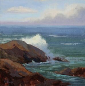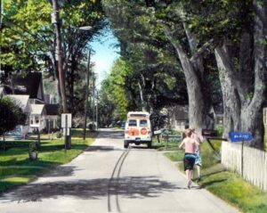
We all have them – our personal favorite painting, the baby, the one painting you were born to paint! Sometimes, we get lucky. The perfect combination of subject, composition, value structure, color harmony – it just works. That one painting may inspire an entire series. Before you know it, your authentic self as a painter, your style, shows itself. That’s what happened to me. The Chase is a painting of two kids wearing nothing but swim trunks chasing an ice cream truck. Everyone remembers the excitement of hearing the ice-cream truck’s song fill the neighborhood. “ICE CREAM MAN!”, we would scream, then run to find loose change and hope he didn’t get away. That painting has set the course for most of my work since. Childhood memories infiltrate everything I paint. If you are struggling with finding your voice and distinguishing yourself as an artist, maybe your favorite painting can be an inspiration for a series.
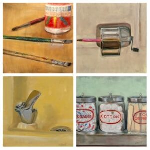
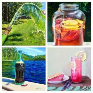
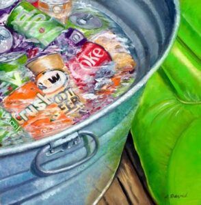
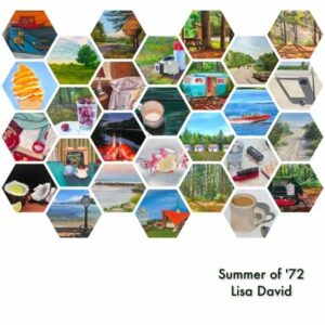
Over the past five years, I have immersed myself into several series of paintings rooted in memory, specifically childhood memories. They have produced enough work for galleries, shows, and studio sales. I’ve done a series of 70 small paintings about summer in the 1960s and 1970s; a series of ten summer drinks from the 1960s and 1970s; a series of 28 paintings of family on a 28-day road trip in 1972. Currently, I am working on a series of 12 paintings about school in the era of Dick and Jane.
Prior to painting, I threw pots. Lots of pots. I was a production potter throwing hundreds of pounds of clay a week fulfilling orders for gift shops all over the country and abroad. I had 18 sales reps selling my wares at wholesale prices which barely left any profit for all my hard work. My passion turned to excruciating work and before I knew it, I resented dry hands, sore back and the constant hum of my pottery wheel. I barely slept. Something had to change. I decided to paint. Years later, the same principles that helped me produce shelves of pottery helped me produce a series of paintings.
It’s satisfying to complete a body of work, a series of paintings. It feels good to have paintings for galleries, shows, and sales. It also feels good to tell people what you are working on. Here are a few tips to help you if you want to tackle a series of paintings:
- Determine the number, size and subject of a series. Set parameters about when you will finish (a painting a day, season, month). Pick a good number, then use social media, blog, etc. so others can follow your journey. Make it a realistic number. The summer I painted one a day was a huge commitment.
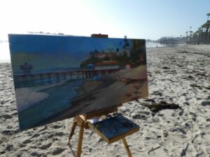
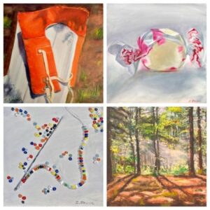
- Source items if you’re doing still-lifes or take photo references combined with observational work. I keep a sketchbook and draw thumbnails for each image. I have bought a few rather bizarre things off eBay to paint, like an old metal ice-cube maker, pick-up stick game, even an old orange life preserver!
- Have gumption and stay with the idea until it is complete even if you doubt your skills and subject. I use the word “GUMPTION” as my mantra and listen to the Hans Zimmer song Gumption from the movie The Holiday! It keeps me painting through anything. There were times when I thought, am I nuts painting Tang, cinnamon toast or Yodels? I may be nuts, but at least I’m being authentic.
- Contact venues for showing your latest series. Tell people what you are painting.
- Set up for success: order supplies to see it through, clean your studio before you start, plan times to paint, tell your family that you’ve decided to make the commitment. Take the series seriously.
- Enjoy every second – painting is the good stuff!
- And remember, if something is important to you, you will find a way. If not, you will find an excuse.
Happy Painting…and give Gumption a try!