We’re inspired. Paint flies. Ideas run rampant and our only fear is one might escape before we get it on the canvas. And then…nothing. Black nothingness. A post-apocalyptic wasteland. We’re left alone staring into our brain and see a gaping hole of rubble where yesterday flocks of ideas beckoned. The paintbrush feels like it weighs a hundred pounds and every stroke feels painful and kludgy. Panic starts to set in. Elvis…has left the building.
Stage 1 – Standing in front of a white canvas – paralyzed.
Stage 2 – Raw panic.
Stage 3 – You’re in a ball on the couch stuffing chips in your mouth reaching for the remote to binge watch Netflix.
What is it that inhabits our brain on one day pouring out ideas, energy and inspiration and then just up and leaves the next day? Connection to Spirit? A muse? Does it leave us or do we leave it? Will it ever come back? I stopped in to see an artist/gallery owner one day whose work I admired. She always seemed like an endless fount of inspiration. Year after year, fabulous work would consistently appear on the walls. I sat down across from her. She looked up at me, said nothing for a few moments and then said slowly, “I’ve…got…nothing. It’s gone. There is absolutely NOTHING there.” There was a tinge of panic. It was a confession and plea. A confession of the secret we all carry that we aren’t the magical beings some people think we are. We aren’t the eternal fount of creativity with never a blip. It was a confession of the fear that the well was dry, that the ideas would never return. Just then, a mini-epiphany exploded in my brain, and though it didn’t diminish my empathy for her, it also made me feel suddenly not so alone. This happens to all creative people. Perhaps more often for some than others. It may not be comfortable but it’s also not the end.
So, what you can do about it? How do you find your way back to productivity and inspiration? First, chill-ax. Take a breath. Stop begging your muse to come back. Your muse is just not that into you at the moment. Quit acting like a jilted lover. Put a chip clip on the bag of chips, get off the couch, pick up a brush and just do the work. Be willing to do the work even when you feel….NOTHING! Feelings come. Feelings go. In true Elvis form feelings, “Ain’t nothin’ but a hound dog.” Okay, that sounds dreary but when you understand the nature of inspiration, the nature of your muse, you’ll be able to trim your sails, navigate the seas and actually begin to enjoy the vagaries of the wind and waves.
Think of your muse as a lighthouse. When it completes its circuit and its beam falls on you the world lights up. We then expect it to come to a grinding halt and forever shed its light on us. When it moves on in its never-ending arc, leaving us once again in the dark, we throw a tantrum. We greedily want it to stop doing its job. We forget it left us with a gift before it continued on its circuit. A new idea. Something to be curious about.
Let the light move on, get comfortable with the twilight. Know that as the light swings once again through its arc, it’s searching the horizon, it’s gathering new ideas to deliver to you when it next visits. Our psyche, our creativity, our passion needs rest periods. It’s only fear that the beam will never complete its sweep and fall on us again that sends us to the couch with a bag of chips. When you learn over time that yes, Elvis has left the building, BUT he is scheduled to return, we can relax and use the time for a number of things. Reconnecting with nature. Doing some introspection as to why, exactly, you paint. Practicing some core skills. Doing a focused study – the painter’s version of a musician doing their scales. In other words, spend/use the time productively so that when the beam sweeps around and falls on you again you’ll be prepared! Half of the secret of life is being prepared so you won’t miss the moments when they present themselves. When you’re alert and fit you can race that train to somewhere awesome and grab onto the handrail as it’s leaving the station on a new journey. If you’re asleep on the couch you’re going to miss the train.
So how about some pretty pain-free techniques for breaking out of a serious funk:
1. This is counter-intuitive, but try making yourself NOT go in your studio. Limit your painting time to something ridiculously doable like 30 minutes. If even that sounds painful make it 15. Set a timer and stop painting even if the fog is beginning to lift and things are going swimmingly. The magic moment will come when you desperately want to work past when the timer goes off. Stop anyway. Stay hungry my friend. Pretty soon you’ll begin passionately hating the timer. Passion is back…even if it’s in the form of glaring at a timer. You’ll fling the timer aside and paint on into the night. The funk will have been banished like a roach by the light.
2. Set a specific intention. Choose a reason to walk into the studio. ‘I will learn about…’ ‘I’m curious about…’ ‘What would happen if…’ ‘Wouldn’t it be fun to try…’
3. Use your tantrum as energy. Put up a dart board in the studio. Throw darts. Then throw paint…at a canvas. Be physical. Stand up to paint. Paint with energy. Don’t slouch in a chair. Jump up and strike the power pose. (Feet wide and strong, chest up, arms thrust above your head in exclamation and face pointing defiantly upwards.)
4. Figure out what it is that’s intimidating you. Hit it head on. Wrestle it to the ground. Stop staying safe.
5. Demand nothing of yourself except to go through the motions. Mix a little paint. Sit on the floor and put your art books in alphabetical order for no particular reason. Lie on the floor, stare at the studio upside down and imagine what life would be like walking around on the ceiling. Congratulate yourself on whatever small thing you managed.
I’ll leave you with an image: “Havana Nights.” It turned out to be one of my favorite paintings of the year. It was waiting for me on the other side of some impenetrable wall. There was a literal war going on inside me. I had no idea what to paint. My internal tantrum was palpable. Finally, by sheer will, stubbornness or exhaustion from my own mental battle I made myself walk into the studio, pick up a brush and make one mark. Then another. Then another. Then there was no stopping. Paintings want to be painted and we sometimes just need to allow them to manifest themselves by the simple act of picking up a brush no matter how we’re feeling.
No one is exempt from periods of struggle. Don’t worry. Pick up your brush. The magic always comes back. The lighthouse doesn’t stop shining. And remember…sometimes our best work waits for us on the other side of the greatest resistance.

Oil Painting
Reflections and Sky Holes
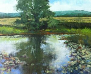
In choosing a subject to paint I often find I’m drawn to water.
Of all the elements we find in the landscape it is the one that pulls at my creative heart. Perhaps it is because it is life-giving. Or maybe it’s the ever-changing reflections on the surface that challenge me.
Next on my list would be trees and the majesty they bring to a scene. Especially here in Middle Tennessee where I make my home. The incredible variations of hardwoods in our forest are forever giving the artist a lush background in spring and summer before changing into their glorious fall garments. The soft Tennessee winter creates a ghostly gray scene, bare of leaves but full of painting possibilities.
When I can find a scene where both subjects are equal in their appeal, there I find joy.
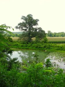
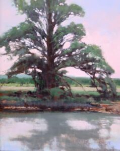
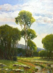
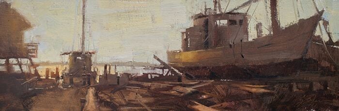
Near my family farm is such a scene. It’s a spring-fed pond filled with lily pads and bullfrogs. Standing guard over this life-giving pond is a very large white oak tree. Likely over a hundred years old. It is separated from the distant hills by a cornfield which creates a perfect backdrop for sky holes.
Those tiny brush strokes that bring life to trees and allow the viewer to see past the mass of leaves into the light beyond.
The challenge was to paint the majesty of this ancient tree while still paying homage to its reflections.
I always do several sketches first to determine the best design for my painting. On this one, I chose to cool my palette a bit from the photograph. My reason was to reflect the coolness of the place. The composition also allows the viewer to feel the towering presence of the tree as though it has no limit to its height.
It’s important to me to try and express through paint the qualities of the scene that captured my heart. A very great teacher and landscape painter I know, once asked me “is it worth painting” when I was struggling with choosing what to paint. His question still helps me to calm my enthusiasm as I stand in a landscape and try to determine what it is I want to convey. This particular painting is from a very remote part of my state. A forgotten backroad to nowhere but very dear to me. Years past I had accompanied my Father to a cattle sale somewhere out past Beaver Dam valley. It was on this drive that we came upon this pond and both remarked at how beautiful it was. This was a time before I was a painter, but deep inside me, the landscape was calling.
Feeling connected to my subject is crucial. The sheer beauty of the scene, it’s history or simply how the light is illuminating it makes a painting possible.
To start I paint in plein air.
My first encounter with plein air began with a group of local painting enthusiasts called The Chestnut Group, a nonprofit alliance of landscape artists and friends dedicated to the conservation and preservation of vanishing landscapes in Middle Tennessee. This amazing group boasts several OPA and OPAM members. Its influence has been monumental to my growth as an artist. If you don’t already belong to a painting group, put it on your list.
Here is a list of things I try to do whenever I paint plein air…
Step into the scene… walk around it.
Be still awhile and let the light reveal its patterns
Take time with the shadows … they support the light… without them properly painted the painting will be void of life
Wait for nature to settle back undisturbed by my intrusions
Sketch, sketch, sketch
Mark the canvas with horizon lines…tick marks and perspective lines
Mass in the masses…
Correct the dark values… I always go too dark at first
Breathe…
Step back
Paint the mid tones
Establish the patterns
Place the lights!
I try to only use photos as structural references in my paintings. The small pieces painted from life give me a truer impression of what I witnessed in the field.
Favorite quotes from painters I’ve studied with or those whose work still speaks from years past run through my mind. I keep them in a small journal within my backpack for quick inspiration.
If you are new to painting my humble advice would be first visit local galleries. Search out the artists’ work that speaks to your creative spirit.
If they teach take their workshops. Paint as much as you can. Read about painting during the times you can’t paint. Study the masters. Their works are all online.
“I hope this is modest enough: because there is no subject on which I feel more humble or yet at the same time more natural. I do not presume to explain how to paint, but only how to get enjoyment.”
Winston S. Churchill, Painting as a Pastime
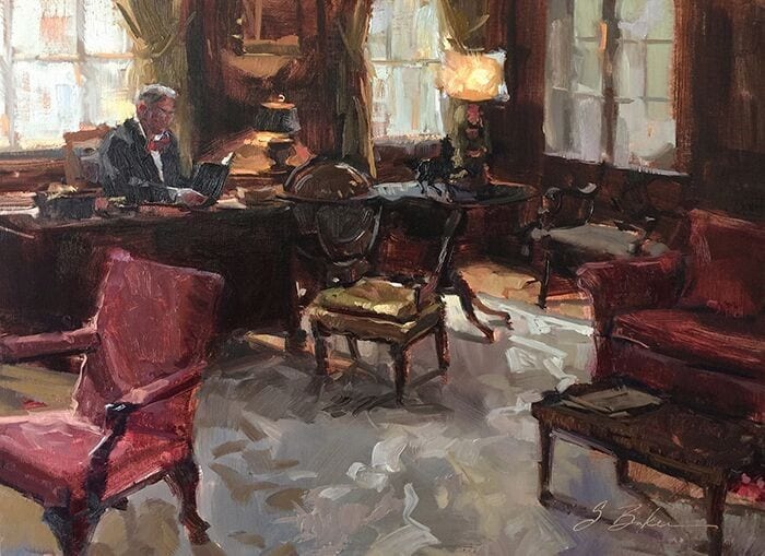
An Interview with Suzie Baker
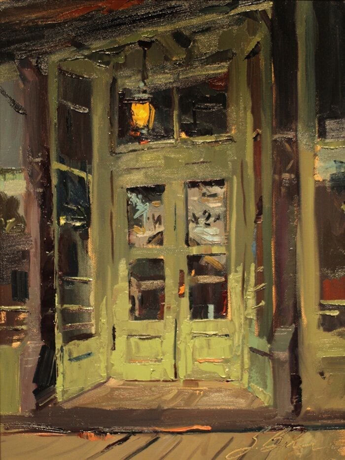
I had the privilege of meeting Suzie Baker, briefly, at the Oil Painters of America (OPA) National Convention, held in Dallas, a few years ago. However, the first time I became acquainted with her work was when she won the Artist’s Choice Award during the 2014 Outdoor Painters Society “Plein Air Southwest Salon”, of which we are members.
The painting, “A Negative View of Saloons”, was surely a runaway favorite, as it is phenomenal.
She is a woman of high energy and enthusiasm; you can see it in her work. She’s also the newly elected OPA Vice President.
I wanted to interview Suzie a few years ago, but she refused…giving some lame excuse like, “Not qualified, not ready”. Well, in my book she was ready then, but now, even more so. She’s won a ton of awards…wins something in just about every competition she enters. She has plenty to offer. You’ll enjoy this.
How has your advertising background helped you as a fine artist? Working as a designer and then an art director, the “real world” gave me exposure to a professional environment as an employee; then, the stakes were not as high as going it alone as an independent artist. The value of working in a professional environment, using design and photo editing software on a daily basis, prepping jobs for print, meeting with clients, and directing illustrators and photographers were all valuable tools I could bring to bear as I segued into being a full-time artist. My design work and painting overlapped some too so that I could supplement those early lean years with design income.
Your landscapes reflect an absolute joy of painting, is that because they are rapidly painted or is it something else? I’m glad you see joy in my work. It is an intention of mine that my work have a spontaneous, confidence to it, but like Dolly Parton says, “It cost a lot of money to look this cheap!” Similarly, it takes a lot of planning to look this spontaneous.
Do you believe one’s style of painting reflects their personality; if so, what’s your style say about you? I suspect one’s work must be an amalgamation of personality, life experience, training, social/historical trends and market forces. I first landed on my preference for direct painting in college. While we learned to paint in the layered approach of the old masters, we also learned to paint in the direct manner of Manet and the Impressionists. I can point to one assignment that had a profound effect on my painting style. My professor, Peter Jones, arranged two still life’s of simple flower cuttings in glass jars. Once our palettes were loaded and brushes were ready, we had 30 minutes to finish each painting, one right after the other. I didn’t have time to overthink, I just painted. The result of which was a revelation of free and expressive mark making that I strive for even to this day. I feel like I need to qualify this experience with a note that I had already had extensive drawing experience and instruction, many painting classes, as well as color theory and design, and so forth. If my professor had given this assignment on the first day of Painting 101, I suspect my memory of it would have been one of discouragement rather than exhilaration.
Continuing with that thought, do you think one’s personality can be a limiting factor in the type of work they’ll create? I can only speak for myself here, but I would have to take medication to paint in a hyper-realistic way, or as the old masters did, with layer upon layer of glazes. I feel overwhelmed just imagining myself painting that way. However, I sure do admire when others do it well. I think the primary limiting factor in the work we create is not our personality, but rather the junk we throw in our path that stops us from creating in the first place. Steven Pressfield calls all that junk, “resistance”, in his book The War of Art. This book should be dog-eared and highlighted; if an audio book, it should be a part of every artist’s bookshelf or digital library…and listened to regularly. It’s a good ol navel-gazing romp that leads to the kick-in-the-pants we need on a regular basis. Also, check out, Art and Fear, by David Bayles and Ted Orland.
There are many differing opinions as to what qualifies as a plein air painting: in your mind, what qualifies? I think the definition matters most in plein air competitions where painting in the open air from life is the stated, or at the very least, implied expectation. They stamp blank canvases for a reason after-all! “En Plein Air Texas” specifically stipulates in their rules that no photography may be used in the production of competition paintings. An artist might however touch-up or minimally fix a troubling passage in a painting, away from the scene. I have no problem with that, but I do take issue with an artist who substantially paints their canvases in the comfort of their host home. If I’m out freezing, or sweating, or up at the crack of dawn, they should be too!!!!
When you paint en plein air, what do you hope to accomplish? I’ve got two answers for this question, depending on the circumstances. While painting at a plein air event/competition, first and foremost, I want to paint a worthy painting, a painting that I would be glad for a collector to purchase and hang on their wall, a painting that requires no qualifier of, “It was painted in 2-3 hours.” The long-term merit of a painting will not be judged by how quickly and in what circumstances it was created; all that matters, in the end, will be its merits as a piece of artwork. Its distinction as a “plein air piece” may be just an historical footnote. Plein air painting, with its challenges and potential limitations, should not be an excuse for substandard artwork, rather, it is incumbent upon the artist to create quality paintings within those limitations. I’ll expand on some of the strategies I use to combat these limitations in some of the other questions. Secondly, if I am on a painting or hiking trip with friends, or out scouting, my goals will be to collect information, experiment, and practice. In those situations, my panels are usually small, 9×12 or less, and might end up going into a frame or just serving as a color study for something larger.
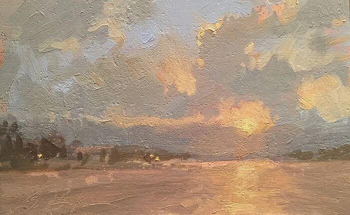
Many of your landscapes involve very transitory lighting/moods; how do you capture that en plein air? The light at dawn and dusk is particularly appealing but exceptionally transitory. I would typically choose a smaller canvas in this circumstance, but there is a trend in plein air competitions to paint larger. I face these challenges in a few ways. I paint small oil sketches while scouting to get the idea, composition and colors sorted. I use an app called “Lumos” to see where the sun will rise and set…to take out some of the guesswork. I tone the surface ahead of time in a way that will support my idea for the finished piece. I arrive early to block-in the major shapes of the painting so that when the moment arises, I can quickly paint the most fleeting light effects, and finally, I often return to the same location with the same canvas for multiple passes.
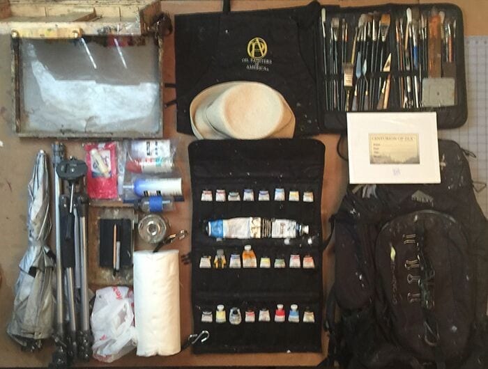
Please explain your painting process. Let me answer this in terms of my plein air work, since that has been what we’ve talked about most here. I’ve found the following habits to be just as important to my finished paintings as the actual brush to canvas steps. Here goes: If it is my first year at an event, I try to arrive early and scout out the area. The first year is always the most intimidating, and scouting allows me to come up with a loose plan of where and when to paint; I say loose plan, because I allow myself to diverge from any charted course if inspiration presents itself. If I am returning to an event, I will review my photos from previous years and think about what I might like to revisit or check out anew. While scouting, I often do quick field sketches in oil or in my sketchbook, making note of the time of day and thinking through compositions. These habits, along with getting enough rest, eating well, and generally taking good care of myself, help lower stress and make me a happier painter! Before getting on location, I prep my backpack and squeeze out/freshen up my paint so that I’m ready to hit the ground running. The painting itself starts with a toned canvas and block-in of major shapes. My common painting method, whether en plein air or in the studio, is to work big shape to small shape, general to specific, big brush to small brush, dark to light, thin to thick.
How do you promote and sell your work other than through galleries and website? This is a good time to ask that question, as earlier this year I assessed how income was generated in 2017. Last year, 72% came from painting sales and 19% from workshops with the remaining 9% coming from prize money and various sources. Those painting sales came from: plein air events, workshops students, direct sales, commissions and galleries, in that order. On the expenses side, travel took the top spot at nearly 30% with art supplies (including framing) at 20%. File that under the category, “It takes money to make money.” Making a living as an artist is a bit of a snow ball effect. You start small and build up as you roll along. Sometimes you have a nice slope to roll down and sometimes it’s more of a slog. As far as self-promotion goes, I have my website; I stay active on social media, including Facebook and Instagram; I send emails out to my distribution list; I have a public profile through Artwork Archive, and I run occasional ads. I enter competitions and consider the cost of submitting to shows a marketing expense. I think attending exhibitions and conventions is a significant element of self-promotion too. These events allow artists to meet and network with magazines reps, vendors, other artists, all while seeing great artwork and presentations.
Here is a quote that, years ago, my mentor Rich Nelson shared with me, that his mentor shared with him. I hope it strikes home with you too. “Making it in this business is a two-step process: Step one, get good, step two, get out there, the better you are at step one, the better step two will go.” Bart Lindstrom
Have you set career goals; is that an important thing to do, and how do you go about achieving them? Yes! I cannot overstate the importance goal-setting has had on my career. Starting in 2010, I began setting yearly goals related to making progress in my business and artistic development. Early on, those goals revolved around getting my digital house in order and advancing the weak areas of my artistic skills. I set goals to enter shows and attended openings and conventions. In doing so, a quick glance at the level of work being produced on the national level in shows such as the OPA National Exhibition and the Portrait Society let me know that I needed to raise the bar in my work. I took a sober assessment and asked myself what was between me and that bar, then set to the tasks of lifting the level of my work. Even now, I look at the year ahead and develop some strategic objectives to complement those earlier goals.
Thanks Suzie for a great interview.
Paintings That Speak
What makes you fall in love with a piece of art? At the 2017 Cowgirl Up! show in Arizona, I was smitten with a painting by Phoenix artist Jessica Garrett. Jessica’s rosy, lit-by-the-sunrise-mountains reminded me of watching the morning sun kiss the eastern face of the Bighorns at my home in northern Wyoming. I regretted not buying the painting before someone else did. I told Jessica later how much it moved me, and she said it actually was the Bighorns (sigh). I still think of that painting.
When I read art magazines or peruse galleries and see an image I love, I try to define what artist did to make it speak to my heart. I’ve written in previous blog posts (at www.sonjacaywood.com) that my most successful paintings are honest, thoughtful attempts at expressing my feeling about a subject. This was the case with one painting last fall:
The distant “drive-by” reference photo snapped years ago from a gravel road didn’t reveal the reason I’d taken it: a group of horses were standing on a hill, catching a breeze on a warm afternoon. I remembered that they seemed “grounded” under a hazy sky, yet somehow they soared over the rest of the landscape.
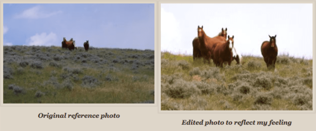
I edited the photo to reflect the way the scene made me feel, and sketched it with oil and mineral spirits on a linen panel. The composition came easily, and careful but expressive strokes in dusty greens and browns brought it to life quickly. I proceeded cautiously, as when a painting’s working with a limited number of brushstrokes, I mistakenly think I’ll improve it if I keep going; many of my paintings lose their “life” in this manner, regressing from something alive with movement and space for the viewer’s imagination to “fill in the blanks” to a contrived and over-worked piece that “tells all.” I’m better at “telling-all” in print than in paint.
Pleased, but not sure it was finished, I shared the image on social media. Within hours, several people inquired as to whether it was for sale. Had I put a price on it that day it would have been a bargain, as it didn’t take long and I hadn’t fallen in love with it yet, but I chose to wait.
By the time I pronounced it “finished,” the list of potential buyers prompted me to exhibit the painting on a broader scale and to have it scanned for prints. On a whim (normally I submit more detailed, complex paintings to national shows) I entered it in my first Oil Painter’s of America National Exhibition and it was accepted! This was an enormous honor- that such a simple painting could hang with the grand, glorious works at this prestigious show makes me wonder what it communicated to the juror and the person who eventually bought it there.
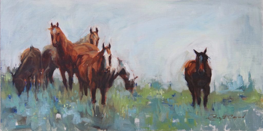
Did the painting say the same thing to everyone who admired it? I don’t think so- some saw it as a rainy morning, not a hot afternoon. My husband never did like it. To me, it relayed my original impression at seeing those horses years before and also left room for others’ interpretations. This painting taught me that it’s not about replicating a photo, portraying a perfect sense of place or mood, or making a painting “look alive,” but making it elicit a “feeling” that communicates with viewers.
I hadn’t known that the mountains in Jessica Garrett’s painting were actually the Bighorns, but she painted it in a way that made me feel like I was home, marveling at my view opposite the sunrise. To perform that magic, she must be inspired by a love for her subject. This is why commissions take me so long- I’ve told clients that I have to fall in love with their subject in order to make the painting “work.” I hadn’t applied it to every day studio work, but from now on I will.
24×24 – Oil on canvas
Everything works together as it should; after several months of health issues kept me out of the studio, I needed the sale more this summer than I did last fall. Besides teaching me not to sell a painting right away, this experience informs me to be true to myself at the easel: for my art to communicate effectively, I must express– in my own artistic voice- what inspired me to paint it, without the intent of moving a potential buyer or juror with flourishes of unnecessary information.
No Matter What, Paint
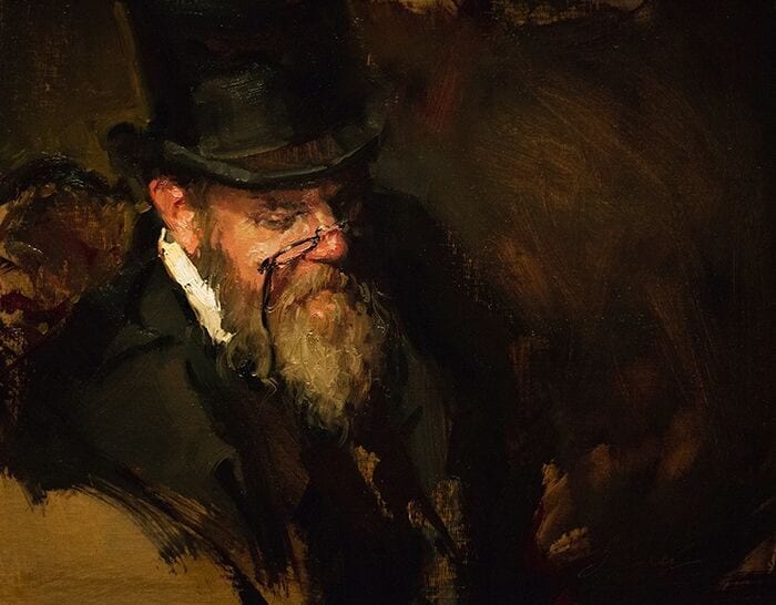
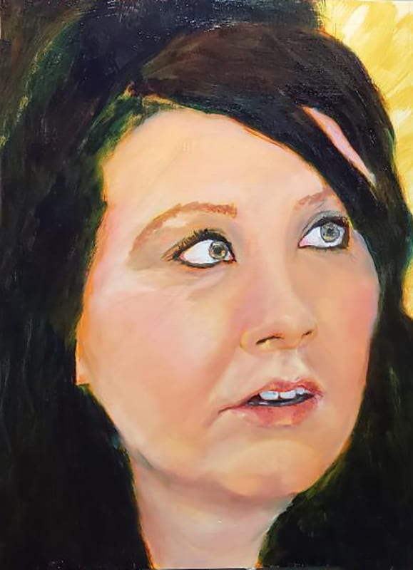
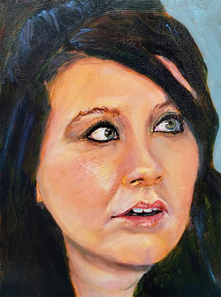
I love to paint most everything but my passion is doing figurative work, especially portraits.
Nothing is more satisfying than to first capture a person’s likeness and then catch at least a glimpse of what I think of as his or her spirit or soul. I relish that moment where I stand back and realize that I have done what I set out to do. Sometimes, of course, I fail. However, I succeed every now and again.
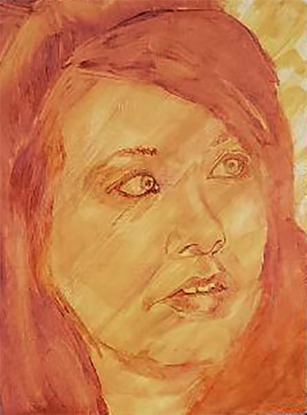
I have been working on a quick portrait study of my son’s girlfriend, Amanda, a woman who does not see herself to be as beautiful as she is. As I have worked on the painting, I have been thinking about vulnerability and self-confidence. My goal in this portrait is to show it all: the beauty, the vulnerability, and the immense spirit that this young woman possesses. As I paint, I worry that I can’t pull it off. And thus, arise my own issues of vulnerability and lack of confidence in my own abilities. I did catch Amanda’s likeness in the underpainting which was done in a rub-out technique on a panel. I was then able to solidify the likeness as I put more color and dimension on the portrait. But can I make her spirit shine through?
I think many artists struggle with these same self-doubts and look in many places to find coping strategies. I mention a few of my own in hopes that they might resonate with you.
First, I want to continue to learn about techniques and materials. I graduated from a wonderful comprehensive atelier program that was really focused on drawing skills, techniques and materials. But, I continue to search for more. I have found along the way, that for an endeavor as intensely personal and subjective as painting, a staggering number of experts give hard and fast rules dictating what they believe is the only way to successfully paint.
That leads to general questions: Who do I listen to? Why should I listen to anyone? If painting is a way that we artists can express the passions and emotions in our souls and hearts, why should any expert be given the power to tell us how to express ourselves? For every book I have read on portraiture that stresses that you must know anatomy, there is another one that sets out measurement rules for the length of the head and placement of eyes, etc., not to mention those that use a sculptural approach to narrow down the masses until the portrait emerges.
So what do I do with all of this conflicting advice and information? I love learning. I use many of the techniques at different times depending on my mood and what I am trying to accomplish in a particular painting. Learning about someone else’s method always yields something new that I can explore and adapt to use in my own work. But, at the same time, I do not think there is a best way to paint or an only way to paint as long as basic conservation procedures are followed so that the painting will last over time. I do not find the conflicting advice confusing as much as comforting. Artists have found so many different ways to communicate their visions.
I also study paintings in museums and online. How does a particular artist paint eyes or lips? What do they do to make the person’s spirit shine through? I watch videos and sometimes attend workshops particularly if the artist’s style or technique takes me beyond my comfort level. Learning is energizing but what I learn is not gospel. I do think limited palettes lead to color harmony, but I do not always use them. Sometimes I want to add a color or a lot of colors. Why not? Just because pigments were severely limited for the early masters does not mean that we must limit our own choices. I like starting with a live model and then working from photographs before finishing the painting with the model. Photographs are great for capturing the likeness but leave a lot to be desired in terms of capturing light and emotion. But I use photos and I am always glad to have the opportunity to take them. I like candid shots that show expressions and typically use several photos of the same person to get a sense of their expressions as well as their features. Some artists say “never work from a photograph.” I say why not if it helps me achieve my goals for the painting.
Sometimes I do quick portraits and other times I take my time. Is there a right way? Not for me since what I want to do is to reveal emotion. I think the most important ability for an artist is to be able to draw accurately. I have to constantly draw to maintain and improve my skill level. It is a case of use it or lose it. So where does my self-doubt come from? Is it from my quest to always get better and the fear that I might not be able to do so? Is it because I worry that others will not like my work? Is it that I compare my work to others and find mine lacking? Is it because every painting can’t be perfect? Is it because so many people are better artists than me? Is it because the painting process is satisfying but not always fun? I think my self-doubt stems from all of the above and much more.
So what do I do about my fears and worries? I put them aside and I paint.