“Everyone needs A Jen”
I have heard from artists countless times…
“So……who is A Jen and why do these artists want one?”
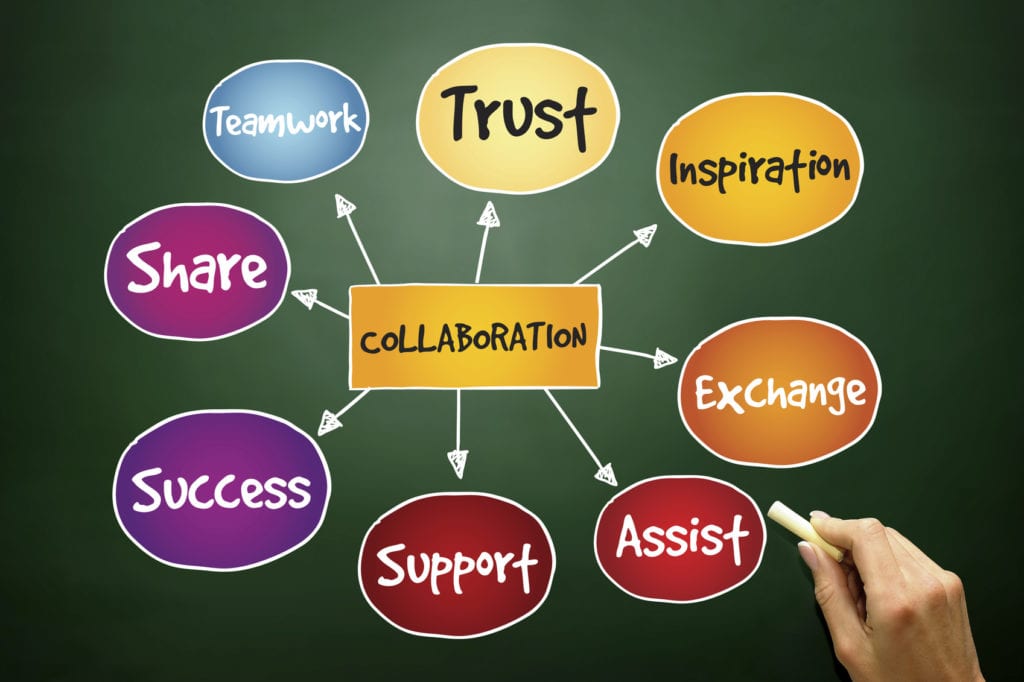
A Jen is someone who does whatever she/he can to take work off your plate so you have more time with a canvas in front of you, paint on your palette and with a brush in your hand. Depending on what she does for you, you can call her your advocate, your business partner, your salesperson, your marketer, your business representative or your admin person. She is with you to help you manifest your dreams.
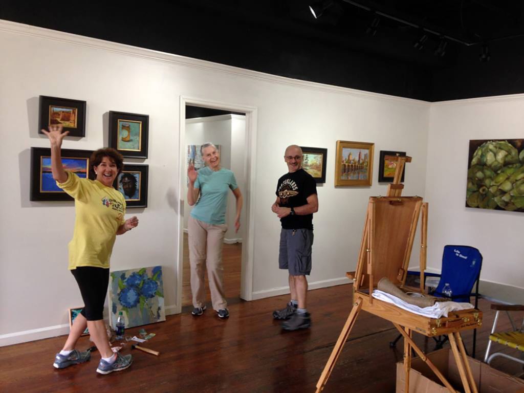
Often artists have A Jen that is also A Spouse, A Partner or A Family Member….and for many this works well. For others, blurring the line between business and personal can cause problems. If this is the case, you may want to consider hiring someone from the outside to more fully support the next stage of growth as a professional artist.
Create YOUR Jen
One of the things that impressed me the most when I first met with the artist I represent was her clarity. She knew what she wanted and had it clearly laid out. This was useful, as it allowed us to match up my skills, knowledge and ability. For this reason I recommend you get as clear as possible about what you need and want.
- Planning/Visioning – help put your dreams into words
- Look for new exciting opportunities in the marketplace
- Create additional products to boost your visibility: books, cards, videos, etc.
- Track and document inventory – both physical (paintings) and electronic (images)
- Oversee and assure deadlines are met (entry into juried exhibitions, shipping of
paintings, etc.) - Negotiate contracts/agreements with galleries and/or other Key Partners
- Create Sales: Meet with collectors or people/organizations interested in purchasing
your work - Spread The Word͟ through social media sites, newsletters, advertisers and
local/national press, development of print materials, e-mails, etc. - Support with workshops: track registrations, send welcome and follow up letters,
material prep - Other fun stuff that will lighten your load and help fulfill your dreams!
Consider that any of these items could, on the one hand, be a stand-alone project for A Jen to do. On the other hand, if you are ready, this might be enough for a full time job! You choose.
Envision the type of person you would like to work with. Imagine what it feels like to be sharing ideas and goals with Your Jen. Do they listen? Share your passion and love for this craft? Are they responsible, reliable, creative and self-assured? Do they see opportunities to enhance your vision or just repeat back what you’ve said? Are they dependable and do you trust them?

Take the Leap
Now that you have defined your needs and set your intention, it’s time to spread the word! Tell people you are looking for your Jen. Describe this person to people. Paint it for them with your words. Keep an open mind….you never know where Your Jen is going to come from!
How I became A Jen
People often ask me how I came to being an artist representative – A Jen. It was not a conventional path! For many years, my primary work was in accounting and bookkeeping, both in the corporate arena and for small businesses. I was using my coaching and leadership training in the service of my accounting work. At a certain point, I started looking for other opportunities to bring forth my skills in the world to play a bigger game. Representing an artist was nowhere on my radar.
Little did I know, many miles away, a certain artist had decided it was time for her to take her business to the next level. She had decided to call someone into her life who could help her with the business aspects of being a professional artist. She set her intention and got clear about what she wanted this person to do.

Almost 4 years have passed since that night in Mary’s living room. We are having more fun than we ever could have imagined and there is still money in the budget! Today, I manage almost all of the above mentioned business aspects for her. This allows her to spend her creative time doing what she loves most, painting and teaching.
Only you know if you are ready to seek out Your Jen. Listen to your heart of hearts and trust what you hear. Have fun and enjoy the process!